![]() |
![]() |
![]() |
![]() |
![]() |
![]() |
![]() |
![]() |
![]() |
![]() |
![]() |
|
#1
|
|||
|
|||
![]()
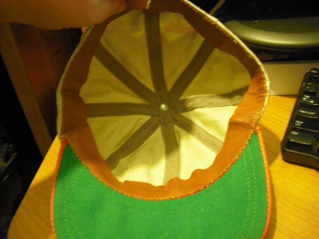
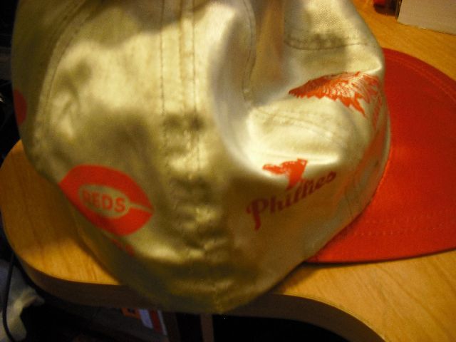
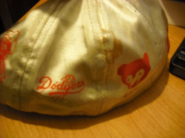
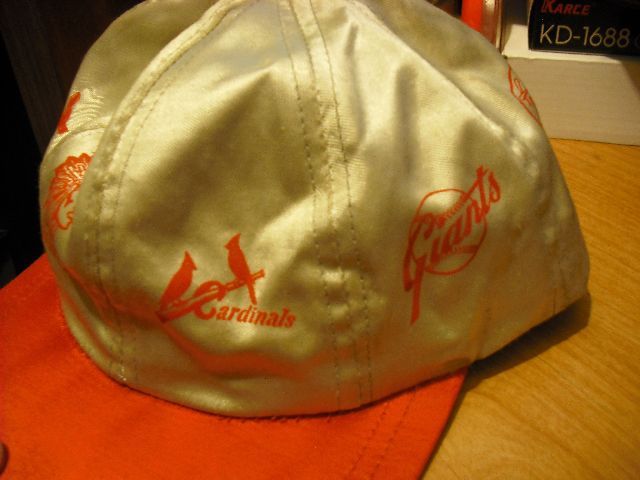
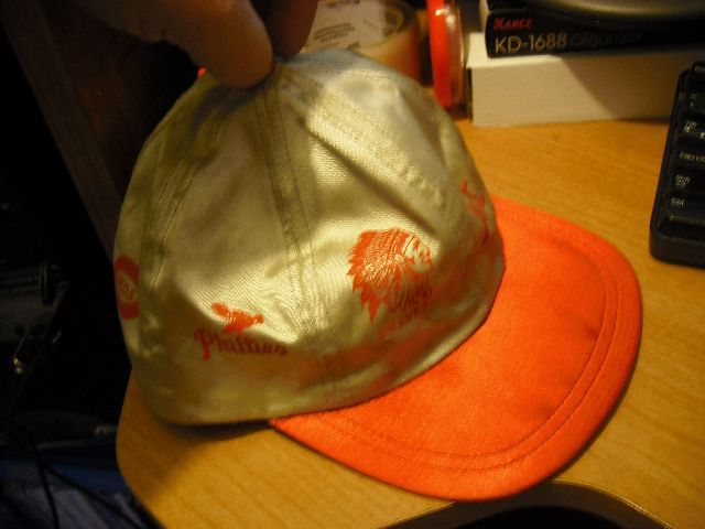
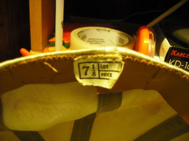
recently came across this cap while cleaning out my parents attic. national league teams, but the logos are all messed up. the dodgers logo didnt start till '58, but the cubs logo stopped in '48. i figure this is some off-brand maker, but am hoping for possibly more info from those that may know. can anyone provide anything on this?
![]() ![]() ![]() ![]() ![]() ![]()
__________________
--Mike Kilo |
#2
|
||||
|
||||
![]()
I'm pretty sure the Dodgers logo was around in that configuration at least 1951 or 1952, same for the Giants on there. The Phillies one is an odd-ball - it shows the Blue Jay which was only used from 43-45 (why they changed their name to the Blue Jays but kept the Phillies name also is one of those unsolvable mysteries...). The Reds logo looks like a 30's-40's version as well.
|
#3
|
||||
|
||||
![]()
Yeah.... that one's a bit of a head-scratcher. The logos don't really match up time-wise. Any way you slice it, there are a few discrepancies. Perhaps the maker just used the logos he liked for each team, and it wasn't a "sanctioned" product of MLB. I've seen kids' jackets of the same era that loooked much like this (with team logos on circular patches).
Pretty cool/unique piece... good post! |
#4
|
|||
|
|||
![]()
anything/one else?
__________________
--Mike Kilo |
#5
|
||||
|
||||
![]()
This could be a 'premium' cap; such as one that could be purchased for either the NL or AL by sending in a coupon for a certain amount of money. Years ago, not so much today, the quality of a cap was determined not by the fabric but by the number of stitches used on the visor. This one has two rows, which means this would have been an inexpensive model.
|
#6
|
|||
|
|||
![]()
this will most likely be going up for sale soon....
__________________
--Mike Kilo |
![]() |
|
|