|
||||||
 |
|
|||||
|
||||||
|
|
|||||
|
#1
 12-08-2009, 07:07 PM
|
||||
|
||||
|
I have run across a decent sized collection of Post cards. I have run across a short print that I have two of, but they are different. It is a 1962 Post #125 Jim Brosnan. There are not that many to compare to. There has been one completed auction and one current auction on Ebay. Both that I have seen are just like the bottom card in the picture below. Both have a dark blue background with a light blue name.
The card that I am questioning is the one at the top of this picture. It has a light blue background and a dark blue name. There is a distinct difference in the two. I was wondering if our detectives on this board could come up with some answers. Maybe you already know. I just know that there is not a variation in the SCD catalog. 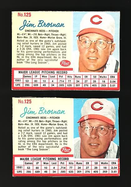

|
|
#2
12-08-2009, 07:36 PM
|
|||
|
|||
|
(PSA board) and here; my instinct for what it's worth (about 3 cents) tells me that these are just printed at different times. One of the cards appear to be much sharper printed than the other one. Is that worth a variation line, I don't know.
Somewhere buried in my archives are two different Post Cereal pamphlets with real detailed access on these cards. If I ever find them, I'll post the information if any Rich
|
|
#3
12-08-2009, 08:10 PM
|
||||
|
||||
|
That was me that posted it over at PSA. Was that your reply?
As far as being a sharper print, my take is that every other detail (color shade and sharpness) is the same. It's like the blues are opposites. In one the background is dark while the name is light, and the other is the opposite. Am I way off here?
|
|
#4
12-08-2009, 09:31 PM
|
||||
|
||||
|
It's interesting that the photos are centered differently in each card. Notice the position of the black stripe on his jersey in comparison to the red line on the right border ...
|
|
#5
12-08-2009, 11:37 PM
|
|||
|
|||
|
While far from an expert on the topic, There are definitely known "tint" variations within the post set. This looks to be exactly what you have. That said, I don't know enough about them to offer a thought on any difference in value if any or which is the tougher one. Be well.
-Howard
|
|
#6
12-09-2009, 10:44 PM
|
||||
|
||||
|
Dont know anything about Post cards, but I saw right away the 2 cards are cropped slighly different, or the print is way off. Look on the right side where the black strip hits the red design (bottom right corner of the image area).
edited to say... i wasnt the first to see this I see 
Last edited by fkw; 12-09-2009 at 10:45 PM.
|
|
#7
12-09-2009, 10:55 PM
|
||||
|
||||
|
Not sure if they are cropped differently, I think someone cut into the red strip and that part of the card is missing, if cut the same would be there.
|
|
#8
12-10-2009, 09:21 AM
|
|||
|
|||
|
They are cropped differently. The right edge is a bit hard to tell because of the trim, and the red could be off center. But on the lower left corner of the picture there's a tiny dark line that's probably a uniform crease. On one it's right at the edge of the picture, and on the other it's farther to the right of the edge of the picture. There's a couple other differences, but they could be from the different colors being out of register.
Steve
|
|
#9
12-10-2009, 10:05 AM
|
|||
|
|||
|
There are numerous color variations throughout the 1962 Post set. Different press runs for different cereals--with potentially different combinations of players on each box.
I don't believe there is any type of premium for the color variations--other than the blue line variations. Many players have the bright blue sky/gray sky tint variation.
|
 |
|
|
 Similar Threads
|
||||
| Thread | Thread Starter | Forum | Replies | Last Post |
| For sale list cards,books,pins,uncut 1961 Post cards,misc... | Archive | Baseball Memorabilia B/S/T | 0 | 01-11-2009 08:46 AM |
| Errors & Variation Discoveries Thread | Archive | Postwar Baseball Cards Forum (Pre-1980) | 2 | 03-24-2008 10:04 PM |
| FOOTBALL 1962 Post Cereal partial set w/many HOFers and Short Prints | Archive | Everything Else, Football, Non-Sports etc.. B/S/T | 0 | 06-28-2007 05:43 PM |
| 1962 Post Footbal Sam Baker SP near mint | Archive | Everything Else, Football, Non-Sports etc.. B/S/T | 0 | 03-26-2007 10:50 AM |
| My last post was about finding a T206 Myers with ghost images | Archive | Net54baseball Vintage (WWII & Older) Baseball Cards & New Member Introductions | 1 | 09-24-2002 12:39 PM |


 Linear Mode

