|
|
#1
|
||||
|
||||
|
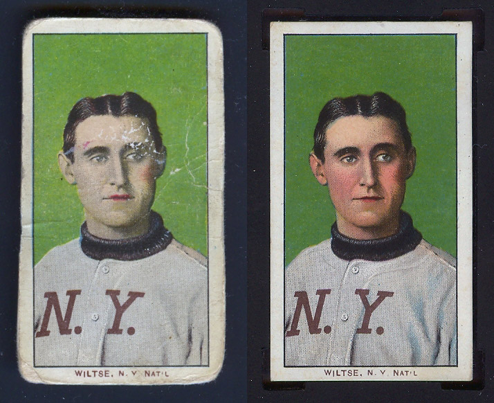
Picked this beater up on eBay recently...
My observations:
I also own the one on the right. To note, both are Piedmont 150 and are missing the bottom portion of the Y in "N . Y . NAT'L" team designation.  
|
|
#2
|
|||
|
|||
|
I think the worn one was was slightly bigger when taken out of the pack, and was packed around by a kid for a while, probably with other cards, and because its edges stuck out further they got banged up. I think the one on the right got pasted into a scrapbook soon after leaving a cigarette pack. And after it was soaked off of the page it has been handled carefully by modern collectors who haven't banged it around.
Last edited by FrankWakefield; 02-11-2011 at 01:57 PM. |
|
#3
|
|||
|
|||
|
TRAE!
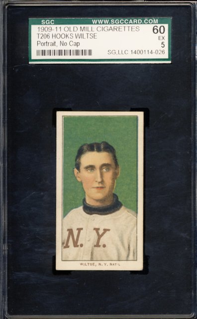
out treasure hunting ,huh??LOL  ....your doing great....nice eye... ....your doing great....nice eye...this one is tougher to tell, i would have to take a look in person.. notice the shading missing in the N.Y. also and the uniform shirt itself...i wish the top and bottom didn't look so "factory cut", but that doesn't necessarily mean it's not scrap....how 's the stock?? the true question is, is it pied 150? or a pied 350??i'm going to guess pied 150...this early run had alot of "errors" and more scrap just inherent of the printing process i assume  these "borderliners" are tuf to tell, some of these are in the eye of the beholder....sgc would just slab this"A", (not missing color) on the flip....i have a sick Butler sgc slabbed "A" which has a double ghosted sov back, hand cut/off register front, but sgc couldn't describe on flip...i have a crumby front scan ...i'll try to post...  BTW...keep up with the great site TRAE! Peace your friend Johnny |
|
#4
|
|||
|
|||
|
Trae
sorry, didn't see in your post it is a pied 150  Anyway...i have two scraps but they are terrible pics.....  The Burns (thanks ART M.!!) is sweet scrap, the Butler has the crazy back(sorry no scan)....both are obvious scrap, just unable to be differentiated on the flip... 
|
|
#5
|
||||
|
||||
|
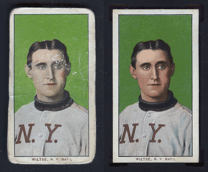
I was going to say that the beater simply has less red, but then I noticed that the right cheek seems to protrude out more.
|
|
#6
|
|||
|
|||
|
Daryle,
your right, cheek does protrude out....good observation 
|
|
#7
|
|||
|
|||
|
Hi Trae,
Good eye. There's another example (besides yours) of what I think may be the "wide format" Wiltse--also a Piedmont 150--in eBay completed listings at: http://cgi.ebay.com/HOOKS-WILTSE-No-...item58873ed06b Maybe you can work your web developer magic and superimpose this possible second example on yours to confirm? Starting to wonder if ALC may have done a touch-up job on Hooks early in the process ... Scot Last edited by sreader3; 02-12-2011 at 03:09 PM. |
|
#8
|
|||
|
|||
|
I'm not so sure about the cheek and shoulder, they measure the same doing some quick on screen measurements. I think those are just optical illusions.
It is either missing one of the red passes, or has a very different halftone red. I also think it's missing a different color, probably blue. Scans of the areas where the uniform lines are missing of weak at a high resolution like 800 dpi would make that clear Steve B |
|
#9
|
|||||
|
|||||
|
Quote:
Quote:
 Top has a little wave to it too, and the stock might feel a little thin, but the scrapbook-esque tear on the back is probably the reason, I think it's normal overall. Top has a little wave to it too, and the stock might feel a little thin, but the scrapbook-esque tear on the back is probably the reason, I think it's normal overall.Thanks for showing your cards (as always!), real cool Burns - I think I remember seeing it before. Quote:
Quote:
Quote:
http://www.t206.org/misc/wiltse_1200dpi.jpg After blowing it up, and looking at the example Scot found above, I think this is simply a slight variation that was touched up early on, as he said. Does anyone out there have this version of the card without a Piedmont 150 back? 
|
|
#10
|
||||
|
||||
|
Quote:

|
|
#11
|
|||
|
|||
|
Well, It does have blue. Interesting. The nicer one you have is darker green so I thought the blue might be missing as well as some of the red. The Ebay one is similar, but there may be a few tiny differences betwen the two.
The Ebay one has much more red so that eliminates a red pass being altogether missing. On the Ebay scan it's just not quite high enough resolution to pick up the details of the screening. (Dot pattern) Do you have a high res scan of the nice one? That would be an interesting comparison. Steve B |
|
#12
|
||||
|
||||
|
Thanks, Tim, but I was asking if anyone had the ghostly/no neck line/"wide" version with a different back (or series especially).
Quote:
http://www.t206.org/misc/ebay_wide_wiltse.jpg Here's a high res of the nice one: http://www.t206.org/misc/wiltse_nice_1200dpi.jpg |
|
#13
|
|||
|
|||
|
Your beater is missing the pink layer of ink. It either wasn't applied or it is completely faded away.
|
|
#14
|
|||
|
|||
|
all of the gray ink in the jersey also appears to be absent. There also appears to be light blue ink missing from the jersey as well.
|
|
#15
|
||||
|
||||
|
That's a lot of missing ink!?

|
|
#16
|
|||
|
|||
|
Yeah, a lot missing. No pink, no gray, and a something going on with the light blue.
There isn't a difference in the shoulder and cheek. The dot patern is identical for both. The areas look different because the blue is printed a bit high and a little left. Without the gray to darken the shoulder it appears bigger. What's also interesting is that under the N on the uniforn the light one has a couple dots that have blended together and the other does not have that. It also doesn't have the 2 five dot sections lower right. But it does have the two blue dots on the uniform in exactly the same places. Probably not errant drops of ink but actually on the plate. There are a few other dots that are consistent between the two of them as well. With enough detailed scans it might be possible to nail down the makeup of the sheets by figuring out how many diferent versions there are. Complicated of course by the probability of multiple plates. Steve B |
|
#17
|
||||
|
||||

__________________
T206Resource.com |
|
#18
|
||||
|
||||
|
Thank you, mkdltn, and thanks again, Steve B.
Steve, if I get what you're proposing, it's possible then, that Scot's theory still holds weight, in that it could have been touched up later, at which time those "missing" colors were added, to complete the touch ups, and their are at least two versions of this card, the beater above likely being the first? Or, do you think the beater is technically still missing colors, despite it being a different version either way? |
|
#19
|
|||
|
|||
|
I think there are two blues. A light blue and a dark blue. The light blue pass for this card appears to be absent but the dark blue is there in the background. I downloaded the scan of the Wiltse card from the LOC site which has poor register which gives clues to the cards color makeup. The image below is a blownup view of the corner where all the different color passes that make up the background can be seen. Your beater seems to have a lighter background since the gray and light blue are gone. Could this be from an aborted print run?
Perhaps the light blue, Pink and Gray the final colors in the card. Last edited by mkdltn; 02-13-2011 at 03:22 PM. Reason: picture |
|
#20
|
|||
|
|||
|
It gets more curious all the time.
I'm not convinced there were 2 blue passes, But I might be convinced. I'll have to have a look at more of the LOC cards. Awesome resource. The light blue/dark blue border is right along the edge of the gray. I think it's just the gray making it appear darker. The LOC card has some differences, mostly in the name/team. But the blue is similar to the nice one. to the left at the level of the mouth all 3 have a blue dot that's outside the main image area. Also all 3 have a brown or black dot in the same area. all 3 also have a blue dot in the left side earlobe. But the light one does not have blue in the uniform, aside from a couple individual spots that match spots on the nice one. (And arenot on the LOC card)and none in the eyes. So maybe 2 blue passes? Or maybe a different blue plate. Another possibility is worn plate. I've been reading up on the history of lithography, and the stone lithography worked a tiny bit diferent from modern plates. What's confusing about a worn stone being responsible is that most of the rest of the blue image is just fine. Possibly an underexposed stone? Gray and pink are certainly missing. Wether this was by accident - An unfinished sheet- Or by design where the pink and gray were added to the press run later would be very hard to tell. It's possible the colors could have been added later, along with a strengthened blue. It could also be a difference between 150 printings and 150/350 printings. Steve B |
|
#21
|
|||
|
|||
|
I had a close look at a few of my T206s yesterday.
Most had a clear dark blue and a clear light blue pass. So yes, another missing color. Steve B |
 |
|
|
 Similar Threads
|
||||
| Thread | Thread Starter | Forum | Replies | Last Post |
| T206 Polar Bear by Series | PolarBear | Net54baseball Vintage (WWII & Older) Baseball Cards & New Member Introductions | 1 | 06-17-2010 03:43 PM |
| T206 Wiltse Portrait No Cap - Missing Bottom of Y in "N.Y." | T206.org | Net54baseball Vintage (WWII & Older) Baseball Cards & New Member Introductions | 14 | 12-21-2009 11:00 PM |
| FS: T206 Johnny Evers Portrait Piedmont SOLD | jabiloxi | Tobacco (T) cards, except T206 B/S/T | 1 | 11-29-2009 07:39 PM |
| T206 Howell portrait..will trade for T206 PSA 2 portrait | Archive | Tobacco (T) cards, except T206 B/S/T | 0 | 05-02-2007 10:42 AM |
| T206 Cy Young Portrait | Archive | Net54baseball Vintage (WWII & Older) Baseball Cards & New Member Introductions | 14 | 03-14-2007 08:08 AM |