|
|
#1
|
|||
|
|||
|
I have been collecting and studying all of the cards from the W516 family recently and have noticed a major difference in several of the W516-1's. I know that there are variances in shading/color in this set (and most strip cards in general), however, these appear to have been printed with two completely separate paper stocks and methods.
One variation has a bright white, thicker, multi-layered, almost glossy paper stock. Notice the chipping around the border of the Burns card below. The other version is printed on a thinner, single-layered, tan colored paper stock. All cards seem to appear in both versions and are otherwise identical. I have searched past threads and have not been able to find any other mention or discussion of this. Just wondering if anybody else has noticed or catalogued this or if anybody would even consider this to be a difference worth noting. |
|
#2
|
||||
|
||||
|
good find, youd think that this card stock difference would have been "discovered" (noted) sooner, as a set collector would have seen the color differences easily with the cards side by side.
I was thinking it was going to be because some of the cards have the ""UNIVERSAL BASE BALL MATCHING CARDS" line at top, but your Burns has enough of the top border to show that it probably isnt from the set.... ??? PS on your cards.....the dotted line on the right side of Burns is missing on 1 variation, that and the blue shadow on ground and line below trees of the Bodie card are the only differences I see with the printing here are a few scans I have from the set...   
Last edited by fkw; 12-17-2011 at 04:01 PM. |
|
#3
|
|||
|
|||
|
Thanks for the input Frank. Sounds like this difference may not have been officially noted before. Your observation about the dotted line on the Burns seems to prove that these were indeed printed differently.
Both versions appear to be similarly common based on a quick ebay search of what's available now. Anybody else have any thoughts on these? |
|
#4
|
||||
|
||||
|
Bump...
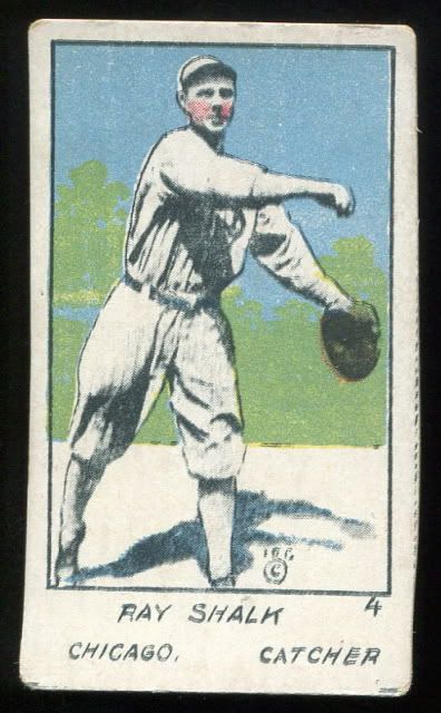
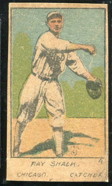
Don't have much to add to this thread except to show my two examples (the cards have been cropped a little differently). It looks like the card on the left is missing a flesh-tone color pass - is this common for this issue?  
__________________
Current projects: White Sox prewar type set White Sox T206 Master set 1952 Topps set |
|
#5
|
|||
|
|||
|
I don't think it's missing, rather entirely different.
To me it looks like there's only one red pass on the one on darker cardboard. The yellow pass and black pass are definetly different, the trees behind him only come to the shoulder on one, and head high on the other. The differences in the black are a bit more subtle, but there. Is the white one a cell phone pic or a scan? If it's a scan then the differences are a bit more obvious or it has two black passes. Steve B |
|
#6
|
||||
|
||||
|
Steve, both cards were scanned.
The card with the white stock sure does have two black passes - it is easy to see with a magnifying glass (especially in the printing and the crop lines at the bottom of the card). The red looks to be applied totally different on each card too. On the white stock card, there is red only on Schalk's cheeks and in his catchers mitt. On the tan stock card there is red applied to the mitt area, but his entire face has red print dots; his forearms and the ground have some red in them too. The red ink along with the color of the paper stock must be what gives the appearance of flesh tones in the second card.
__________________
Current projects: White Sox prewar type set White Sox T206 Master set 1952 Topps set |
|
#7
|
|||
|
|||
|
Hi, Marc.
Back in 2004 when I was much more of a novice, I returned a thin Schalk [like the one above] to the seller kilburnhighroad for a refund because I thought it was a phoney. Besides the refund, he was very nice and explained to me that those strip cards were commonly printed on different stock. So some collectors have been aware of the difference for a long time. He also advised me to join Net54. How I wish I had heeded his advice as it took me five more years to finally find this mecca for card collectors. Oh well, I'll have to be happy with better late than never. Doug Last edited by dougscats; 01-24-2012 at 01:37 PM. |
|
#8
|
|||
|
|||
|
That's cool, I wonder if it's two black passes or if the plate was laid out double.
There are a few little diferences in the black, mostly the line between the fore ground and the green background. The lower left corner of the border has a small projection too. The doubling makes it tough to be sure of some others. It's one of those ones where the longer you look the more differences you find. Steve B Quote:
|
|
#9
|
|||
|
|||
|
Thanks to everyone for the updated input. If you have both variations in hand, you can easily see that they are printed entirely differently, rather than just missing a color pass or something along those lines.
Doug, that's interesting that somebody else was aware of the different paper stocks. I did quite a bit of searching before I posted this thread and found no mention of it anywhere. I realize that the strip card sets are not nearly as widely collected and studied as many other major sets of the era but I would have thought that a major difference like this would have at least been noted. I imagine that with the wide variety of subcategories of the W516 family of cards, there were probably multiple different printing processes and distribution methods. |
|
#10
|
|||
|
|||
|
Bumping this old thread to note a possible W516-1 pose variation for Tris Speaker. Another collector pointed out it looks his head moves between two of them, as if taken from photos moments apart. Might be a print register difference (shifted black?), but the effect is discernible for what's otherwise a very similar print process.
What do people think? Anyone else seen similar photo (or ink) differences in other W516s? |
|
#11
|
||||
|
||||
|
Quote:
Doubt this will be the discovery of the year, but happy to have found the subtle difference... 
__________________
... http://imageevent.com/derekgranger HOF "Earliest" Collection (Ideal - Indiv): 250/346 (72.3%) 1914 T330-2 Piedmont Art Stamps......: 116/119 (97.5%) 1923 V100 Willard's Chocolate............: 180/180 (100%) |
|
#12
|
||||
|
||||
|
W516 has long been understood to have variations in stock, ink, numbering, lettering and font. Of which there are many. The basic set, type 1, has the cards facing the right way numbered a specific way. Other iterations reverse negatives, change numbering, reverse negatives and change numbering, reuse the image with different numbers and typefaces. And there are multiple inking schemes as well. None of the stock and ink variations are new per se, they just aren't subjects of significant collector interest and not well cataloged; let's face it, T206 this isn't. I've found them with the bright white stock as well; FWIW, I've found the white stock only with the type 1 cards and only with black ink. I think all it amounts to is a variation among print runs for type 1 cards. Some pictures:
White stock Cobb, image facing right way:  Beige stock Alexander, image facing right way:  Beige stock Johnson, image facing wrong way:  Mathewson with image wrong way, different font/numbering, blue ink:  Beige Collins, blue ink, image reversed: 
__________________
Read my blog; it will make all your dreams come true. https://adamstevenwarshaw.substack.com/ Or not... Last edited by Exhibitman; 12-13-2013 at 02:56 PM. |
|
#13
|
|||
|
|||
|
Yes, #5 type collection is my baby. Thanks for pointing that out; it's interesting to find something so subtle on a century-old set.
|
|
#14
|
||||
|
||||
|
Awesome! I stumble on your site at least once a month!
I think this is bigger than just a card stock / reverse image / card number subtlety as Speaker's face is definitely angled differently in the two cards. As others have said a million times, a discovery like that in the t206 set would set the world on fire! Strip card discoveries (I've had two legitimate ones in the span of 24 hours) certainly garner zero interest. My other post about a W519 Cravath #18 (previously unconfirmed existence) has had a total of zero replies and almost as many views. Oh well!!
__________________
... http://imageevent.com/derekgranger HOF "Earliest" Collection (Ideal - Indiv): 250/346 (72.3%) 1914 T330-2 Piedmont Art Stamps......: 116/119 (97.5%) 1923 V100 Willard's Chocolate............: 180/180 (100%) Last edited by h2oya311; 12-13-2013 at 04:39 PM. |
|
#15
|
||||
|
||||
|
It seems many strip card sets used different stock. There are an infinite number of varieties and differences. I think one could almost only collect W cards and make a full time hobby of it.
__________________
Leon Luckey www.luckeycards.com |
|
#16
|
|||
|
|||
|
Quote:
Strip cards don't catch the common eye, for sure, but they do have the cheapness working against them. Whoever first made those sets might be shocked any of them survived to the 21st century. :-) |
 |
| Thread Tools | |
| Display Modes | |
|
|
 Similar Threads
|
||||
| Thread | Thread Starter | Forum | Replies | Last Post |
| T207....indeed a strange set....let' talk about it ? | tedzan | Net54baseball Vintage (WWII & Older) Baseball Cards & New Member Introductions | 78 | 06-11-2010 09:00 PM |
| 1931 Metropolitan St. Louis Cardinals complete ex-mt set $800 Moved to Ebay | cardinalcollector | 1920 to 1949 Baseball cards- B/S/T | 3 | 04-22-2010 10:37 AM |
| Needing 34 1911 Zeenuts to complete my set.... come on guys..some of these are easy!! | shammus | Pre-WWII cards (E, D, M, etc..) B/S/T | 0 | 10-23-2009 08:45 PM |
| 1963 John Kennedy card set with 4 uncataloged variations | Archive | Everything Else, Football, Non-Sports etc.. B/S/T | 0 | 02-05-2008 07:15 PM |
| How many T207s make a set ??? variations ??? | Archive | Net54baseball Vintage (WWII & Older) Baseball Cards & New Member Introductions | 18 | 05-09-2007 12:26 PM |