|
||||||
 |
|
|||||
|
||||||
|
|
|||||
|
#1
 02-02-2012, 12:26 PM
|
|||
|
|||
|
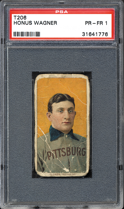
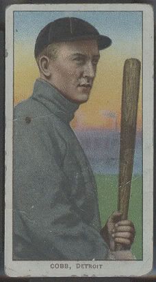
Collectors know one of the appealing aspects of the white-border set is the great mix of colors. Whether it be a solid background on a portrait or a rainbow of hues gracing an action shot, the color schemes on our minature pieces of art are breathtaking, to be sure. I often find myself mesmerized by the red background on the Cobb portrait. Sometimes I think I could gaze at it for hours and hours.
So, what's your favorite T206 color? Last edited by Rob D.; 02-02-2012 at 12:27 PM. 
|
|
#2
02-02-2012, 12:33 PM
|
||||
|
||||
|
My favorite background color is the Green followed closely by the Red.
|
|
#4
02-02-2012, 01:17 PM
|
|||
|
|||
|
The Dougherty portrait with the purple background.
|
|
#5
02-02-2012, 01:24 PM
|
||||
|
||||
|
how about cards with a rainbow of colors
|
|
#6
02-02-2012, 01:57 PM
|
||||
|
||||
|
I like the T206 portrait colors that less common or unique.
My favorite portraits are the ones with the mint green background becuase there are only a few - particularly Walsh, usually Cassidy and sometimes Moran depending on the printing. The contrast of Walsh's dark uniform and dark hair against the mint green background is awsome. The vast majority of the other White Sox portraits that have yellow or orange backgrounds (with the exception of Dougherty) just don't look as good (IMHO). I also like the light taupe (?) color of the Rucker portrait. Not much of a color per se, but it stands out from the group becuase it's the only one with that color. The Willis portrait cards are cool when the background is more of a purplish wine color like Clayton "teetwoohsix"'s shown below (thanks, Clayton). Most of them are dark red. As far as the on-field poses go, I really like the sky in the Spike Shannon card. Tons of colors in there (mint, pink, light orange) that you don't notice unless you stop to look close. Thanks to t206resource.com for the images of Walsh and Rucker. Steve
|
|
#7
02-02-2012, 01:59 PM
|
||||
|
||||
|
red
 
__________________
Read my blog; it will make all your dreams come true. https://adamstevenwarshaw.substack.com/ Or not...
|
|
#8
02-02-2012, 02:19 PM
|
||||
|
||||
|
Although green in general is my favorite color, and I am partial to multi-colored backgrounds (like blazing sunsets), for T206's my favorite are probably the red and orange/red ones that transition in color, like the Steinfeldt portrait. There are a bunch of them (will try to post some later) that I can sink my eyes into for minutes (hours...hey that's a lot of time).
Brian
|
|
#9
02-02-2012, 02:21 PM
|
||||
|
||||
|
Rob, thanks for making me do a spit-take!
|
|
#12
02-02-2012, 03:22 PM
|
|||
|
|||
|
I love the pink.
__________________
Wanted: Low grade T-Cards, 48-49 Leaf Paige, 49 Bow. J. Robby, T206 Chase Pink Portrait, E-card Rebel Oakes, E95 Cicotte, anything Matty, 53 Bow. Reese, 19th C. and Dead-ball photos.
|
|
#13
02-02-2012, 04:16 PM
|
||||
|
||||
|
Quote:
|
|
#14
02-02-2012, 04:24 PM
|
||||
|
||||
|
Quote:
Brian (I still like those orangey-red transitional ones and I will post later to prove their dominance in the T206 color scheme) Last edited by brianp-beme; 02-02-2012 at 04:25 PM. Reason: left out a like
|
|
#15
02-02-2012, 04:42 PM
|
|||
|
|||
|
the deep red of the t206 Phelan portrait captivates me.
gratefully, i have Lionel Carter's example, framed and a focal point in the office. best, barry
|
|
#17
02-02-2012, 07:10 PM
|
|||
|
|||
|
i also love the pink lol!!!
__________________
my 1952 topps set less than 60 to go!!! also looking for psa 3-6 1954 topps hockey looking for 1952 topps high series commons
|
|
#18
02-02-2012, 07:50 PM
|
||||
|
||||
|
I love how deep the red is on these cards, and not just a solid color for the background, but a whole range of shades. The Kling always catches my eye...the richness of all the hues of red just overwhelm me to the point where I must sit down.
Brian Last edited by brianp-beme; 02-02-2012 at 07:57 PM.
|
|
#19
02-02-2012, 08:54 PM
|
||||
|
||||
|
Carrigan Red, hoping to get Homedepot to carry it.
Rawn
__________________
Not a forensic examiner, nor a veterinarian, but I know a horse's behind from a long ways away.
|
|
#20
02-02-2012, 10:01 PM
|
||||
|
||||
|
^^^ Very nice examples, Brian.
I've always liked the blue background on the Tris Speaker card, which can be especially striking when the blue is deep, dark, and free of white print marks. The subject on this card is pretty cool in his own right, but the perfect combination of background colors puts this card over the top... Last edited by CW; 02-02-2012 at 10:01 PM.
|
|
#21
02-03-2012, 10:05 AM
|
||||
|
||||
|
Steve- I'm with you on the Violet color of the Willis card- one of my favorites for sure.
I really like the greens I think the most. One of my favorites (I don't have one yet-maybe someone who does will post one?) is the Hans Lobert T206. Something about that background color makes that card one of my favorites in the set. The color blends are awesome. They had some amazing artists back then !!! Sincerely, Clayton
|
|
#22
02-03-2012, 10:38 AM
|
||||
|
||||
|
i love how the red color is not monochromatic...it has different hues of red that give the portraits an almost three dimensional look...almost eerie in a good way..they simply POP off the paper!
|
|
#23
02-03-2012, 12:03 PM
|
||||
|
||||
|
Yellow. The first card that comes to mind is Jimmy Lavender's. The yellow background makes his image appear to jump off the card.
__________________
jasoncarota.com | hickory + hide
|
|
#27
02-03-2012, 02:14 PM
|
|||
|
|||
|
Not mine but this one was pointed out earlier. Nice card of Lobert.

|
|
#28
02-03-2012, 02:37 PM
|
||||
|
||||
|
I dont know what color this would be but I like the green grass with the clear blue sky in the background as seen in this card.
|
|
#31
02-03-2012, 04:00 PM
|
||||
|
||||
|
Here's a sampling of my favorite T206 colors.
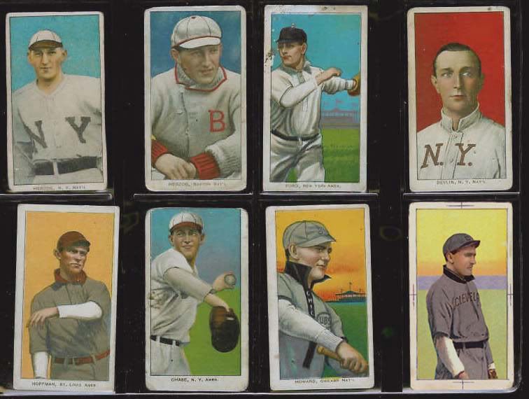
|
|
#32
02-03-2012, 04:23 PM
|
||||
|
||||
|
Thanks for showing that Lobert, I love that card.
Some more nice colors........
|
|
#33
02-05-2012, 11:39 AM
|
||||
|
||||
|
Bought this card today
LOVE the salmon and green color scheme!  Absolutely beautiful!
__________________
Bill Potter T206 Beater Collection currently at 51/524
|
|
#34
02-06-2012, 11:07 PM
|
||||
|
||||
|
Definitely like pink the best
|
 |
| Thread Tools | |
| Display Modes | |
|
|
 Similar Threads
|
||||
| Thread | Thread Starter | Forum | Replies | Last Post |
| FS: T201 Mecca, T205 Gold, T206 White, OM T210-3 | npa589 | Tobacco (T) cards, except T206 B/S/T | 14 | 10-21-2011 08:01 PM |
| T206 Pickering Portrait gd-vg Orange Color Variation SOLD | Archive | Tobacco (T) cards, except T206 B/S/T | 0 | 04-19-2008 06:43 PM |
| Another slight T206 color variation | Archive | Net54baseball Vintage (WWII & Older) Baseball Cards & New Member Introductions | 5 | 02-26-2008 10:51 AM |
| Favorite T206 CArd | Archive | Net54baseball Vintage (WWII & Older) Baseball Cards & New Member Introductions | 32 | 07-01-2006 12:46 PM |
| FOR SALE T216 Kotton, T209 color, T204 Ramly, T206 commons | Archive | Tobacco (T) cards, except T206 B/S/T | 2 | 05-14-2006 05:55 PM |


 Linear Mode

