|
||||||
 |
|
|||||
|
||||||
|
|
|||||
|
#1
 05-19-2024, 12:23 PM
|
|||
|
|||
|
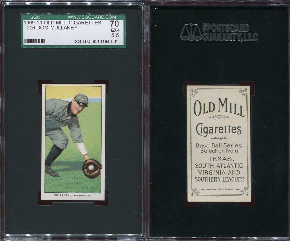
For all of you T206 collectors, I am wondering what you consider to be ideal centering for T206's and similar cards. I usually think of 50/50 cards as having all borders with the same width, but because the T206's have lettering on the bottom border does that change things?
Here are three different cards from the Heritage Auction that just closed. (If you won any of these, congratulations to you!) These cards are all about the same left-to-right (all are a bit thicker on the right side), but are different top-to-bottom. Doc White - this card has a top border that matches the width from the lettering to the bottom of the card. Red Cobb - the width of the top border matches the side borders. Orval Overall - the lettering is centered within the bottom border. Which of these cards do you think is the best centered from top to bottom? Are any of these ideal or do they all come up short in some respect? 
|
|
#3
05-19-2024, 01:21 PM
|
||||
|
||||
|
This is really a thread for the OCD crowd...which in the hobby refers to those with Obsessive Centering Disorder.
Brian (these E220 Hollocher cards thank me every day for giving them a good home, though the one on the left is not only fit and trim, but also has a well-centered personality) Last edited by brianp-beme; 05-19-2024 at 01:25 PM.
|
|
#4
05-19-2024, 02:11 PM
|
|||
|
|||
|
Interesting question. I generally prefer centering similar to the red Cobb. Uniform on left right and top borders, with slightly wider border on bottom. To me, this centering creates intentional footer space for the name, rather than a name that is squished into a border frame that is barely large enough. No idea if this is the correct centering, but definitely what I prefer.
That being said, I own a few cards where there is way too much space on the bottom border, and that really bugs me.
__________________
T206 Progress: 72/524 Instagram: @TheRasmussenCollection
|
|
#5
05-19-2024, 02:16 PM
|
||||
|
||||
|
I like mine top heavy, and I include all of the white border on the bottom front, where the names are too. Some others may not...
And literally, 97% of the time someone says "perfect centering", it isn't. Sometimes it's not even close. I would call this one 50/50 L-R and 55/45 (maybe even 60/40) top to bottom. It's not perfect but I would say "great" centering. Perfect needs to be within a few percent in either direction, to me. 
__________________
Leon Luckey www.luckeycards.com Last edited by Leon; 05-19-2024 at 05:19 PM.
|
|
#6
05-19-2024, 03:16 PM
|
|||
|
|||
|
Quote:
__________________
T206 Progress: 72/524 Instagram: @TheRasmussenCollection
|
|
#7
05-19-2024, 03:19 PM
|
||||
|
||||
|
I'm not sure if there's even a right or wrong answer either way here quite frankly, as long as the bottom and top borders aren't totally out of whack each way. Now side to side centering is a whole different ball of wax!
Every example here looks great to me in regards to top to bottom centering, except of course those E220's  My apologies in advance to the owner of those as they are beautiful in their own right! My apologies in advance to the owner of those as they are beautiful in their own right!
__________________
Tony A.
|
|
#9
05-19-2024, 03:36 PM
|
|||
|
|||
|
Quote:
He eventually committed suicide in his mid-40s.
|
|
#10
05-19-2024, 03:40 PM
|
||||
|
||||
|
Quote:
Just to show that I am not anti-decent centering, here are a few T206 cards worthy of the OCD gang. Brian
|
|
#11
05-19-2024, 07:52 PM
|
||||
|
||||
|
Quote:
__________________
Eric Perry Currently collecting: T206 (136/524) 1956 Topps Baseball (198/342) "You can observe a lot by just watching." - Yogi Berra
|
|
#12
05-19-2024, 09:11 PM
|
||||
|
||||
|
Quote:
3-2-counts Cobb looks centered to me
|
|
#13
05-20-2024, 09:55 AM
|
||||
|
||||
|
I like a little fatness at top and below the letters in the name. Gives me more comfort that the evil trimming people haven't visited my card. Here's an example from my collection:

__________________
Galleries and Articles about T206 Player Autographs www.SignedT206.com www.instagram.com/signedT206/ @SignedT206
|
|
#14
05-20-2024, 10:50 AM
|
|||
|
|||
|
Some great examples in this thread. Paul, that card above is awesome.
Been collecting T206 since 1991...For me, I lean towards the original poster's Cobb example, equal border thickness top & sides, and a little meat below the name/team caption. Last edited by MVSNYC; 05-20-2024 at 10:50 AM.
|
|
#15
05-20-2024, 10:57 AM
|
|||
|
|||
|
what pleases my eye the most is if side and top borders are all equal. Because of the writing on the bottom border that has more leeway to my eye.
__________________
Check out https://www.thecollectorconnection.com Always looking for consignments 717.327.8915 We sell your less expensive pre-war cards individually instead of in bulk lots to make YOU the most money possible! and Facebook: https://www.facebook.com/thecollectorconnectionauctions
|
|
#16
05-20-2024, 11:05 AM
|
|||
|
|||
|
Quote:
|
|
#18
05-21-2024, 07:41 AM
|
|||
|
|||
|
Nice cards, everybody. And thanks for the feedback from all you experienced T206 collectors.
Sent from my SM-S906U using Tapatalk
|
|
#19
05-21-2024, 11:48 AM
|
||||
|
||||
|
Centered enough for the girls I go out with.

|
|
#20
05-21-2024, 01:50 PM
|
|||
|
|||
|
Most cards with borders on 4 sides (that contain all the card information within those borders) have the same distance from the border to the edge of the card. Geometrically speaking, T206 cards are centered if the distance between the black border and the edge of the card on the left, right, and top side is the same, therefore the bottom of the card is centered as well by definition (assuming non-trimmed cards). The proof is left to the collector. (Though some well trimmed cards could be centered as well)
If cards are trimmed inside the borders, these are known in the medical community as "doctored without borders" cards.
|
|
#21
05-21-2024, 03:38 PM
|
||||
|
||||
|
Quote:
__________________
Eric Perry Currently collecting: T206 (136/524) 1956 Topps Baseball (198/342) "You can observe a lot by just watching." - Yogi Berra
|
|
#23
05-22-2024, 09:01 AM
|
||||
|
||||
|
Quote:
|
|
#25
05-22-2024, 03:28 PM
|
|||
|
|||
|
I purchased some in the 70s from dollar boxes. I had no idea about centering, corners etc. I just wanted portraits. So when I had them graded 20 years ago they are all over the place. Ill have to pull some out and look
|
|
#26
05-22-2024, 08:09 PM
|
|||
|
|||
|
Quote:
|
|
#27
05-24-2024, 10:24 AM
|
|||
|
|||
|
I'm not too picky. I like both of these.
__________________
T206 518/518
|
|
#28
05-25-2024, 09:45 PM
|
||||
|
||||
|
My preference is centered all around. Both of my Cobb Reds are well centered but to each their own. I actually prefer the PSA 4 (on right) better but the PSA 3 has a authentic tobacco stain that I love also. What are y'alls thoughts on back centering? (left is PSA 4, right stained is PSA 3)
Last edited by BrooksRobinson; 05-25-2024 at 09:50 PM. Reason: Uploaded backs
|
|
#29
05-25-2024, 09:54 PM
|
||||
|
||||
|
I like 'em a bit top heavy also (cards too). Besides perfect centered, I try to get them like this one.
|
|
#31
05-28-2024, 10:02 AM
|
||||
|
||||
|
Back centering, even if not too good, doesn't bother me. IF it's missing some letters that might be a different story. Personally, I like the 3 as I like big tops...
Quote:
__________________
Leon Luckey www.luckeycards.com
|
|
#32
05-28-2024, 10:12 AM
|
||||
|
||||
|
I'd be fine with the centering of any of those cards, but I prefer the centering on the Doc White.
On a card like a T206, centering is extremely important to me. On a card like a N172 Old Judge, the quality of the image is far more important to me than the centering.
|
|
#33
05-28-2024, 10:58 AM
|
||||
|
||||
|
I don't like the names to look cramped at the bottom. Top's gotta have some meat, but the ideal bottom centers the name as well. Centering on back is not vital.
    Sent from my motorola edge 5G UW (2021) using Tapatalk
|
 |
|
|
 Similar Threads
|
||||
| Thread | Thread Starter | Forum | Replies | Last Post |
| T206 Centering | Andrew1975 | Net54baseball Vintage (WWII & Older) Baseball Cards & New Member Introductions | 12 | 11-24-2017 06:02 PM |
| t206 Walsh, SGC 30, Great Centering | GregMitch34 | Tobacco (T) cards, except T206 B/S/T | 3 | 03-14-2013 10:59 AM |
| T206 Centering Marks? Red on top | Blitzu | Net54baseball Vintage (WWII & Older) Baseball Cards & New Member Introductions | 7 | 01-09-2012 05:57 PM |
| Question on t206 centering | Archive | Net54baseball Vintage (WWII & Older) Baseball Cards & New Member Introductions | 3 | 03-18-2008 09:53 PM |
| top to bottom centering t206 | Archive | Net54baseball Vintage (WWII & Older) Baseball Cards & New Member Introductions | 0 | 01-16-2007 05:29 PM |


 Linear Mode

