|
||||||
 |
|
|||||
|
||||||
|
|
|||||
|
#1
 05-07-2022, 11:40 AM
|
||||
|
||||
|
Sorry that I didnt think to post this yesterday on his birthday, but I would love some crowd source ideas and opinions on which cards of Willie Mays, main issues or otherwise, have the best eye appeal
I have his 54 and 56 which I love except the fact that his close up is the same image which makes the 2 cards displayed next to each other look kind of weird. Is it just me or are many of his regular issue Topps cards not so great looking images of him! Sometimes his facial expression looks a little stressed and there are also some without a baseball cap on. I think I might want to replace one of my two cards with another issue that is somewhat affordable (for instance I love his 1952 Bowman but thats gotten pretty much out of my budget for now) any suggestions on cards of Willie that you find to be especially great looking little works of art?? Thx for your input and, happy belated Birthday Willie! 
|
|
#2
05-07-2022, 11:58 AM
|
||||
|
||||
|
I'm partial to his '62 Topps because I like action shots and his big grin. I like his '66 Topps too.
But obviously, it's all personal preference. You can see all of his major issues here: https://www.oldsportscards.com/willi...aseball-cards/ And yes, its annoying that Topps kept recycling his images. Last edited by cgjackson222; 05-07-2022 at 12:23 PM.
|
|
#5
05-07-2022, 12:14 PM
|
||||
|
||||
|
Poster
|
|
#6
05-07-2022, 12:43 PM
|
|||
|
|||
|
My favorite is still the 1954 Topps but also love the 1967 Topps pin-up since it's a larger image than his 1966 and 1969 Topps.
|
|
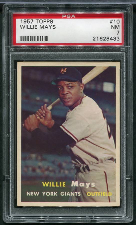
#7
05-07-2022, 01:33 PM
|
|||
|
|||
|
Quote:
__________________
Bought from: orioles93, JK, Chstrite, lug-nut, Bartholomew_Bump_Bailey, IgnatiusJReilly, jb67, dbfirstman, DeanH3, wrm, Beck6 Sold to: Sean1125, sayitaintso, IgnatiusJReilly, hockeyhockey, mocean, wondo, Casey2296, Belfast1933, Yoda, Peter_Spaeth, hxcmilkshake, kaddyshack, OhioCardCollector, Gorditadogg, Jay Wolt, ClementeFanOh, JollyElm, EddieZ, 4reals, uyu906
|
|
#9
05-07-2022, 03:15 PM
|
||||
|
||||
|
My choice is based almost entirely on the nostalgia of Willie coming back home to New York (making kids across the boroughs go into a frenzy trying to get his card), so for me the best will always be this one...
s-l1600-2.jpg Of course, second place goes to him actually donning the Mets uniform... s-l1600-3.jpg
__________________
All the cool kids love my YouTube Channel:
Elm's Adventures in Cardboard Land  https://www.youtube.com/@TheJollyElm Looking to trade? Here's my bucket: https://www.flickr.com/photos/152396...57685904801706 I was such a dangerous hitter I even got intentional walks during batting practice. Casey Stengel Spelling "Yastrzemski" correctly without needing to look it up since the 1980s. Overpaying yesterday is simply underpaying tomorrow. 
|
|
#10
05-07-2022, 03:40 PM
|
||||
|
||||
|
These two, hands down.
__________________
Four phrases I have coined that sum up today's hobby: No consequences. Stuff trumps all. The flip is the commoodity. Animal Farm grading.
|
|
#12
05-07-2022, 04:03 PM
|
||||
|
||||
|
Starts and ends with 1954 Topps IMO.
__________________
Read my blog; it will make all your dreams come true. https://adamstevenwarshaw.substack.com/ Or not...
|
|
#13
05-07-2022, 05:39 PM
|
|||
|
|||
|
I have two that stand apart for me:
1. 1966 Topps (great ear to ear grin - and image reminds me of a "basket" catch) 2. 1971 Topps Super (sporting that tremendous pigeon-toed gait strolling in from CF) Worst Mays? '61 Topps
|
|
#15
05-07-2022, 08:20 PM
|
||||
|
||||
|
Another one I really like the look of:

__________________
Read my blog; it will make all your dreams come true. https://adamstevenwarshaw.substack.com/ Or not...
|
|
#16
05-07-2022, 09:30 PM
|
||||
|
||||
|
I think the 1952 Bowman is my favorite Mays card. I like his determined look and the clouds behind him. Such a classic. Here's mine:
 1952_Bowman_Mays2_1 by 1956 Topps Guy, on Flickr 1952_Bowman_Mays2_1 by 1956 Topps Guy, on Flickr
|
|
#18
05-08-2022, 07:21 AM
|
||||
|
||||
|
Heritage Auctions has a neat lot of Mays Cards up for auction now with some issues I hadn't seen before.
I kind of like the 1968 Topps Action as Stickers Mays based on the '66 Topps image. Last edited by cgjackson222; 05-08-2022 at 07:51 AM.
|
|
#19
05-08-2022, 07:55 AM
|
||||
|
||||
|
The best looking Mays cards are the ones we own.
__________________
52 Topps cards. https://www.flickr.com/photos/144160280@N05/ http://www.net54baseball.com/album.php?albumid=922
|
|
#20
05-09-2022, 11:05 AM
|
|||
|
|||
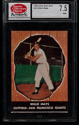 .. " Hires Root Beer " ..
|
|
#21
05-09-2022, 02:09 PM
|
|||
|
|||
|
+1 for the 1952 Bowman. I LOVE this card (here's mine). I also really like the 1956 Topps (although I don't own one...yet). I think 1956 Topps has some of the best images for a LOT of players....the large profile pic with full action background is great (the Jackie Robinson, Clemente, and Mantle all have great looking cards in that set).
No one has mentioned 1951 Bowman in this thread yet. Personally, I think Mays looks too "angry" in that one. Maybe others do too, which is why it doesn't make the list? Mays.JPG
|
|
#22
05-09-2022, 07:20 PM
|
|||
|
|||
|
I've always liked the 1966 Topps Mays.
|
|
#23
05-10-2022, 08:38 AM
|
||||
|
||||
|
Quote:
__________________
Postwar stars & HOF'ers. Cubs of all eras. Currently working on 1956, '63 and '72 Topps complete sets.
|
|
#24
05-10-2022, 11:13 AM
|
||||
|
||||
|
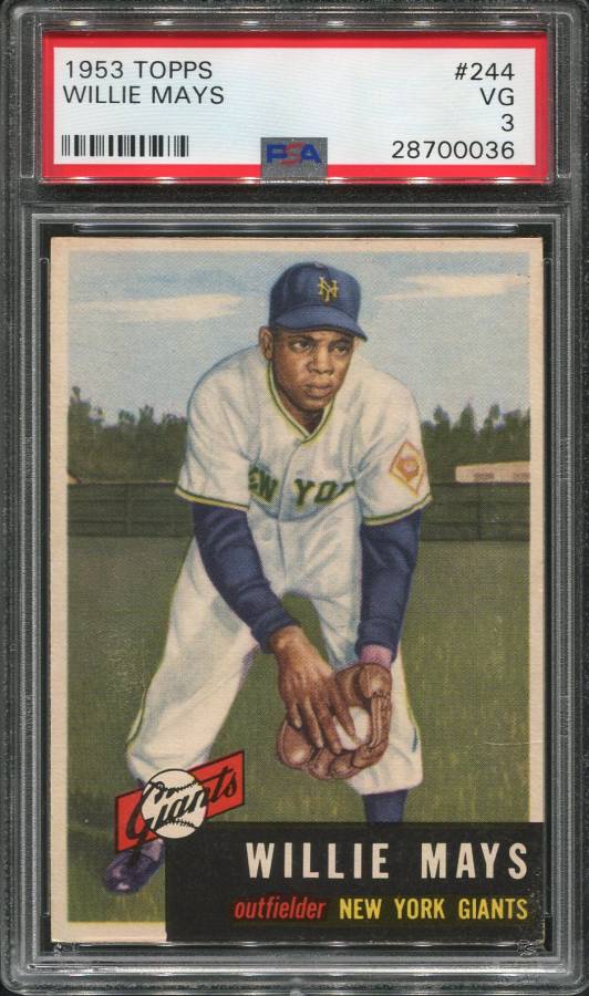
Interesting that no one is bringing up the 1952 and 1953 Topps. For all the money that those cards command, you'd think they'd have some more support. I see plenty of people saying the 52T Mays should one day approach the 52T Mantle, but the eye appeal just isn't there, in my opinion. The 52T Mantle is an iconic image. In his 52T, Mays just looks annoyed.
__________________
198/240 1933 Goudeys (Ruth #144, #149, Gehrig #92) 136/208 T205s 47/108? Diamond Stars
|
|
#26
05-10-2022, 11:52 AM
|
||||
|
||||
|
Quote:
__________________
Postwar stars & HOF'ers. Cubs of all eras. Currently working on 1956, '63 and '72 Topps complete sets.
|
|
#27
05-10-2022, 12:34 PM
|
||||
|
||||
|
The image of the 52T Mantle seems intended to make him look heroic. It's as if Leni Riefenstahl had designed a baseball card.
__________________
198/240 1933 Goudeys (Ruth #144, #149, Gehrig #92) 136/208 T205s 47/108? Diamond Stars
|
|
#28
05-10-2022, 12:39 PM
|
||||
|
||||
|
Quote:
I think it's that way because we long ago equated it to heroic in our minds. Don't disagree with you on the end result.
__________________
Postwar stars & HOF'ers. Cubs of all eras. Currently working on 1956, '63 and '72 Topps complete sets.
|
|
#29
05-10-2022, 05:05 PM
|
||||
|
||||
|
Quote:
There is no better looking Mays card than this one. The orange background makes the image of Mays really pop!
__________________
Seeking very scarce/rare cards for my Sam Rice master collection, e.g., E210 York Caramel Type 2 (upgrade), 1931 W502, W504 (upgrade), W572 sepia, W573, 1922 Haffner's Bread, 1922 Keating Candy, 1922 Witmor Candy Type 2 (vertical back), 1926 Sports Co. of Am. with ad & blank backs. Also 1917 Merchants Bakery & Weil Baking cards of WaJo. Also E222 A.W.H. Caramel cards of Revelle & Ryan.
|
|
#30
05-11-2022, 06:51 AM
|
||||
|
||||
Last edited by bobsbbcards; 05-11-2022 at 06:52 AM.
|
|
#31
05-11-2022, 06:57 PM
|
||||
|
||||
|
This cards artwork is based on the fundamentals of fine art painting and in my opinion not only the finest Mays card but one of the best looking baseball cards ever produced.
_ Last edited by Casey2296; 05-11-2022 at 07:31 PM.
|
|
#33
05-11-2022, 07:15 PM
|
||||
|
||||
|
Though already posted, I'll throw in my votes for the following:
1955 Bowman - get past the TV and that is a great image 1964 Giants - great colors and pose 1966 - my first 'big' card from the '60s, first card in the set and the first year I was alive. JB67 - that is probably the nicest '57 Mays I've seen. Not many with registration that good and the total lack of 'noise' on the photo. Amazingly sharp for a '57.
__________________
Working Sets: Baseball- T206 SLers - Virginia League (-1) 1952 Topps - low numbers (-1) 1953 Topps (-54) 1954 Bowman (-2) 1964 Topps Giants auto'd (-2) Last edited by Bigdaddy; 05-11-2022 at 07:18 PM.
|
|
#34
05-11-2022, 09:03 PM
|
||||
|
||||
|
They should've given all of his cards the 'standing in the backyard in front of the laundry near the green barn' treatment...
51Bmaysbackground1972.jpg
__________________
All the cool kids love my YouTube Channel:
Elm's Adventures in Cardboard Land https://www.youtube.com/@TheJollyElm Looking to trade? Here's my bucket: https://www.flickr.com/photos/152396...57685904801706 I was such a dangerous hitter I even got intentional walks during batting practice. Casey Stengel Spelling "Yastrzemski" correctly without needing to look it up since the 1980s. Overpaying yesterday is simply underpaying tomorrow.
|
|
#35
05-11-2022, 09:27 PM
|
||||
|
||||
|
Very nice Jolly.
|
|
#36
05-12-2022, 12:08 PM
|
|||
|
|||
|
Nice edit work on the 72T Darren!
Here is Mays 1970 Kellogg's #12.
|
|
#37
05-12-2022, 09:28 PM
|
||||
|
||||
|
Quote:
__________________
COLLECTING BROOKLYN DODGERS & SUPERBAS
|
|
#39
05-18-2022, 11:12 AM
|
||||
|
||||
|
Quote:
__________________
B/S/T deals completed with: Peter_Spaeth, iwantitiwinit, Neal, Gobucsmagic74, Jdepue, NYYFan63, incugator, Kris19, becollie, skelly423, Raremintpaper, 4k6, Jhoff122, DoubleJ
|
|
#41
05-18-2022, 06:14 PM
|
|||
|
|||
|
Quote:
|
|
#42
05-18-2022, 09:06 PM
|
||||
|
||||
|
Quote:
__________________
B/S/T deals completed with: Peter_Spaeth, iwantitiwinit, Neal, Gobucsmagic74, Jdepue, NYYFan63, incugator, Kris19, becollie, skelly423, Raremintpaper, 4k6, Jhoff122, DoubleJ
|
|
#44
05-19-2022, 09:52 PM
|
||||
|
||||
|
Quote:
Last edited by Casey2296; 05-19-2022 at 10:31 PM.
|
|
#46
05-20-2022, 05:31 AM
|
|||
|
|||
|
Hey Jolly is it my imagination or does your card seem to use the same background (brown tarp bleachers) as the "51" Bowman Mays ?
__________________
H Murphy Collection https://www.flickr.com/photos/154296763@N05/
|
|
#47
05-20-2022, 05:59 AM
|
||||
|
||||
|
Quote:
But SO many other great ideas in this thread! As the OG of this post, let me say Thanks for all of the great input (although now I am as confused as ever! Too many choices) Jeff
|
 |
|
|
 Similar Threads
|
||||
| Thread | Thread Starter | Forum | Replies | Last Post |
| rare Willie Mays cards | ALBB | Postwar Baseball Cards Forum (Pre-1980) | 35 | 04-06-2022 06:42 PM |
| Buying Willie Mays cards. Psa 8 or better | johnmartines | 1950 to 1959 Baseball cards- B/S/T | 2 | 12-10-2021 06:07 PM |
| Unusual Willie Mays Cards...let's see em'! | ullmandds | Postwar Baseball Cards Forum (Pre-1980) | 24 | 12-03-2021 06:47 PM |
| 2 Willie Mays Cards FS | Enfuego | 1960-1979 Baseball Cards B/S/T | 5 | 05-29-2016 05:42 PM |
| WTB: 1951 Bowman Willie Mays + 1952 Topps Willie Mays | vintagehofrookies | 1950 to 1959 Baseball cards- B/S/T | 13 | 02-07-2015 10:34 AM |


 Linear Mode

