|
||||||
 |
|
|||||
|
||||||
|
|
|||||
|
#1
 10-30-2020, 11:57 AM
|
||||
|
||||
|
From the Great White North:
__________________
Read my blog; it will make all your dreams come true. https://adamstevenwarshaw.substack.com/ Or not... Last edited by Exhibitman; 10-30-2020 at 04:57 PM. 
|
|
#3
10-30-2020, 09:59 PM
|
||||
|
||||
|
These are the only known OPC variations other than card stock, at least through 1985 anyway.
__________________
interesting to some absolute garbage to others. - Error cards and variations are for morons, IMHO. Last edited by Cliff Bowman; 10-30-2020 at 10:22 PM. Reason: Correction
|
|
#4
10-30-2020, 10:15 PM
|
|||
|
|||
|
Quote:
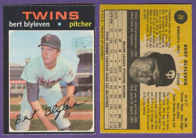
I collect Orioles cards and have two different backs for the 1969 OPC Orioles Rookies card #66. Ptd. in Canada is farther right on the top card and more left on the lower card. Since I only collect the Orioles, I'm not sure if other Rookie Stars cards have the same variation. 1969 OPC #66 Variation.jpg Also, the 1967 OPC Checklist #62, with Frank Robinson has two different backs. The copyright symbol is under the R on one version and the T on the other. I will try and post pictures tomorrow. Last edited by BaltOrioles; 10-30-2020 at 10:24 PM.
|
|
#5
10-30-2020, 10:24 PM
|
||||
|
||||
|
You're right, I forgot about that one.
__________________
interesting to some absolute garbage to others. - Error cards and variations are for morons, IMHO.
|
|
#7
10-31-2020, 03:43 AM
|
||||
|
||||
|
Quote:
|
|
#8
10-31-2020, 07:48 AM
|
|||
|
|||
|
Quote:
1967 OPC Variations.jpg
|
|
#9
10-31-2020, 10:03 AM
|
||||
|
||||
|
Quote:
__________________
Working Sets: Baseball- T206 SLers - Virginia League (-1) 1952 Topps - low numbers (-1) 1953 Topps (-54) 1954 Bowman (-2) 1964 Topps Giants auto'd (-2)
|
|
#10
10-31-2020, 11:51 AM
|
||||
|
||||
|
Always loved the OPC cards as a kid - grew up close enough to Canada to pick some up whenever we crossed the border. The gum was much better than Topps. I have a bunch of wrappers I have had since 78 or 79 and I came across them a few years ago - I could still smell the gum and it was like being instantly transported back 40 years!
The 1971 backs are night and day better than the gray, green, black and white mess of the backs of the Topps counterparts. Thanks for the scans - lots of great memories!
|
|
#12
10-31-2020, 12:05 PM
|
||||
|
||||
|
Beautiful Clemente's, Howard.
A few of my others:  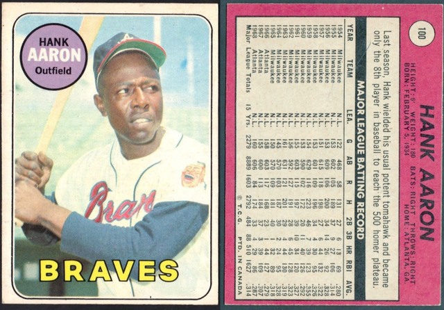 
__________________
Read my blog; it will make all your dreams come true. https://adamstevenwarshaw.substack.com/ Or not...
|
|
#15
11-01-2020, 09:49 AM
|
||||
|
||||
|
The Wizard!!!
__________________
My collection can be viewed at http://imageevent.com/jeffintoronto Always looking for interesting pre-war baseball & hockey postcards!
|
|
#16
11-01-2020, 09:33 PM
|
||||
|
||||
|
Is 1971 the first year OPC included the updated team on card fronts?
__________________
Thanks, Jason Collecting interests and want lists at https://jasoncards.wordpress.com/201...nd-want-lists/
|
|
#17
11-01-2020, 09:37 PM
|
||||
|
||||
 Highlight of my modest OPC collection is the full set of Hank Aaron specials, including the OPC-only versions of 3-8.
__________________
Thanks, Jason Collecting interests and want lists at https://jasoncards.wordpress.com/201...nd-want-lists/
|
|
#18
11-01-2020, 09:51 PM
|
||||
|
||||
|
Those are great, Jason. Not easy in good shape and centered.
__________________
Read my blog; it will make all your dreams come true. https://adamstevenwarshaw.substack.com/ Or not...
|
|
#19
11-02-2020, 05:08 AM
|
|||
|
|||
|
Here are a couple of my favorites.
|
|
#20
11-02-2020, 07:36 AM
|
||||
|
||||
|
Not everyone likes rough cuts, but I dig them.
 Sent from my iPhone using Tapatalk
__________________
Postwar stars & HOF'ers. Cubs of all eras. Currently working on 1956, '63 and '72 Topps complete sets. Last edited by jchcollins; 11-02-2020 at 07:36 AM.
|
|
#21
11-02-2020, 08:08 AM
|
|||
|
|||
|
I love the OPC cards. Growing up in Maine, we sometimes traveled over to Canada. I picked up a few cards as a kid, but at first I didn't realize there was a difference. Centering has always seemed to be an issue the the OPC sets.
1966 OPC Orioles team set with Jim Palmer rookie. I wish that OPC had included Brooks and Frank Robinson in the set. 1966 O-Pee-Chee #1.jpg 1966 O-Pee-Chee #2 - Copy.JPG 1966 OPC Jim Palmer SCAN9680.jpg SCAN9679.jpg
|
|
#22
11-02-2020, 10:38 AM
|
||||
|
||||
|
I love the rough cuts; that's how you know it is an OPC. Well, that plus crappy centering on nearly every card. Which makes it so fun when you find some clean, sharp, centered cards, even commons.
Meanwhile, a few more:   
__________________
Read my blog; it will make all your dreams come true. https://adamstevenwarshaw.substack.com/ Or not...
|
|
#23
11-02-2020, 10:52 AM
|
||||
|
||||
|
Quote:

__________________
Eric Perry Currently collecting: T206 (136/524) 1956 Topps Baseball (198/342) "You can observe a lot by just watching." - Yogi Berra
|
|
#24
11-02-2020, 07:36 PM
|
||||
|
||||
|
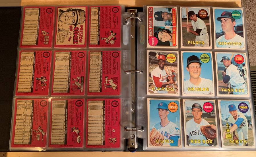
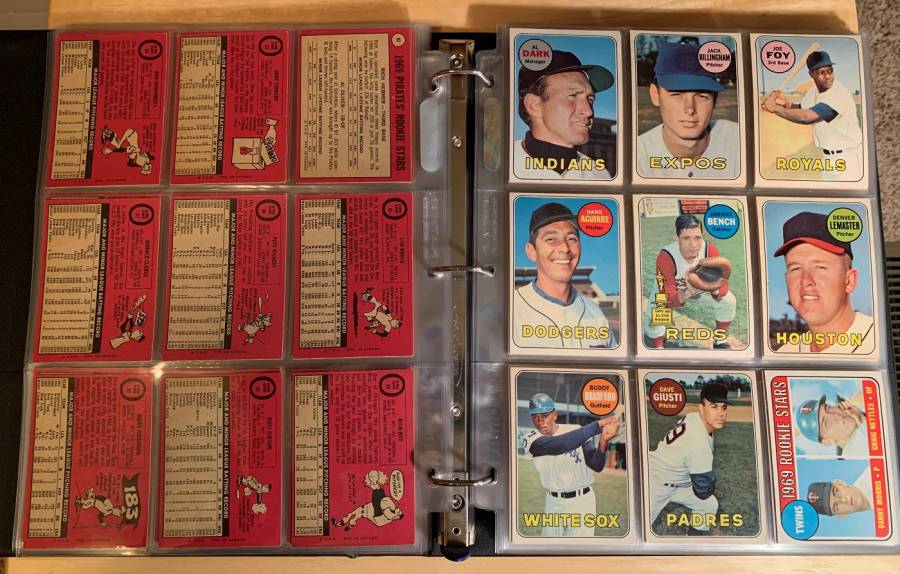
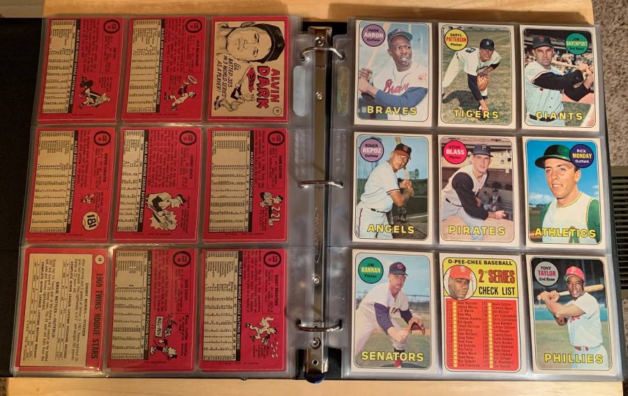
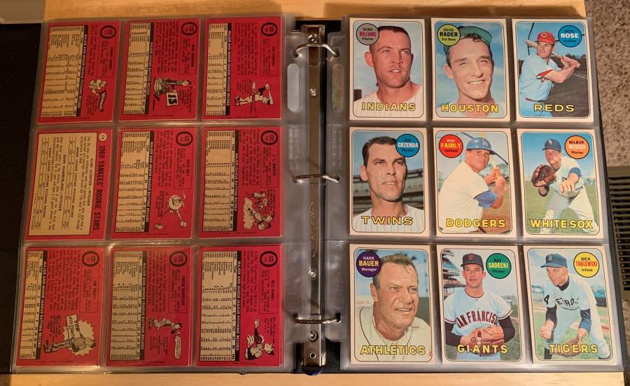
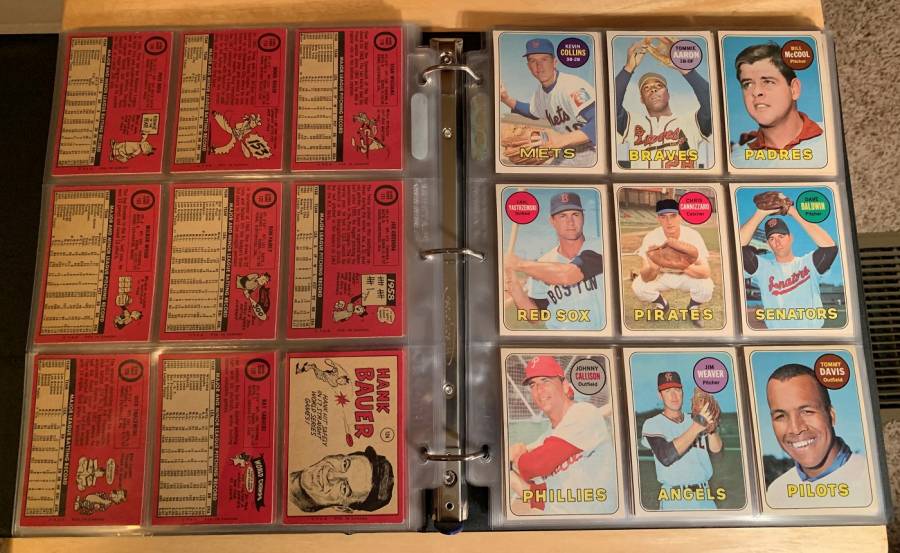
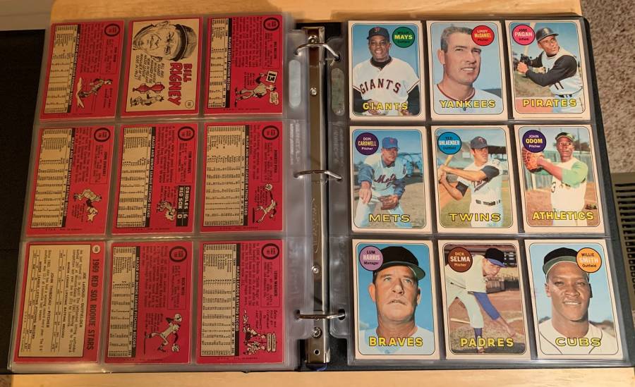
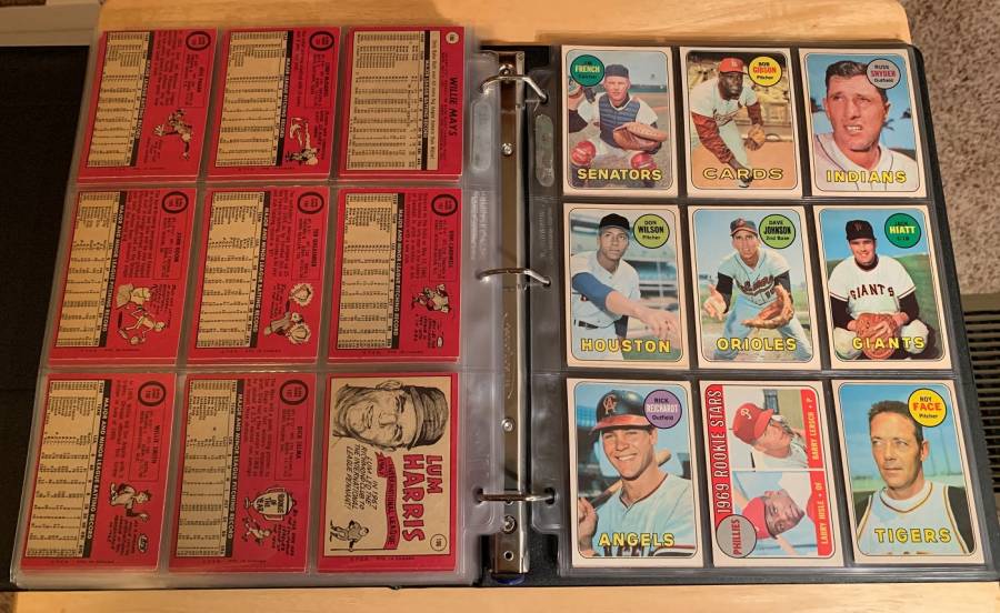
Here's a few pictures of my complete 1969 OPC set in the binder. I love the magenta backs on these!
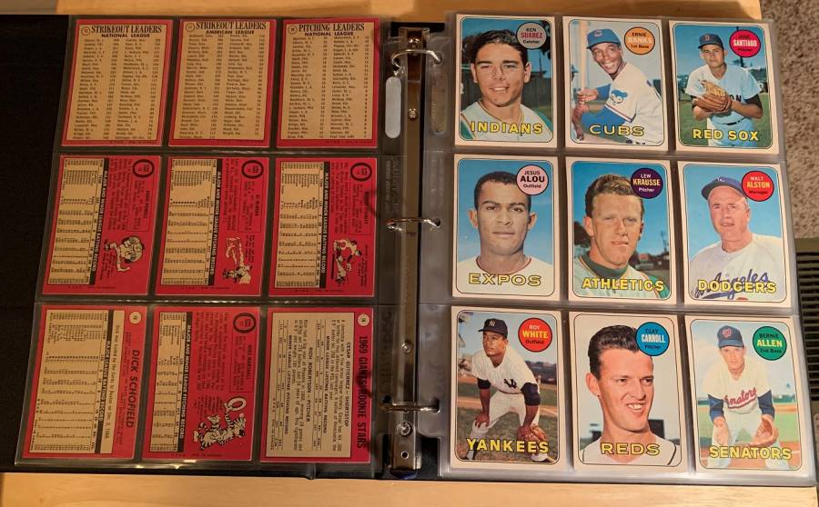 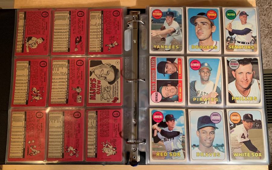       
__________________
Current projects: White Sox prewar type set White Sox T206 Master set 1952 Topps set
|
|
#26
11-02-2020, 08:36 PM
|
||||
|
||||
|
Is there any premium between with these OPC cards like there is with OPC VS Topps hockey cards? I believe I have a few OPC baseball cards somewhere but I'd have to hunt for them.
__________________
52 Topps cards. https://www.flickr.com/photos/144160280@N05/ http://www.net54baseball.com/album.php?albumid=922
|
|
#27
11-03-2020, 12:11 PM
|
||||
|
||||
|
Not much, as far as I can tell. I bought a collection of OPC cards once and was surprised by how little they are worth. The average card costs more but not by a ton. So few people collect OPC relative to Topps, I guess. I got into them because of my player collections and my love of all things 1971 Topps (OPC has much nicer backs and stock IMO). I try to pick up nice HOFer examples on the cheap when I see them at the National or on eBay.
__________________
Read my blog; it will make all your dreams come true. https://adamstevenwarshaw.substack.com/ Or not...
|
|
#28
11-03-2020, 03:02 PM
|
||||
|
||||
|
My favorite year is 1974 with the yellow backs. When I collected the 1965 through 1985 OPC Cubs team sets the most difficult to find were the 74's, followed by the 65 high numbers. The last card I needed in the whole run was a 74 Dave Rosello four player rookie card.
__________________
interesting to some absolute garbage to others. - Error cards and variations are for morons, IMHO.
|
|
#29
11-03-2020, 05:04 PM
|
||||
|
||||
|
Quote:
Were these sold stateside as well or mainly/only in Canada?
__________________
52 Topps cards. https://www.flickr.com/photos/144160280@N05/ http://www.net54baseball.com/album.php?albumid=922
|
|
#30
11-03-2020, 06:59 PM
|
||||
|
||||
|
Quote:
|
|
#31
11-03-2020, 07:09 PM
|
||||
|
||||
|
__________________
All the cool kids love my YouTube Channel:
Elm's Adventures in Cardboard Land  https://www.youtube.com/@TheJollyElm Looking to trade? Here's my bucket: https://www.flickr.com/photos/152396...57685904801706 I was such a dangerous hitter I even got intentional walks during batting practice. Casey Stengel Spelling "Yastrzemski" correctly without needing to look it up since the 1980s. Overpaying yesterday is simply underpaying tomorrow. 
|
|
#32
11-03-2020, 07:22 PM
|
|||
|
|||
|
I know Pete gets no love, but I was thrilled to pull this from a pack in 1965.....and for OPC, great centering. Still one of my fave cards!
__________________
Successful deals with dkbobasa, Mintacular, Hangman, Donscards, Bocabirdman, Goferboy00, Digdugdig, jimivintage, baseballart, jimmysuitcase, 39special, smokeyburgess, scooter, shorttmail66, KCDoughboy, Andrew1975, t206fix, Eggoman, others. Member of OBC. www.oldbaseball.com
|
|
#34
11-04-2020, 07:45 AM
|
||||
|
||||
|
Doesn't it seem like Topps purposely made the USA card backs unreadable in the 1970s? From 1971-1980 I can't think of a single year where the OPC card back wasn't easier to read than the USA card back. In 71 and 74 especially so.
__________________
Read my blog; it will make all your dreams come true. https://adamstevenwarshaw.substack.com/ Or not...
|
 |
|
|


 Linear Mode

