|
||||||
 |
|
|||||
|
||||||
|
|
|||||
|
#1
 02-10-2020, 06:39 PM
|
|||
|
|||
|
I am new to the community and I would like to thanks for accepting me. I would like to start a fun thread featuring some of the worst photos of ball players. I have a few favorites I would like to submit. Caption's are always welcomed! reggie jackson.jpg

|
|
#2
02-10-2020, 06:43 PM
|
|||
|
|||
|
This is about the worst picture of Reggie Jackson I have ever seen. Does Topps actually show the players their image before it gets printed? I'm sure Mr. October really hates this one. Which is sad because all the other A's cards of Reggie are some of my favorites. Look at his face, he looks like he is 80 year old!
Last edited by LarsenMN; 02-10-2020 at 06:43 PM.
|
|
#3
02-10-2020, 07:52 PM
|
||||
|
||||
|
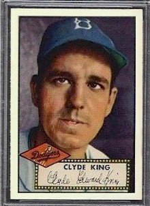
1973 was the first year I collected cards but as a nine year old I loved the Jackson photo. It was always better than those posed shots they used and this photo literally showed motion to my nine year old mind and could just imagine Reggie throwing someone out at the plate.
|
|
#5
02-10-2020, 08:04 PM
|
||||
|
||||
|
__________________
-- PWCC: The Fish Stinks From the Head PSA: Regularly Get Cheated BGS: Can't detect trimming on modern SGC: Closed auto authentication business JSA: Approved same T206 Autos before SGC Oh, what a difference a year makes.
|
|
#6
02-10-2020, 08:20 PM
|
||||
|
||||
|
Brooks brother from a half a century or so earlier. Egan wasn't the most attractive of baseball fellas, but the photographer for this D381 should have tried to make things better, not worse. For comparison I added a photo that presents him in a much nicer light.
Brian Last edited by brianp-beme; 02-10-2020 at 08:29 PM. Reason: added much nicer photo
|
|
#7
02-10-2020, 08:37 PM
|
|||
|
|||
|
In a set that has very few good photos, Paul Derringer's photo stands above the rest.
http://bbcard1.com/double/?p=100
__________________
Get my new book Baseball Cards at the Edge of War, 1941: The Games, The Gum and The Glory Last edited by bbcard1; 02-10-2020 at 08:41 PM.
|
|
#8
02-10-2020, 09:03 PM
|
||||
|
||||
|
"Oyster Joe" Martina looks much nicer on his T210-1 card than he does on his 1924 Diaz card. Martina's only year in the Majors was with the 1924 WS Champion Senators.
__________________
Seeking very scarce/rare cards for my Sam Rice master collection, e.g., E210 York Caramel Type 2 (upgrade), 1931 W502, W504 (upgrade), W572 sepia, W573, 1922 Haffner's Bread, 1922 Keating Candy, 1922 Witmor Candy Type 2 (vertical back), 1926 Sports Co. of Am. with ad & blank backs. Also 1917 Merchants Bakery & Weil Baking cards of WaJo. Also E222 A.W.H. Caramel cards of Revelle & Ryan.
|
|
#9
02-10-2020, 09:05 PM
|
||||
|
||||
|
Japan has some weird ones.
This is Hideji Kato's card from the 1975-76 Calbee set with the top half of his head cut off. This card is not miscut or anything, its actually perfectly centred. They just had a picture where you can't even see half his head and for some reason went with it.
__________________
My blog about collecting cards in Japan: https://baseballcardsinjapan.blogspot.jp/
|
|
#11
02-10-2020, 09:38 PM
|
||||
|
||||
|
One of the worst photos for a baseball card and yet one of my favorite cards at the same time.
.
__________________
I'm always looking for t206's with purple numbers stamped on the back like the one in my avatar. The Great T206 Back Stamp Project: Click Here My Online Trading Site: Click Here Member of OBC (Old Baseball Cards), the longest running on-line collecting club www.oldbaseball.com My Humble (Outdated) Blog: Click Here
|
|
#12
02-10-2020, 09:46 PM
|
||||
|
||||
|
I always thought that 1973 Jackson was actually a photo of Fred Sanford, from Sanford and Son. I just figured Fred had a junkyard softball team, with Lamont, Bubba, Grady, and Rollo...and somehow the photos got mixed up.
Quote:
Last edited by HercDriver; 02-10-2020 at 09:46 PM.
|
|
#13
02-10-2020, 10:40 PM
|
||||
|
||||
|
Quote:
__________________
BZT
|
|
#14
02-10-2020, 11:22 PM
|
||||
|
||||
|
Quote:

__________________
Just a dad trying to figure out how to build a collection his kids will take interest in. Interests: HoF, Grover Hartley, Cleveland, Jim Thome, Jose Ramirez, Akron Zips, Historically Significant Figures Cooperstown Project Progress: 194/351 - 55.27% Follow along and see what I need here. YouTube Channel: Collecting America's Pastime
|
|
#17
02-11-2020, 12:04 AM
|
||||
|
||||
|
Notice how the photo of Bill Gullickson on this card looks kind of grainy, almost as if it was taken by someone just pointing a camera at a game being played on a 1980s TV set?
That is because the photo on this card was actually taken that way. For their 1988 set Calbee didn't have photos of some players and their last minute solution was to just take pictures of a TV during live broadcasts of games and use them. There are a few dozen cards like that in the set. Japanese card sets of the 70s and 80s are almost unbeatable for bizarre photography.
__________________
My blog about collecting cards in Japan: https://baseballcardsinjapan.blogspot.jp/
|
|
#18
02-11-2020, 04:47 AM
|
||||
|
||||
|
I wonder what pre-war set has the most action photos?
This Vintage card photo's funny. The photo's quality is not very good though. What you don't see here are the players on either side swinging a jump rope. This was a spring training exercise often used by Cardinals in the 30's. lf.jpg Last edited by SAllen2556; 02-11-2020 at 04:55 AM.
|
|
#19
02-11-2020, 07:00 AM
|
||||
|
||||
|
One of the goofiest cards i have ever seen
|
|
#21
02-11-2020, 10:29 AM
|
||||
|
||||
|
This Jack Morris is one of my favorites.
257E1AE5-FC8C-48CD-9EE4-49D7F40FA25B.jpg
|
|
#22
02-11-2020, 11:09 AM
|
|||
|
|||
|
Quote:
|
|
#23
02-11-2020, 11:25 AM
|
||||
|
||||
|
The 1970s are a great time period to find bad photos. Catcher Pat Corrales has two consecutive cards where he can't even get upright.
|
|
#24
02-11-2020, 11:55 AM
|
|||
|
|||
|
He was screwing with the photographer, right? Had to be.
__________________
Check out https://www.thecollectorconnection.com Always looking for consignments 717.327.8915 We sell your less expensive pre-war cards individually instead of in bulk lots to make YOU the most money possible! and Facebook: https://www.facebook.com/thecollectorconnectionauctions
|
|
#25
02-11-2020, 01:57 PM
|
|||
|
|||
|
Quote:
Let's not forget about the 1970 Topps Gene BRABENDER.... The name is probably worse then the photo. Typical look of a guy who drives a window less cargo van.
|
|
#28
02-11-2020, 08:29 PM
|
||||
|
||||
|
__________________
All the cool kids love my YouTube Channel:
Elm's Adventures in Cardboard Land  https://www.youtube.com/@TheJollyElm Looking to trade? Here's my bucket: https://www.flickr.com/photos/152396...57685904801706 I was such a dangerous hitter I even got intentional walks during batting practice. Casey Stengel Spelling "Yastrzemski" correctly without needing to look it up since the 1980s. Overpaying yesterday is simply underpaying tomorrow. 
|
|
#30
02-11-2020, 09:19 PM
|
||||
|
||||
|
Quote:
Jackie Robinsons Leaf RC is another one with a horrible facial expression. I could never pull the trigger on one bc I cant stand looking at it.
__________________
Items for sale or trade here UPDATED 3-16-18
|
|
#31
02-11-2020, 10:11 PM
|
||||
|
||||
|
Quote:
Brian
|
|
#32
02-11-2020, 11:58 PM
|
||||
|
||||
|
I know, not a photo, but this always makes me laugh. Henry Melchoir prancing, tiptoeing...
__________________
Tim
|
|
#33
02-12-2020, 08:43 AM
|
||||
|
||||
|
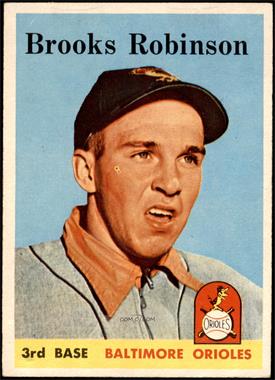
I would concur the 58 Brooks Robinson takes the cake. But the 73 Johnny Bench is another - I think its great, but Johnnys face is not on it - his back is totally turned, about to catch a foul pop in front of the SF dugout. Ive heard rumor that Bench himself hates this card, and refuses to sign it at shows.
 Sent from my iPad using Tapatalk
__________________
Postwar stars & HOF'ers. Cubs of all eras. Currently working on 1956, '63 and '72 Topps complete sets.
|
|
#34
02-12-2020, 08:59 AM
|
|||
|
|||
|
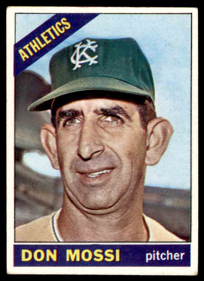
Any of those lousy Topps airbrush jobs.
|
|
#36
02-12-2020, 09:19 AM
|
||||
|
||||
|
I personally don't think this one quite qualifies as that's actually a pretty good representation of what he looks like. haha.
Quote:
__________________
~20 SUCCESSFUL BST (1 trade) on Net54
|
|
#38
02-12-2020, 09:45 AM
|
|||
|
|||
|
Quote:
__________________
Check out https://www.thecollectorconnection.com Always looking for consignments 717.327.8915 We sell your less expensive pre-war cards individually instead of in bulk lots to make YOU the most money possible! and Facebook: https://www.facebook.com/thecollectorconnectionauctions
|
|
#39
02-12-2020, 09:46 AM
|
|||
|
|||
|
Quote:
__________________
Check out https://www.thecollectorconnection.com Always looking for consignments 717.327.8915 We sell your less expensive pre-war cards individually instead of in bulk lots to make YOU the most money possible! and Facebook: https://www.facebook.com/thecollectorconnectionauctions
|
|
#40
02-12-2020, 09:58 AM
|
||||
|
||||
|
Quote:
__________________
... http://imageevent.com/derekgranger Working on the following: HOF "Earliest" Collection (Ideal - Indiv): 250/346 (72.3%) 1914 T330-2 Piedmont Art Stamps......: 116/119 (97.5%) Completed: 1911 T332 Helmar Stamps (180/180) 1923 V100 Willard's Chocolate (180/180)
|
|
#41
02-12-2020, 10:02 AM
|
||||
|
||||
|
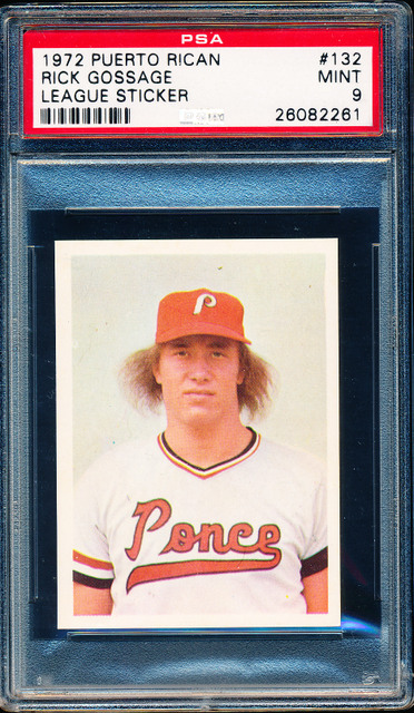
I always think of this "rookie" mugshot of Goose Gossage:
__________________
... http://imageevent.com/derekgranger Working on the following: HOF "Earliest" Collection (Ideal - Indiv): 250/346 (72.3%) 1914 T330-2 Piedmont Art Stamps......: 116/119 (97.5%) Completed: 1911 T332 Helmar Stamps (180/180) 1923 V100 Willard's Chocolate (180/180)
|
|
#43
02-12-2020, 03:37 PM
|
||||
|
||||
|
what was Topps doing for their 1973 set? There's a lot of garbage photos in that set. I always wondered why I never bothered to pursue the set (or any card in it)....I'm starting to see why.
__________________
... http://imageevent.com/derekgranger Working on the following: HOF "Earliest" Collection (Ideal - Indiv): 250/346 (72.3%) 1914 T330-2 Piedmont Art Stamps......: 116/119 (97.5%) Completed: 1911 T332 Helmar Stamps (180/180) 1923 V100 Willard's Chocolate (180/180)
|
|
#44
02-12-2020, 04:10 PM
|
|||
|
|||
|
Quote:
Last edited by Paul S; 02-12-2020 at 04:17 PM.
|
|
#46
02-15-2020, 10:15 PM
|
||||
|
||||
|
If we're taking about cards where you can't see the player's face, Topps doesn't do any better today. Case in point: this 2019 Topps Now card of Pete Alonso (#32). You can't see his face, and the parts of the uniform number that are showing could be any number.
 Unlike most cards, Topps Now are designed and printed the day after the event, so it's not like they have the luxury of waiting until the best photo comes along. But even when you take that into account, was this really the best photo they could get before their deadline?
__________________
The GIF of me making the gesture seen 'round the world has been viewed over 444 million times!  If only I had one cent-- make it half a cent-- for each view... 😭
|
|
#47
02-16-2020, 08:39 AM
|
|||
|
|||
|
Plus the black border backs are hideous. The 73 Topps is known for action shots rather then the typical posed photo. I hate the 1961 Topps set too. Why the hell would you have players take head shot photo's without the teams ball cap. Worse Willie Mays card ever.
|
|
#49
02-19-2020, 07:38 AM
|
||||
|
||||
|
You would think with today's technology they could do better.
and while not a photo I always like the pic of this guy crawling to base.  Quote:
__________________
Leon Luckey www.luckeycards.com
|
 |
|
|
 Similar Threads
|
||||
| Thread | Thread Starter | Forum | Replies | Last Post |
| Vintage Dizzy Dean photo card | GrayGhost | Baseball Memorabilia B/S/T | 1 | 04-29-2018 04:51 PM |
| How to best remove pasted on photo from a vintage card | polakoff | Net54baseball Vintage (WWII & Older) Baseball Cards & New Member Introductions | 5 | 11-04-2015 01:30 PM |
| vintage photo (or large card) storage - binders? | Archive | Net54baseball Vintage (WWII & Older) Baseball Cards & New Member Introductions | 0 | 05-05-2007 01:47 PM |
| Worst placed stain on a vintage card | Archive | Net54baseball Vintage (WWII & Older) Baseball Cards & New Member Introductions | 2 | 04-04-2004 11:14 PM |
| Odd Vintage Shoeless Joe Jackson Card/Photo | Archive | Net54baseball Vintage (WWII & Older) Baseball Cards & New Member Introductions | 6 | 12-05-2002 06:33 PM |


 Linear Mode

