|
||||||
 |
|
|||||
|
||||||
|
|
|||||
|
#1
 05-26-2013, 07:38 PM
|
|||
|
|||
|
Hi-
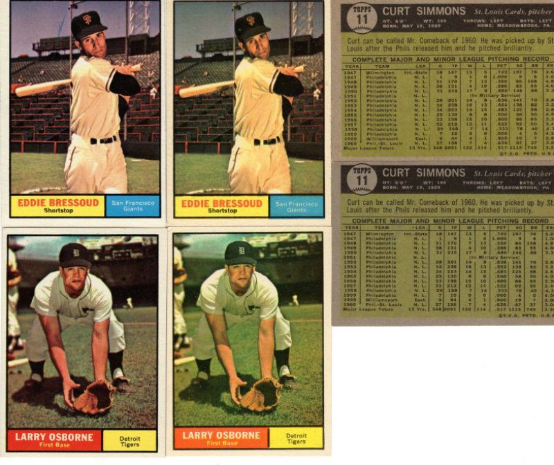
I am not sure how to accurately phrase the title, but I was wondering if the same 1961 Topps series had multiple printings? For example, below are scans of two cards of Carl Sawatski. One shows his 5 o'clock shadow as much more pronounced than the other. Below that is a scan of three Ray Rippelmeyer cards. Each one looks a little different to me based on the darkness of the background color. Is this type of thing common in most Topps sets? I assume there are more out there. Were these caused by multiple printings? I did not find these two listed on any variation list for 61 Topps, but I am guessing it is because of how minor the differences are. Thanks, Alan Elefson aelefson@hotmail.com 
|
|
#2
05-26-2013, 08:11 PM
|
|||
|
|||
|
Good catch on the noticeable differences in these two cards. I think color differences like these occur in most sets and may just be differences in ink levels on different runs...unlike the 62 greenies where two different printing companies were involved
Most differences in cards that are the result of unintentional printing differences are not listed as variations. Definitions of what should constitute a true variation versus a print defect or variance cab vary by individual. For me, variations are intended card differences, such as the 59 Spahn DOB differences or the 59 tread/option or not cards. But some famous and recognized variations like the 57 Bakep, the 58 Herrer and 52 Campos black star, would not fit my definition. And recently PSA's recognition of the 61 Fairly green smudge in the baseball on the back as a variation means even a minor print defect can still qualify as a hobby variation if it gets some official recognition by a recognized authority. But all that is just my personal view
|
|
#3
05-26-2013, 08:28 PM
|
|||
|
|||
|
Good catch on the noticeable differences in these two cards. I think color differences like these occur in most sets and may just be differences in ink levels on different runs...unlike the 62 greenies where two different printing companies were involved
Most differences in cards that are the result of unintentional printing differences are not listed as variations. Definitions of what should constitute a true variation versus a print defect or variance cab vary by individual. For me, variations are intended card differences, such as the 59 Spahn DOB differences or the 59 tread/option or not cards. But some famous and recognized variations like the 57 Bakep, the 58 Herrer and 52 Campos black star, would not fit my definition. And recently PSA's recognition of the 61 Fairly green smudge in the baseball on the back as a variation means even a minor print defect can still qualify as a hobby variation if it gets some official recognition by a recognized authority. But all that is just my personal view and I collect all types of variants/errors/variations/print defects Last edited by ALR-bishop; 05-26-2013 at 08:30 PM.
|
|
#4
05-27-2013, 10:06 AM
|
|||
|
|||
|
I think there were different runs.
The inks are usually mixed as needed so the colors can vary. The question is what caused a difference. The top two cards seem to have a different level of black ink, The darkeness of the hat shows it a bit better. I've seen a lot of that, some black ink used was more opaque that others, or it was applied thicker. The varying colors where blue or red are involved, especially purple or darker blues usually comes down to one of three things. Lightly printed colors or not. A slight shift in registration. Or the odd one, many darker blues look like the blue was printed twice, and slightly off register. It can happen when an adjustment is made, but shouldn't be as common as it is. So I'm thinking it might be something that happened when the plate was made. I should try to make scans of some of those. It's interesting just how much they affect the color. Steve B
|
|
#5
05-27-2013, 10:15 AM
|
|||
|
|||
|
Thanks Steve and Al! Al, I agree with what you wrote concerning what should/should not be a true variation. Steve, I would love to see some scans of what you are describing as it is always interesting to learn about the printing process of these cards.
Thanks again, Alan
|
|
#6
05-27-2013, 11:26 AM
|
|||
|
|||
|
When working on this set in 1984, I bought lots and saved the best. I too, noticed the color differences and saved the sharper images. Since the checklists have big variation (Louis, Luis), I would have to think there were different print runs in the same series. Being in manufacturing and printing on plastic bags, there is a marked difference from what I see at 8AM and what happens at 3AM.
1961 is the first set as old or older than me I finished. Therefor I am Tomman1961.
|
|
#7
05-27-2013, 02:15 PM
|
|||
|
|||
|
|
#8
05-27-2013, 02:36 PM
|
|||
|
|||
|
Irregularities I have
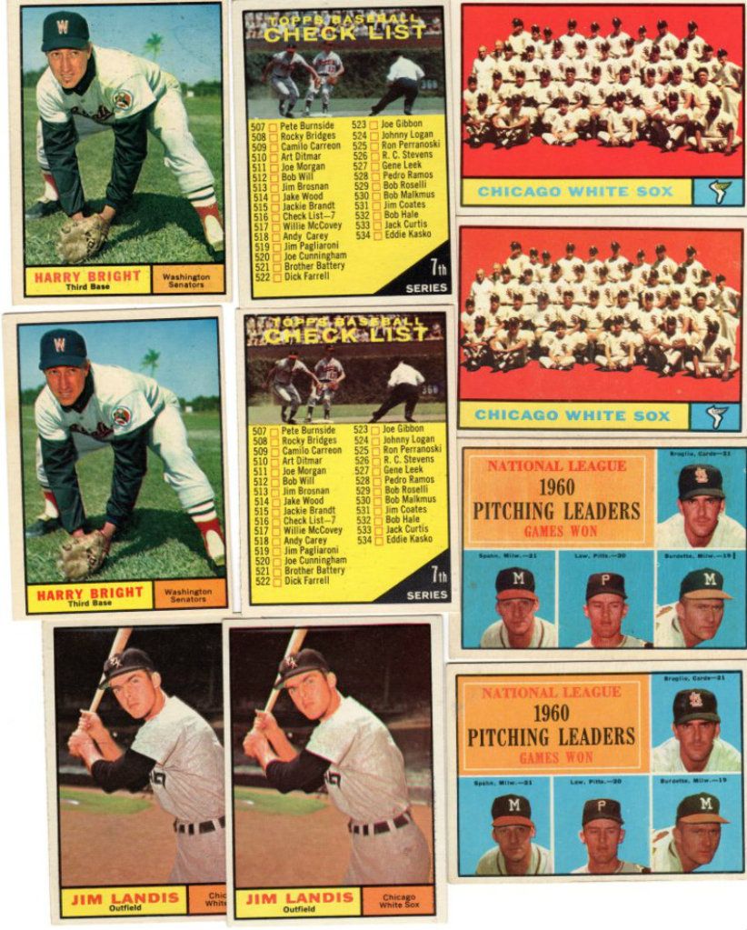
#7--White Sox wing white or yellow # 11 Simmons -with or without broken stat box on back #17--names even with CL boxes or not #47--bar or not in Burdette # 62 Pilarcik--yellow, blue or normal grandstand above bar # 98 --3 different CLs #189--Number 4 shows on fielder to left or not # 203 Bressoud--with or without blue streak by cap # 209 Osborne--black border between name and tean whole or broken #249--Reds--irregular border above logo on front or not # 256 Hoeft---broken upper left front border or not # 271 Landis---bat crosses border or not # 273 CL---copyright in different locations # 361--CLs--different on front and back # 437 CL---Luis and Louis # 447 -Bright--with or without arc above his butt # 492---Fairly---and many others, with or without green smudges ov varying degrees on back # 515--CL--grass under ump's feet or not I think most CLs in the 60s were double printed on a single sheet and thus almost all have some difference or another
|
 |
|
|
 Similar Threads
|
||||
| Thread | Thread Starter | Forum | Replies | Last Post |
| 1961 Post Cereal /w Variations, 1962/63 Jello, 1961 Coke Ball of Fame, 1960 Leaf | Sean1125 | 1950 to 1959 Baseball cards- B/S/T | 1 | 12-30-2012 06:50 PM |
| OPC vs Topps variations in the 60s | Gamebits | Postwar Baseball Cards Forum (Pre-1980) | 4 | 05-16-2012 06:24 AM |
| 1961 Topps errors/variations | kzgnc6 | Postwar Baseball Cards Forum (Pre-1980) | 6 | 02-19-2010 08:07 PM |
| 1961 Topps Errors/Variations | kzgnc6 | Postwar Baseball Cards Forum (Pre-1980) | 1 | 02-18-2010 09:07 PM |
| 1961 Topps Billy Martin PSA 8 & 1961 Topps Brooks Robinson PSA 7 | aaroncc | 1950 to 1959 Baseball cards- B/S/T | 2 | 08-01-2009 08:33 PM |


 Linear Mode

