|
||||||
 |
|
|||||
|
||||||
|
|
|||||
|
#1
 10-25-2020, 04:35 PM
|
||||
|
||||
|
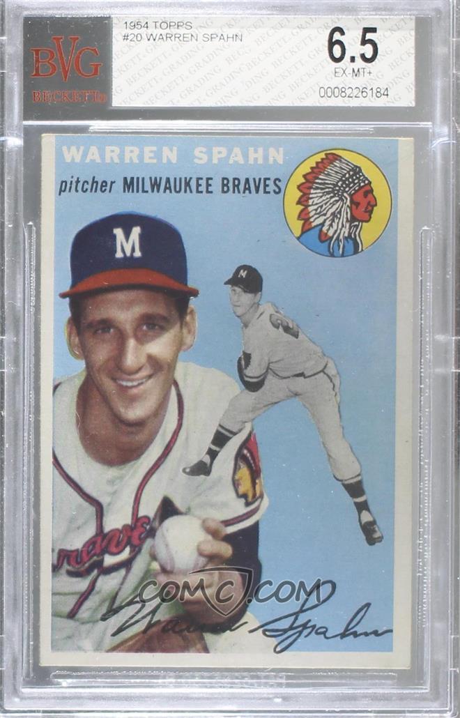
Does anyone have an example of what's considered perfect centering on a 1953 Topps Card? I've seen some of the PSA 9s where the team name is close to the cut at the bottom. My confusion arises with the width below the team name matching the white top border.
*Edit* I updated the thread title since I actually meant 1953 but had mistakenly listed 1954. Too many stats in my head today, thanks all who contributed on 54 and anyone who may contribute on 53.
__________________
BZT Last edited by Santo10Fan; 10-25-2020 at 04:58 PM. Reason: I'm stupid 
|
|
#2
10-25-2020, 04:40 PM
|
|||
|
|||
|
Quote:
__________________
Get my new book Baseball Cards at the Edge of War, 1941: The Games, The Gum and The Glory
|
|
#3
10-25-2020, 04:50 PM
|
||||
|
||||
|
Both side borders should be even with the bottom border. This one is pretty close, save the 45/55 left-right centering.
 And this is the pre-war board. I know it gets a lot of 1948/49 Leaf and Bond Bread threads, but Topps should definitely be in the Post-War side.
__________________
-- PWCC: The Fish Stinks From the Head PSA: Regularly Get Cheated BGS: Can't detect trimming on modern SGC: Closed auto authentication business JSA: Approved same T206 Autos before SGC Oh, what a difference a year makes.
|
|
#5
10-25-2020, 04:55 PM
|
||||
|
||||
|
Quote:
Thanks, BZT
__________________
BZT
|
|
#6
10-25-2020, 05:04 PM
|
||||
|
||||
|
This is close to as good as you're gonna get on a 53. If you notice, the position and Team name ride on top of the bottom border.
Last edited by Casey2296; 10-25-2020 at 07:12 PM.
|
|
#7
10-27-2020, 08:41 AM
|
||||
|
||||
|
Some '53's have a very light color to the sky at the top of the paintings, and this can be hard to distinguish from the border. To me, some of these don't look bad when the centering is off top to bottom.
__________________
T206 novice. Postwar stars & HOF'ers. Cubs of all eras.
|
|
#8
02-03-2021, 05:06 PM
|
||||
|
||||
|
Quote:
__________________
BZT
|
 |
| Thread Tools | |
| Display Modes | |
|
|
 Similar Threads
|
||||
| Thread | Thread Starter | Forum | Replies | Last Post |
| top-bottom centering on 1954 Topps | darwinbulldog | Postwar Baseball Cards Forum (Pre-1980) | 4 | 02-17-2020 07:58 AM |
| What year did Topps finally get better with centering? | btcarfagno | 1960-1979 Baseball Cards B/S/T | 4 | 02-01-2017 07:08 AM |
| WTB: 1954 Hank Aaron Rookie RC (Nice Centering) + others listed | Canofcorn | 1950 to 1959 Baseball cards- B/S/T | 1 | 05-21-2015 09:08 PM |
| FS 1954 Topps Kaline RC $200 50/50 centering | jjcollects | 1950 to 1959 Baseball cards- B/S/T | 1 | 08-17-2013 01:36 PM |
| 1967 Topps Centering | John V | Postwar Baseball Cards Forum (Pre-1980) | 0 | 08-09-2011 11:54 AM |


 Linear Mode

