|
||||||
 |
|
|||||
|
||||||
|
|
|||||
|
#1
 07-01-2009, 09:52 PM
|
||||
|
||||
|
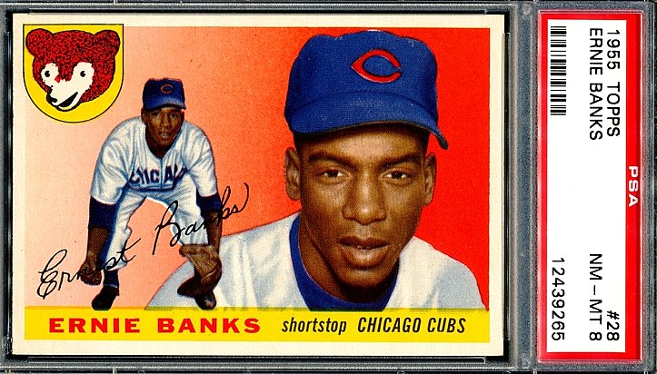
Strictly based on eye appeal alone, I am curious what most collectors consider Topps' finest year.
My vote - 1955 And then restrict it to only 1960's - I really like the 1965's. steve 
|
|
#4
07-01-2009, 11:47 PM
|
||||
|
||||
|
Strictly based on eye appeal, my vote for best all time:
1954 Topps-That #250 card of the kid is just gorgeous as well as many others. Resrticting to only the 60's, my fav is 1965. Love those big and bold pennants with the team emblem.
|
|
#5
07-02-2009, 06:45 AM
|
||||
|
||||
|
1967. The perfect card IMO. If I restrict it to just '60s....hmmmmm.
|
|
#6
07-02-2009, 08:14 AM
|
|||
|
|||
|
67
56
__________________
My wantlist http://www.oldbaseball.com/wantlists...tag=bdonaldson Member of OBC (Old Baseball Cards), the longest running on-line collecting club www.oldbaseball.com
|
|
#10
07-02-2009, 02:31 PM
|
||||
|
||||
|
For me, the 1953 is my favorite. I love the large "paintings" and overall design.
for 60s only, the 67 set. Simple, uncluttered design. The Mantle card has always been one of my favorite regular issues of his.
|
|
#11
07-02-2009, 09:01 PM
|
|||
|
|||
|
Favorite is 56 then 55, 54, 59, and finally 58. I stick with tobaccos for all time favorites the T205's but I love the 50's
|
|
#14
07-03-2009, 09:26 AM
|
|||
|
|||
|
1957
1967 Regards Rich
|
|
#16
07-03-2009, 12:54 PM
|
|||
|
|||
|
For the front design, either '57, '67, '56 or '64
For the back (I know, who cares) either '72, '57, '66 or '77 (my first year as a real collector)
|
|
#19
07-04-2009, 12:43 AM
|
||||
|
||||
|
Best All-Time = 1953 (I think the two best-looking Topps BB cards of all-time are the Jackie Robinson and Willie Mays from '53)
Best of the '60s = 1962 Steve Last edited by Steve D; 07-04-2009 at 12:45 AM.
|
|
#20
07-04-2009, 07:59 AM
|
||||
|
||||
|
I dig the '62's. I have four or five slabed packs. One of my packs is a 1962 Topps Wax Pack with Mantle/Mays Managers Dream card on the back.
Wanna Rip......1962TOPPSpackMantleMays.jpg
|
|
#25
07-08-2009, 04:40 PM
|
||||
|
||||
|
1950s: 1955
1960s: 1967 1970s: 1976 Narrowing to one set each from the '50s and '70s wasn't easy. I didn't go by player selection or rookie cards, but by design, photo quality, and color and these came out on top.
|
|
#28
07-09-2009, 02:01 PM
|
||||
|
||||
|
1950s: 1957 (1958 and 59 are just dreadful)
1960s: 1961, 1963, 1964 (1968 is ugly) 1970s: 1978 is da bomb. love the script lettering, some of the images are outstanding.
__________________
www.thetriple-l.com
|
|
#29
07-09-2009, 05:35 PM
|
||||
|
||||
|
Respectfully disagree.
Favorite: 1959 (The last year I actively collected. I think it was about then when I noticed that girls had different parts) Next: 1953 (The first year I actively collected)
|
|
#30
07-10-2009, 05:42 AM
|
||||
|
||||
|
I fully respect and honor that opinion. The historical perspective and context for each person can be very personal and that's what is so great about this hobby.
For me, not having such a connection, the 59's are viewed entirely through an objective, more distant lense. The flipside is that I have that kind of conneciton for 1984 Fleer. Honestly no barnburner of a set, but I am more fond of it because that was my second intro to cards, but the first real substantial time I started collecting more aggressively.
__________________
www.thetriple-l.com
|
|
#31
07-11-2009, 06:24 AM
|
|||
|
|||
|
My hat is off to 1967 for the bright color palette that reminds me of Kodachrome which itself has proven so easy to love. 1966, by comparison, looks drab and muddy with poor flesh tones. The players in 67 look to have blood in their veins. Also appreciate any photos taken at spring training right after wind sprints. Nothing like a sweat soaked, gasping closeup. Fred Gladding comes to mind.
The photo quality in 67 is higher than most of the 60s, although 65 is good, and the overall quality control of the printing process is good. In my experience 67 had few mis-cuts and centering problems and the images are free of dust, dirt, smears, printer lines and other crap that plagues other years like 1961. (did they ever clean the printing presses and plates that year?) 69 had lots of miscuts. 68 is tough to like, although the color quality is close to 67 the burlap border is big and fugly. I'd like to know how they chose that. If that was the best idea they had I wonder what they rejected. The layout for the 63s works for me. Big Photo, small photo, bright colors that go to the edges at the bottom, easy to read card backs. I really like them/ Speaking of card backs, 61's are the worst. What joker thought that tiny black on green statistics was a good idea. I need a magnifying glass to read them.
|
|
#37
07-15-2009, 10:04 AM
|
||||
|
||||
|
1950's........1953 Topps (the paintings are cool)
1960's........1962 Topps (something about those wood borders) 1970's........1971 Topps (high end cards in this set are so rich looking)
|
|
#39
07-15-2009, 07:24 PM
|
||||
|
||||
|
1955
 1965 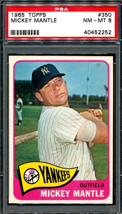
__________________
http://www.flickr.com/photos/calvindog/sets
|
|
#40
07-15-2009, 08:15 PM
|
||||
|
||||
|
Have to go with 1957. Maybe it's because that's the first year I started buying baseball cards and so nostalgia factors into my opinion, but '57 is it!
|
|
#41
07-17-2009, 02:17 PM
|
|||
|
|||
|
Just based on eye appeal, I'd pick the 57s, though I like the 55s as well. My favorite post-war set is the 1953 Bowman Color, so I tend to like cards with great photos and minimal distaction. The 57 is the closest to this.
|
|
#42
07-17-2009, 04:38 PM
|
||||
|
||||
|
Since you qualified it by Topps Sets I'd have to go with 1956 Topps for the '50s (although the '53 Bowman Color Set blows away any other set from that era).
For the 1960's - I'd go with 1967 Topps.
|
|
#44
07-17-2009, 05:47 PM
|
|||
|
|||
|
....or by few
|
|
#45
07-23-2009, 02:09 PM
|
||||
|
||||
|
1967 has always been my favorite.
|
|
#46
07-24-2009, 08:46 AM
|
|||
|
|||
|
I always liked the 1972 Topps Set with the bright colors and the In Action Cards. I can remember looking at the back of the Expos Team card where they list the Career Batting and Pitching Leaders and thought it looked cool seeing Rusty Staub,s name on every batting category(I know they were only 3 years in).
|
|
#48
08-01-2009, 12:09 AM
|
|||
|
|||
|
Hello Everyone,
My favorite set from the 1960s is 1961. The design was so simple, it reminds me of the default layout for Power Point presentations, just three boxes. A large photograph on top, and two smaller boxes, on the lower left the player's name and position, on the right the team. The colors are solid and bright. There is no confusion. The focus on the back is on the statistics, not commentary; and the cartoons on the back are fun to read and taken as a whole give an interesting insight into the life of a baseball player. I know there are a lot of portraits and not many action photos. I remember that when I collected the set as a kid I was drawn to the action photos. My favorites were Jerry Adair, Hank Aguirre and Bill Mazeroski, but now I've grown to love all the head shots. I would argue that the 61 Mick is the most recognizable card in the Mantle cannon. In the portraits the personalities of the players is really revealed. The set pays homage to the great moments of the game: Ruth's 60th Homer, Hornsby's .424 average, Chesbro's 41 wins and the feats of Mathewson, Johnson and others. The set is loaded with Hall-of-Famers and history. Like all sets there are faults, for example, the manager cards are silly and it is difficult to find perfectly centered cards. Nevertheless, when you look at the set in an album its symmetry, artistry and design are striking. Take a moment to examine below one page from my set and you will see what I mean. Best wishes, Joe
|
|
#50
08-01-2009, 09:57 PM
|
||||
|
||||
|
50's: 1953 great artwork w/1952 (right there with it)
60's: Maybe 1969, nice basic design
__________________
Er1ck.L. ---D381 seeker http://www.flickr.com/photos/30236659@N04/sets/
|
 |
| Thread Tools | |
| Display Modes | |
|
|


 Linear Mode

