Hey guys,
I finally got these back from the photographers (it's about time). I'm at the point where I've been looking at these for so long, I just can't even tell how I feel about them anymore. I've been color correcting them a little bit in Photoshop the past hour, and I think what I have is pretty close to the reality of the darn things, though they could probably benefit from some more tweaking.
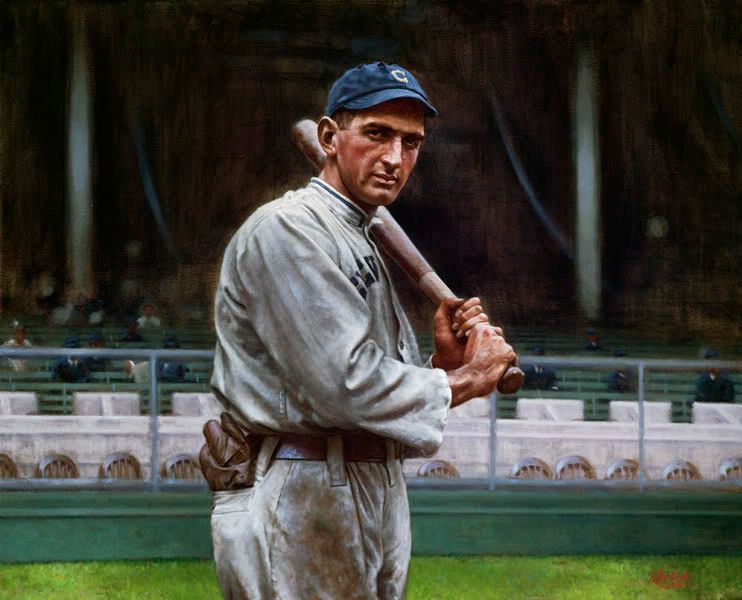
Anywho, the first is based off of Conlon's famous photo of Joe Jackson from the Polo Grounds during the 1913 season. I felt like it was necessary to not keep the stands as blurry as Conlon's camera showed them to be, as that's the true sign of the painting being done from a photograph. So, what's there are the simple structures that appeared in the ballpark that year, most notably the front row (which at the time, was painted white, but would be replaced by white marble a few years later).
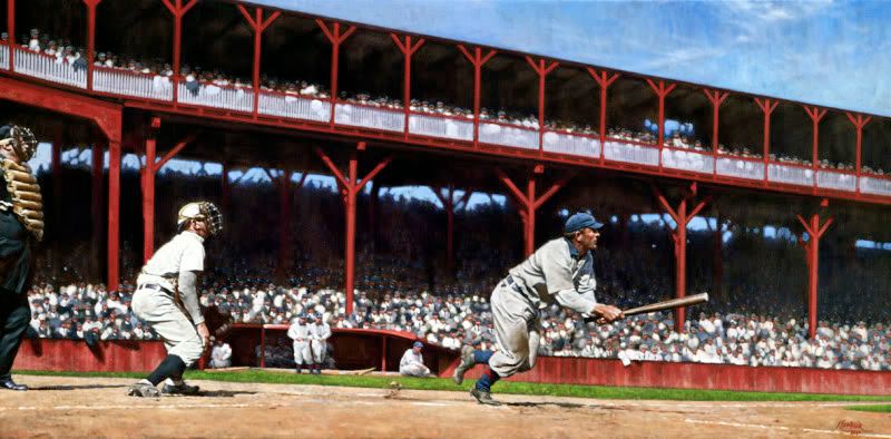
The second is of Honus Wagner lacing one into the outfield against the Chicago Cubs at the West Side Grounds. I'm a bit unsure as to what the exact date is, but I know it's sometime during the 1909 season. This one also had some tough issues with the stands, as I found out that when the place was remodeled in 1908, the grandstand (along with most of the other features of the ballpark) was painted red. Using that color and making it sit back enough behind Wagner was NOT easy. I hope I succeeded.
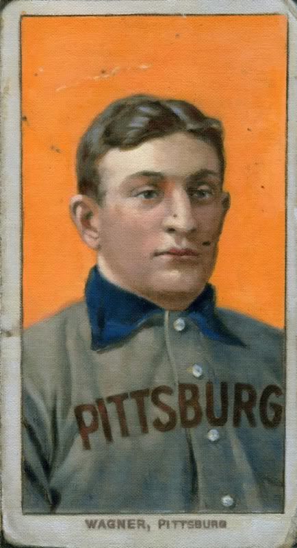
And last is the weird assignment, a scaled up version (5.5"x10") of the famous T206 Wagner card, specifically the SGC 40 that was brokered by Memory Lane last summer. There were a few tough things going on with this painting, one being the recreation of the moire pattern, which I could only suggest without driving myself absolutely bonkers. Also, trying to get that damn orange right also proved to be tough. After having the original card scanned, then sent to me, then printed out, you can imagine that there would be some color shifts in the whole process. And, now that you're all viewing it on different computer screens, it's probably still not right. But, hopefully the client is happy with how it looks in person!!
So, any crits/problems/tomatoes/comments/suggestions are appreciated. Always!!
Thanks,
Graig