Quote:
Originally Posted by KendallCat

Thank you for the nice comments. I tried to find examples with nice eye appeal and centering - Matty C has taught me a lot in regards to centering and things to look for when selecting cards. I have included a few more close ups of cards in the run.
1952 Mantle rookie
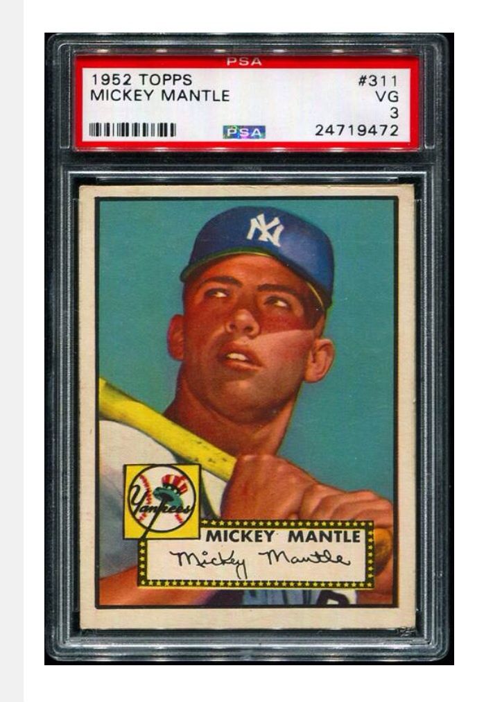 |
Beautiful cards, KC.

Can you see/tell why your 52 graded only a 3? It looks way nicer than that to me but I likely can't see the reason(s) why in the scan?