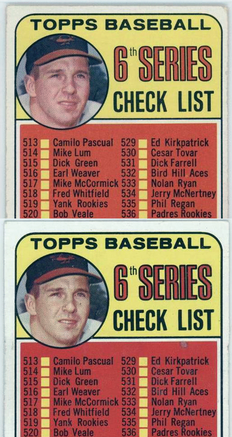
I decided to check out the other Brooksie checklist I know of, 1969 #504, and I found there is a variation there. It is so frickin' subtle that it almost doesn't even count, but there is a slight difference in the cropping of the image.

The easiest way to see it is by focusing on the edge of his hat brim at far right. On some/most versions of this card it touches the black, circular border. On a smaller number of these cards it falls short of reaching the border. If you concentrate on the image I created here, you can see how the picture is shifted very slightly upward and to the right. Look at the dark shadow on his jersey to the right of his chin and the upper left and right portions of his hat (as well as the top of the Orioles logo). The spacing in these areas changes between the two versions.