Hey all,
It's been a busy couple of months, as I've been trying to move stuff out of the studio that's been sitting around for a bit. Unfortunately, there's still a lot left to go. Well, it's not unfortunate that I have work to do, but it's unfortunate that people have been waiting as long as they have. Le sigh.
Anywho, here's what I've completed recently, including John's raffle painting:
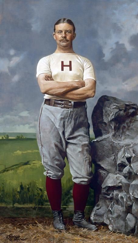
Samuel Winslow, 1885, 16" x 28"

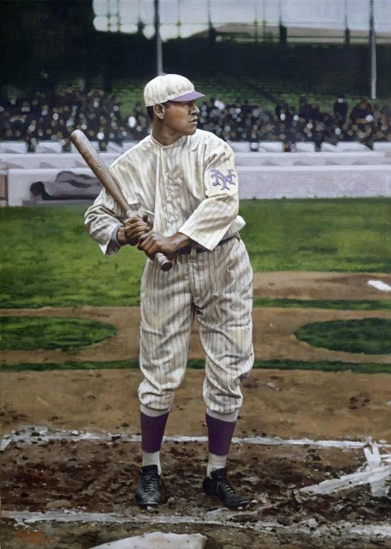
Joe Jackson, 1911, 18" x 22"
Jim Thorpe. April 10, 1913, 20" x 28"
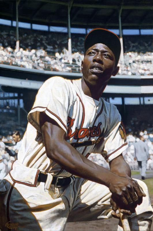
Hank Aaron, 1955-6, 16" x 24"
The Samuel Winslow was a lot of fun. First off, for those of you unfamiliar with him, he was best known as a member of the U.S. House of Representatives from Massachusetts. However, Winslow also happened to be the team captain of the Harvard baseball club, and according to his good friend Ernest Thayer, the ORIGINAL inspiration for
Casey at the Bat.
The image itself was a lot of fun to work with. Outside of the fact that I was thrilled to work on a painting of the actual inspiration for the great figure, I was also super stoked to have the image be from a studio shot. The biggest challenge for me was in the background of the piece, that landscape, which in this case, was just a background used in a studio setting. I imagined that it was just a fully painted screen of some sort. I wasn't even sure that it would have been in color, as an artist may have just created something like that using a grisaille (monochromatically). But I figured that the quality of that painting (or from what I could tell from the black and white cabinet) didn't seem to match what a grisaille traditionally looks like, so I opted for color. The challenge really laid in reminding myself that it was just a backdrop, and the color of it wouldn't be reflected in Sam himself, as it would normally if he was in the environment. Hopefully it manages to sit back enough in the final. And not for nothing, but Winslow looks like a bad@$$.
With Jackson, the thing that immediately attracted me to the image that the client picked was that shape of the grandstand. It's REALLY awkward, and almost seems like it's chopping Joe's head off. Pictorially, it's a no-no, and I should have nixed it. But there was something in the way some of the other shapes and angles in the image worked with it that I just couldn't get away from. And, something about his head behind clocked off by that shape held a nice metaphor in place, I thought. Granted, I could be completely wrong in all of this, but either way, I LOVED it.
The Thorpe was also a lot of fun, which again had a lot to do with the environment around him. The image came from 1913, and I'm pretty sure it was the first game of the season for the Giants. So, the weather that day was pretty frigid apparently, and though sunny in the morning, by the time the players took the field for BP and the crowd wandered into the ballpark, it had become terribly overcast. I kind of imagined the light being pretty silvery, which can be the case on a cold April day. So that had to reflect not only in the depiction of the stands, but also on Thorpe himself. The purple of his hat and 'NY' were cool touches that had to be adjusted for the occasion.
If anyone has any thoughts, questions, comments or critiques, I'd certainly love to hear them.
Hope ya dig these four!
Graig