Hey everyone,
Thanks for tuning back into this thread. Now that we have the image all worked out and I can actually put something down on canvas, I'll be updating it a LOT more regularly until the piece is in John's hands. And certainly, I really appreciate you all chiming in and sharing your thoughts.
First off, I definitely agree about the quality of the Aaron jumping image - it really is pretty bad@SS. I think that one would make one heck of a cool painting, especially at the 16" x 20" size (or thereabouts). However, I'm definitely loving this Peskin shot as much, too. I guess I'm just at peace with the fact that I know I'll do the other one at some point as well.
Anywho, onto the canvas at hand. The drawing is officially on the darn thing.
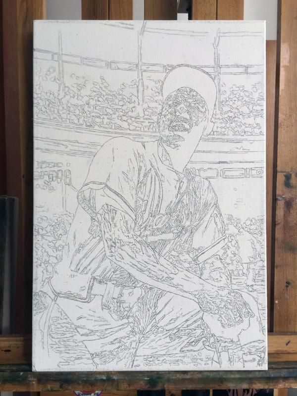
They're a few people off the boards who have asked me about the squiggly lines and what they represent, so I thought I'd address it here for those of you who may be curious. For the most part, having an underdrawing done for a painting acts as a road map for most artists, whether it's for something as simple as gesture lines, or if it's meticulous to the point of creating a full-on black and white guide that will later be glazed over with transparent color. By no means does everyone use them, and I don't want to say whether I think it's 'wrong' to do so, but for me, it works.
For me, rather than just doing an outline of things for a skeleton, I prefer to get a bit more involved. All of the those squiggles that you see are changes in value, color, and/or temperature. Sometimes those changes are subtle, sometimes they're major, but the most important thing for me is that they're there. It's kind of a way of thinking about the drawing as being sculptural moreso than a bunch of lines that I'm filling in with color. Though, I guess you could say that it still looks rather paint-by-numberish. Whoops.
Anywho, now that it's all drawn in, I can start with some color. The drawing was spray fixed with a Krylon product called Workable Fixatif, which will create a clear acrylic-based barrier between the drawing and the paint that'll go on top of it.
With that, I put a warmish oil wash over the painting to create a colored-ground to work off of. For me, the ground is meant to do two things. One, to get rid of the stark white of the canvas as soon as possible. Traditionally, when creating a ground one would usually do so with a medium value so that when colors are placed on top of it, they can observed closer to their real value. For example, on a completely white surface, a small spec of paint in a medium value would look much darker than it actually is.
The second thing the ground does for me is create certain atmospheric effects that can't be attained in any other way. Since all oil paint has a bit of translucency to it, whatever's underneath a typical stroke of mine will show through and effect it in some way. That's the sort of thing that will create richness, nuance, and a lot of headaches - all parts of the process.

After the National, I plan on jumping back into the thing and starting to put down some actual color. But man, I'm THRILLED that I have something to show before heading out to Cleveland.
I hope y'all dig my thoughts along with the progress shots, even if it can sometimes sound flowery or long-winded. Regardless, as per usual, any thoughts, comments, or critiques are ALWAYS appreciated.
Thanks for reading!
Graig