
03-25-2014, 03:26 PM
|
|
member
|
|
Join Date: Mar 2013
Posts: 69
|
|
Quote:
Originally Posted by perezfan

Finally, I can spot all the nuances and subtle differences in that Red Sox Pennant ^^^^^^^^^ ")
Always wondered why they decided on the grey graphics against red felt. Not exactly the definition of perfect contrast, but nice examples none-the-less! |
Here is a better view!!! 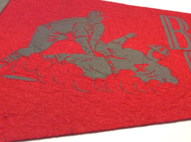
|