Quote:
Originally Posted by mrvster

GREAT INPUT!
Ted, your Chase and Baker are the classic "light " vs. "dark" examples contrasted next to each other...
there are a few that pop up that are borderline...I can usually differentiate them because of my scrap eye.... 
I'm thinking:
the two different colors are two complete different printings spaced some time apart for some reason(this is only a theory of mine).. 2 complete different bulk ink supplies.... |
I think your theory regarding....two printings using different shades of blue ink is a plausible; and, does explain the light blue vs dark blue backs on the '42s.
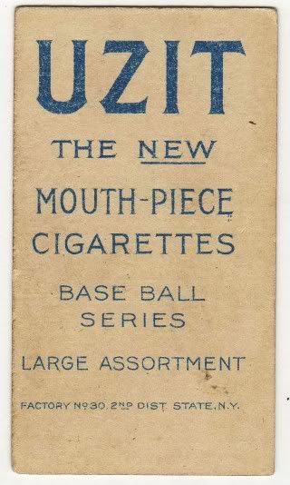
I'll expand that thought to include UZIT cards. A fair comparison, as both these T206 backs were printed at the tail-end of the T206 press runs in the early
months of 1911.
Two years ago, I posted this thread regarding the similarity of PIEDMONT 460 factory #42 and UZIT backs with respect to blue ink differences..............
http://www.net54baseball.com/showthr...ory+42+vs+UZIT
For example......
........................................ Dougherty .................................................. ................. Herzog .................................................. Schaefer

 Note
Note........the porous quality of the blue ink on the backs of the Dougherty and Herzog cards vs the solid (and darker) blue of the Schaefer back.
TED Z