Ah, now that's some details I'm glad to see.
.005 is a big difference. As a point of reference, I've measured probably 50+ T206s out of curiosity, and there is only +- .001 difference, And that's on 100 year old cardboard.
I didn't know SGC had rejected one.
Also I didn't know about the different reaction of the ink.
The things I think we can agree on are that Fleer and the other main producers used multiple printers and produced cards in multiple print runs between say 1986 and 1994. Fleer made around 12 different corrections to the Ripken card, so it's certain they made multiple runs probably at different locations.
So, I guess I'll go over the differences and what my take on them is. I'll quote Bens assessment and refer to the other one posted on
http://www.billripken.com/mystery/mystery1b/report.html
This is the bulk of Bens assessment quoted directly from
http://www.billripken.com/mystery/report2.html My comments will be in red.
1) Grey dot bars are different because they need to go past the edges of card so you do not see white edges like test run cards and that is the pattern available in there print shop program.
The pattern of the bars is different. And to me that's an important difference. As one of the main features of the design it shouldn't change. In the E98 thread I said there were a few things that would convince me the PSA 9 is real. One of those would be an 89 Fleer common with the gray bars screened at an angle like the card in question. The reason isn't that they have to be to avoid white lines at the side. That portion can be screened any way that's wanted and merely extended past where the card should be cut, just as the normal 89 Fleer cards were done.
2) Orioles Logo on front is also just pasted using photo shop pics. available from program.
The logo IS also different in a few ways. Another point against, and a fairly strong one. The platemaking process in 89 was more photographic than computerized, and the logos should have all come from the same piece of original art. I don't have Photoshop, so I can't say if there's an orioles logo, or if it matches the one on the odd card. I would like to have a look at the upper left card here.
http://www.billripken.com/versions/big/flaw4.jpg It has some of the traits of the odd one. It would be interesting to see the logo and the gray bars.
3) The photo of Bill is larger than on a normal card. This is done so there is no white edge around photo from copying and pasting. Printing Dies do not magically change size for one card version. That and the fact real Fleer printing dies are the size of a whole sheet not one card. The ones you by on ebay are cut from full size dies just like cards are cut from full sheets.
Yes, it's different. I wouldn't rule a card from that era out based on just the cropping. Many sets from then have a lot of differences, usually small. Some, like 91 fleer have nearly every card cropped differently.
4) The coloring on entire front of card is not consistent with known real cards. Using a magnifying loop look at the orange stripes at top and bottom of photo on front on the Mystery card they are put on backwards, but in the right pattern on the rest of orange/red on the card. This means that a different program was used to separate the colors when making the printing plates for mystery card and there is no way this happened at Fleer.
I'm not sure what is meant by the stripes being put on backwards.
The colors are darker, not uncomon for 80's cards to show color differences.
The stripes are also screened with the screen at a different angle from the normal cards and from the rest of the same card. The photographic process used at the time had different screens available, different ones used on the same card might be unusual, but not impossible.
5) Ink is of a different higher quality. I never done the black light ink test because I do not have one.
I would have discounted this one altogether before learning the blacklight results in the original post. Quality is subjective, and different shops often use different inks depending on what that shop prefers.
Reactive vs non-reactive ink is possibly another point against. I haven't looked at 89 fleer with the blacklight, but I can say that 91 Topps has three different inks used for the backs. One in non-reactive, another reacts by glowing bright orange-red, the third barely reacts, but looks like a very deep red. (That last one is actually somewhat hard to find)
6) Card stock is not even close in thickness. Real 1989 Fleer card stock is thicker. The card stock(smoother) is why the black print looks to be sharper and of better quality on entire card.
As I said above, .005 is a large difference, and a serious point against.
7) 95% of the back is just copied and pasted from a real card. The copyright line and Printed in USA are different because they had to use the grey dot patten lines from the photo shop program again to not get the fake looking white line on top or bottom of the card.
Yes, the back is screened differently as well as the front. I've already addressed the percieved need to use a different screen to avoid white lines. The gray on the back is so different I couldn't call it copied and pasted from a real card. It's worse in some areas better in others.
8) Yellow on back covering stats has a different print pattern also from color separation program.
I can't comment much on this. None of the information so far has shown scans of that area. considering that most areas of the card have been rescreened I'm not surprised. If the area is screened rather than solid I would count that as a major point against.
9) I almost forgot the photo itself actually made one of my print friends LOL when he seen it. The photo itself is copied from a real card and you can tell because it is of a lower quality. If it was a real Fleer card they would have used the original like they used on every other card/die and there would be no difference in photo quality. Every time a photo is copied it looses some quality. If you take a Mystery card and a real card and put then side by side and scan and print them on a home printer the photo quality difference will stick out even more.
I'm not seeing much quality difference in the closeup scans. And the cropping has already been covered above.
On to the other assessment.
It's very scan heavy, so I won't quote it entirely.
I think it's failings are mostly in how narrow of a view they took. With so many differences I'd have like to see them look at more areas of the card. As well as the inks and cardboard.
The points I think are important are these.
The details of the pattern in the bat knob of the logo are very interesting.
The odd card
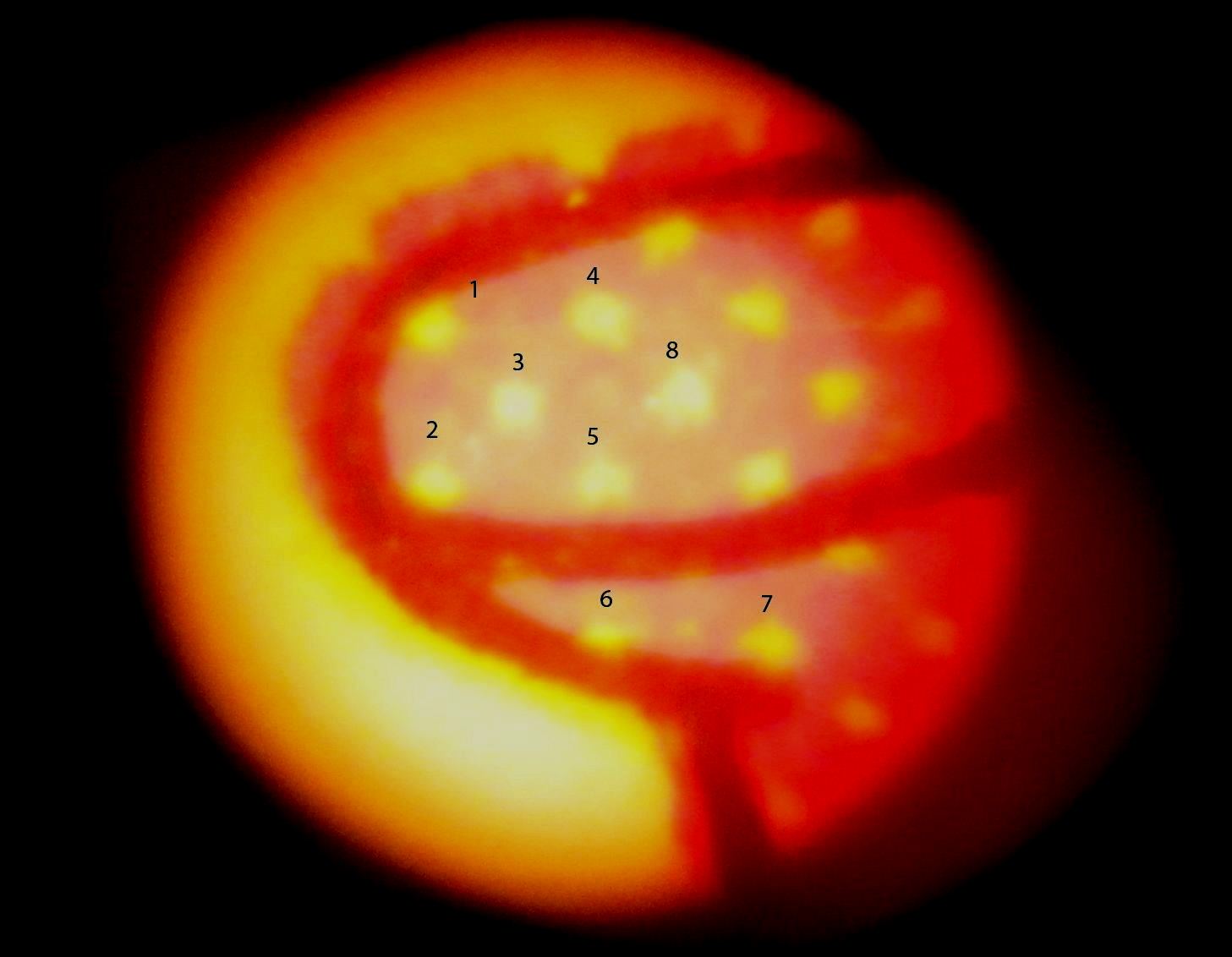
A regular Ripken error.
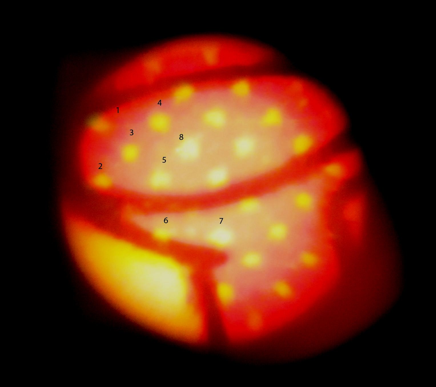
The spot they identify as number 8 is indeed unusual and identical.
This presents a real puzzle. The logos are different, and have different screened areas, especially area of the hat. But in at least one area appear to be from the same negative (The plates are made photographically from large assembled negatives called masks. ) This would happen if the mask for the logo was reused but altered for the normal cards.
OR
if the negative was taken by the same camera through the same screen at eacatly the same place. combined with the rest of the front being screened differently I think that's highly unlikely.
I also think that someone having the ability to scan and copy a detail as small as the faults on that particular dot and then carry that over into the printing wouldn't need to do any of the other alterations. They could simply print from the detailed scan.
So why is the logo screened identically while the rest of the card is drastically different?
That's the puzzle.
Another is that nearly every fake made around that time had the same sort of flaws, typically screening in areas that should be solid. While this card doesn't. They were also produced in large quantities, where this card seems to be much less common. Even the absurd black and white fakes were everywhere and are still easy to find.
I don't think it's a recent digital copy. I do think it was made arround 1989 if not in 1989 and on typical commercial printing equipment. So why make this much effort to produce a handful of cards if it's fake?
I'm not 100% convinced the card is fake. I am convinced that it's not normal 1989 fleer production.
The options I see are.
1) Fake
2) Very early production, maybe from a rejected batch from one printer.
3) "Special" production. Were the errors ever offered in quantity on home shopping? I know they had some exclusive cards, and it's not inconceivable that Fleer might have had someone run a few hundred for them. And I'd bet that most of the HSN exclusives were sold outside the hobby.
4) Faked by someone inside Fleer or one of Fleers printers using partial original elements and new ones they made from the original art. Playing around with stuff isn't unheard of, either officially or unofficially. (UD reprinted their own cards at least once and supplied fakes to a major retailer on another occasion. )
5) genuine, but from a printer that only did a small bit of production just before the change to the corrected version.
6) From a planned Fleer set to be sold outside the US. (Canada, UK, south america, through the us military- something like that ) If the printing was done for an unannounced program, and the error was found before the announcement, that might have been enough to cancel the whole thing because reprinting or pulling the card and replacing it would have been too expensive for that product.
Things that would convince me enough to be sure of a category-
Another 89Fleer, preferably a common with similarly different screening.
A similar card accompanied by a reciept from HSN, bonus if it comes with the original packaging.
Documentation from Fleer rejecting a printing for being too different.
Documents from Fleer telling a backup printer to stop production
documents about a planned release for some other market that was called off.
I do think that PSA shouldn't have slabbed it as a normal Ripken error. and that they should have declined slabbing or opinion until what it actually is has a bit more backup.
I'd be ok with fakes being slabbed as fakes. Label this one as "89 Fleer Billy Ripken error fake type 1" The same could be done for the others produced during the late 80's.
Steve B