Quote:
Originally Posted by JollyElm

Wow, I can't for the life of me figure out why people like the 1970 set. Such a boring, poorly designed offering. Ick!!
|
SO MUCH THIS. The fonts used on the '70 set are a design tragedy of epic proportion.
The 1972 is by far my favorite. The '71 is excellent, too.
The rest: meh. I know a lot of people like the '75, but it's too garish for my taste. The '72 is completely of it's time, but in a very tasteful way.
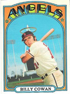
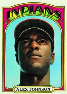
A couple of cool ones from the set: