|
||||||
 |
|
|||||
|
||||||
|
|
|||||
|
#351
 08-24-2011, 09:04 AM
|
||||
|
||||
|
well I think what I like the most about your paintings is the realism. especially in the wide action shots. this painting of ruth is an A no doubt but when I see the paint strokes and the overall loose ness (is that a word? lol) it loses a bit for me. this is just nit picking obviously by I say if it ain't broke don't fix it. I prefer your A + style of painting.


|
|
#352
08-24-2011, 09:11 AM
|
||||
|
||||
|
Graig,
As usual, your painting rocks. You could paint a pile of poo and it would probably look good. My feeling on this painting is that I prefer your other work more. For me the attention to detail is the thing that really breathes life into your work. Joe Jackson's hands and glove, Matty's face and uniform, Tyree and Harrison's image, Gehrig's face, Babe's nose and your manipulation of shadows in paintings too numerous to mention are the things that make your work speak to me and elicit that emotional response and connection. (Those of you who have followed this thread will understand which paintings I am referring to) I can see what Dean means about the eyes, but I don't prefer that as the main effect. There is a certain fluidity of movement to your paintings that I think comes from the detail. We've discussed this before, so you know what I mean. I just don't get that from this one and it's one of the effects that I most admire in your work. Now, I freely admit, that there are others out there who will appreciate this style. After all art appreciation is very subjective. Perhaps the non baseball people would like these more as Neiman has this looser style to his work and is arguably the most commercially successful sport artist ever. What do I know, I always thought his stuff was ugly. I guess different strokes for different folks. All that being said, If you really don't know what to do with it, you can send it to me for safe keeping on a wall in my home.  (Note to self: Damn, I gotta start saving money for my next painting) Best, Mark EDIT: Graig, I have a better idea. Why don't you paint the same image in your regular style and send them both to me so I can inspect and compare them in person on my wall. That would be the fairest way to truly see which style I would like better. ")
__________________
My signed 1934 Goudey set(in progress). https://flic.kr/s/aHsjFuyogy Other interests/sets/collectibles. https://www.flickr.com/photos/96571220@N08/albums My for sale or trade photobucket album https://flic.kr/s/aHsk7c1SRL Last edited by Lordstan; 08-24-2011 at 09:27 AM. Reason: spelling
|
|
#354
08-24-2011, 11:35 AM
|
|||
|
|||
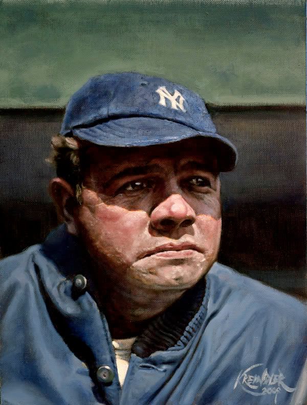 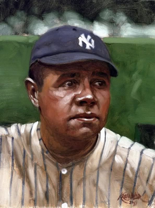 My thoughts. Two Kreindler Ruth's. The first is what we've come to love. The second is nice, but it is completely different. If I had not known the first, I imagine that I would be more enamored with the 2nd than I am. The implication is that I do not have the same appreciation for the 2nd as the 1st. In real simple terms, with your usual style I find myself wishing that I could afford a piece, and longing for my sons to finish up college and start supporting themselves. With the second style, it is nice but I don't have a desire to have one. Again second style is nice, but I think that it lacks the character that your normal style has, which seems to tell a story. With the second style I find myself looking at it from the outside, as opposed to your normal style where I can feel immersed in it, like I am able to imagine being there. Would I appreciate it if someone gave it to me? Yes. Would I buy it myself? No. If I were to see the 2nd style with your name on it, without seeing it here from you first, I would think that it was a very poor forgery of your work. Without your name on it, I wouldn't be able to pick it out as yours. That's just one man's thoughts and opinon though. And since Nieman was already mentioned, I am not a fan of his work either. Go figure. Last edited by timzcardz; 08-24-2011 at 11:38 AM.
|
|
#355
08-24-2011, 12:03 PM
|
|||
|
|||
|
The above posters have put it very well. I think that what may come to be known as your "Realist Period" is not yet over, and you should wait to begin the "Abstract Period" for a personal/artistic yearning to explore different means of expression, not because your agent thinks you can crank out more saleable work that way!*
*This last clause is totally a joke.
|
|
#357
08-24-2011, 05:14 PM
|
||||
|
||||
|
Wow, guys. Thank you SO much. This was exactly what I was hoping for.
I'm definitely on the same page as all of you, as it's pretty hard for me to do a quick sketch and call it 'finished'. That has a lot to do with the fact that I can show a lot of OCD when it comes down to the kind of minutia some of these paintings demand. Additionally, beyond feeding into those obsessions, I think those little things are what really make the pictures fun to me. Well, the whole thing is really fun, but you know what I mean. I guess since I end up doing so much research regarding weather, advertisement colors, game situations and everything in-between, I feel like I just yearn to show it all. And in a way, I feel like most baseball enthusiasts want to see it all. I mean, not in my paintings per se, but in whatever they collect. I think that's one of the reasons the game is so wonderful: their history just becomes so strict, that if done 'right', all of that minutia is able to evoke a specific era that much more. Now, I don't intend on making a habit of doing these sketches for any purpose other than for color studies, so none of you will have to worry about me changing my approach or anything. Not that you're worried. But you know what I mean. Perhaps when I'm older and can't really get as tight as I want to be, things will become more expressive. Until then I'll be keepin' it tight!! Thanks again, Graig
__________________
Check out my baseball artwork: www.graigkreindler.com www.twitter.com/graigkreindler www.facebook.com/graigkreindler
|
|
#358
08-29-2011, 10:04 AM
|
||||
|
||||
|
Hey all,
Thanks again for all of your opinions regarding that Ruth study - it's nice to have feedback on something that's been sitting in the dark for a couple of months. Hopefully, everybody on the east coast wasn't terribly effected by Irene. Luckily, things weren't too bad in our part of Brooklyn. So, after a bunch of working this weekend, I feel like I've accomplished something. Well, not much, but a start. For starters, I just got these back from the photographers today: 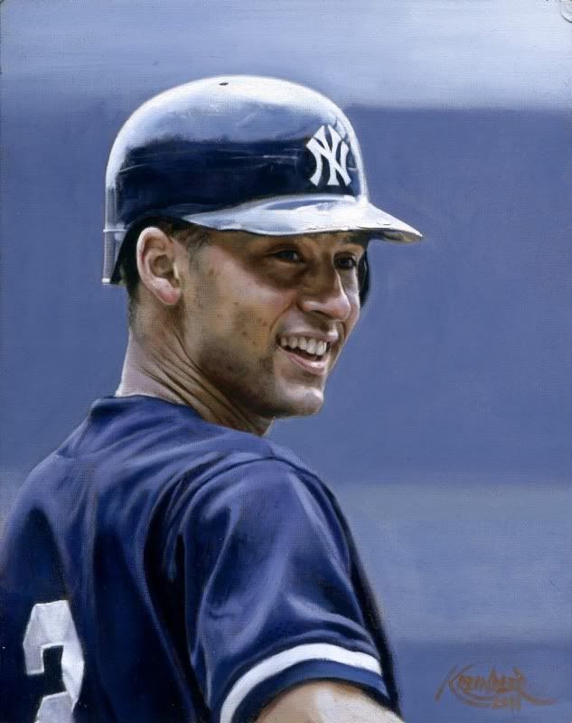 Derek Jeter, 2000 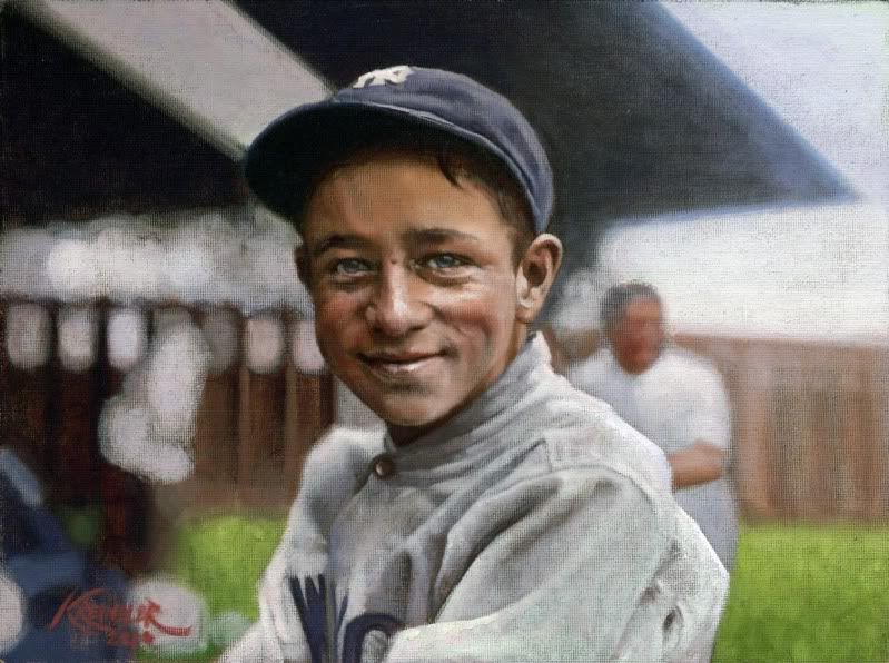 Eddie Bennett, 1921 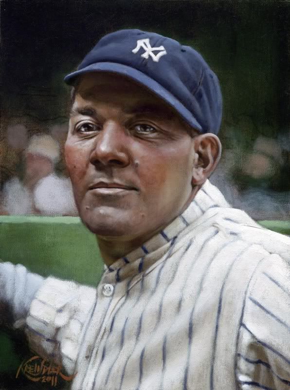 Pat Collins, 1926 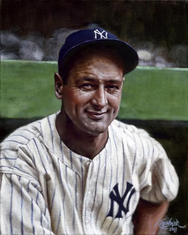 Lou Gehrig, 1936 Though I had painted the same image a couple of years back, I had to do the Gehrig over unfortunately, the reason which doesn't make me happy. Though, I suppose at the new size (16" x 20"), it could be a cool start to a project depicting portraits of the '36 Yanks and Giants - something I've had in the back of my head for a while now. I figure in the end, it will encompass about 50 paintings, and in the end, could hopefully be displayed in some gallery somewhere as a set. Or, two sets. So, I guess that's where my spare spare time is going to be spent... Already next on the list is Mr. Ruffing, which is currently in progress: 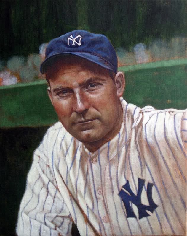 Red Ruffing, 1936 After that, I have to take this guy to the photographers in a week or so, after some glazes and a varnish: 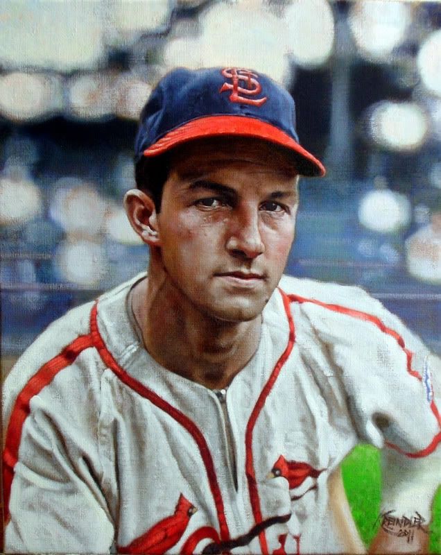 Stan Musial, 1942 The Musial is also 16" x 20" and I must say, I REALLY dig that size for portraits like this. It just seems super comfortable, and the heads end up being about 3/4 life sized, which is pretty ideal. And the big guy on the easel, the one that needs to be done by the end of the week: 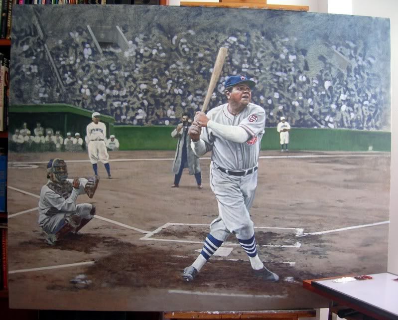 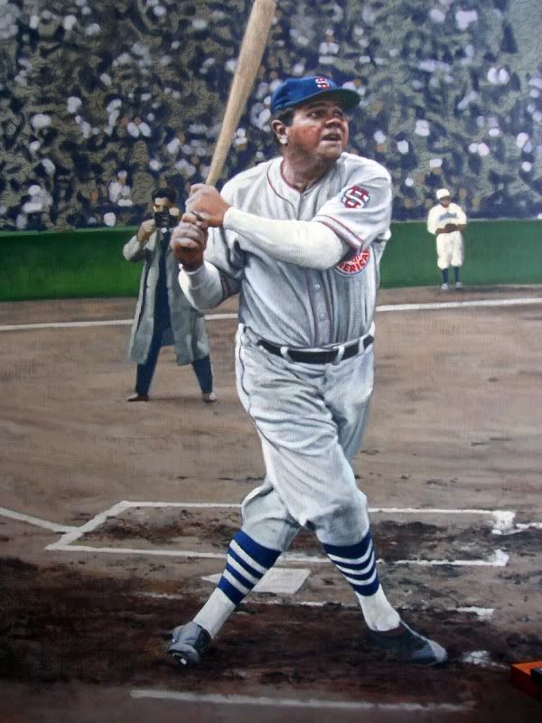 Babe Ruth, November 4, 1934 The Bambino is taking part of a pre-game home run derby of sorts, before the start of an exhibition game. Actually, it was the first contest for the U.S. team during their famous tour of Japan, with this scene taking place at Meiji Jingu Stadium. The canvas is GINORMOUS. I think the final size ends up being about 50" x 64", and since I'm using a different kind of stretcher bar for something this large, it feels like it weighs about 300lbs...well, maybe not that much...but it's hard to move!! Anywho, I hope you guys dig 'em. As per usual, excuse my cruddy photography on those last few. And comments/crits/problems/tomatoes are always appreciated! Thanks, Graig
__________________
Check out my baseball artwork: www.graigkreindler.com www.twitter.com/graigkreindler www.facebook.com/graigkreindler
|
|
#359
08-29-2011, 11:19 AM
|
||||
|
||||
|
Eddie Bennett! Wow! Finally getting some recognition!
|
|
#360
08-29-2011, 02:49 PM
|
||||
|
||||
|
David,
To my client, few get MORE recognition than Mr. Bennett! Graig
__________________
Check out my baseball artwork: www.graigkreindler.com www.twitter.com/graigkreindler www.facebook.com/graigkreindler
|
|
#362
09-06-2011, 02:46 PM
|
||||
|
||||
|
I'm a little late to the Ruth discussion here, but wanted to voice my own opinion... I personally like the "quick" version better than the meticulous versions. At the end of the day, simply stated, I guess it comes down to personal preference. The "roughness" to the quick Ruth is personally appealing, and given the choice of the two - I would take that one.
__________________
For information on baseball-related cigarette and tobacco packs, visit www.baseballandtobacco.com.
|
|
#363
09-07-2011, 11:52 AM
|
||||
|
||||
|
Thanks for weighing in, Jon! I think that in the end, that was something that my agent really liked about it, too. To this day, I'm still unsure what his intentions are with it, or whether he wants me to do anymore, but I suppose we'll see. For now, I just have to see where my hand takes me. Or something.
Jim, you bring up something that I've been wrestling with for a while now. I think that having a shallow depth of field can really make things pop, though I can't decide whether it's for the reason I want them to. I think that George (and in similar ways, Phillip) Burke was a master at that sort of thing with his photographs, as the clarity in his portraits is second to none. But at the same time, his backgrounds really end up being almost indiscernible, which is the big reason his work is so life-like (and recognizable). At the same time, when you look at his work, there's no doubt that it's a photograph - the background elements he plays with to make the portraits pop look the way they do because of his lens. I think the same thing would probably have to happen to my stuff, which I don't know if I'm after, as I would love the viewer to not necessarily think that it was a photograph (then again, what WOULD they think it came from?). So, if I can find a happy medium, then I think I'd get less headaches. It all comes down to edge, value and chroma control in the end, something I'm still trying to improve upon as much as possible. Anywho, here's another one I just got back from the photographers: 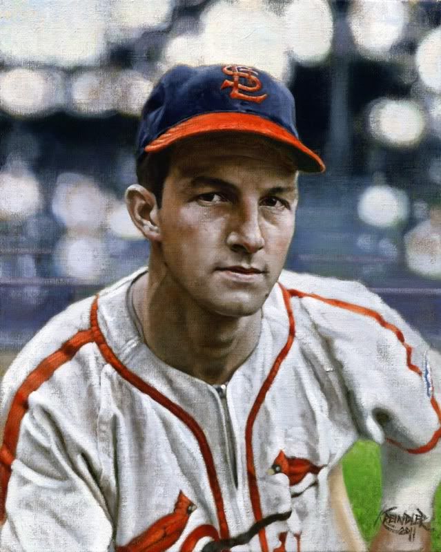 Stan Musial, 1942 Thanks again for all of the great replies, everyone. Graig
__________________
Check out my baseball artwork: www.graigkreindler.com www.twitter.com/graigkreindler www.facebook.com/graigkreindler
|
|
#364
10-18-2011, 08:29 PM
|
||||
|
||||
|
Hey all,
I guess it's been a while since I've posted anything! Well, there is a good amount of new stuff going on, but I can't post it all quite yet, as I'm waiting to get something back from the photographers. This shot of the Babe from Comiskey in 1918 is one I can share now, though: 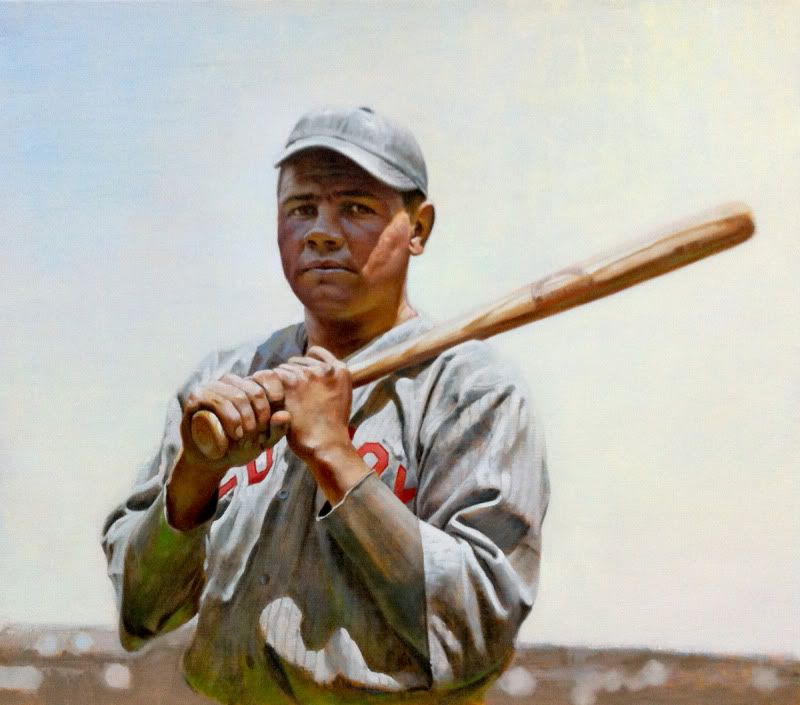 I've been working on this on Tuesdays for the past two weeks or so, as it's something I'm carving away at in a class I'm taking at my alma mater. Since doing so, I think I've been able to make some nice jumps in learning about subtle stuff, though it's probably nuance that not many will notice. To me however, it makes all the difference. Always gotta keep pushing!!! Anywho, the photo was from my iPhone, so it's a little grainy - sorry about that. Hope you enjoy! Graig
__________________
Check out my baseball artwork: www.graigkreindler.com www.twitter.com/graigkreindler www.facebook.com/graigkreindler
|
|
#366
10-18-2011, 09:08 PM
|
||||
|
||||
|
Graig,
I like the Red Sox Ruth also. It really speaks to me. Awesome!!
|
|
#368
10-19-2011, 06:22 AM
|
||||
|
||||
|
Thanks for the compliments, guys! I'm relieved that you three dig it so far. Since I was trying a lot of 'new' stuff with this painting, I was a bit worried that it could fall short. Then again, any of them could fall short.
Either way, it's good to know that I'm on the right track. Thanks again!
__________________
Check out my baseball artwork: www.graigkreindler.com www.twitter.com/graigkreindler www.facebook.com/graigkreindler
|
|
#369
10-19-2011, 07:12 AM
|
||||
|
||||
|
Graig, GOOD LORD! You have to take a class? You should TEACH a class. You are one of the finest artists I have ever had the pleasure to view. Rembrandt is my favorite but you are a close second (seriously, no joke). That Ruth is spectacular, looks like a photograph. You may be the only artist that won't have to die to have his paintings worth a fortune or admired by only black-clad, self centered weirdos. Keep up the great work and always thanks the Lord for your incredible talent.
__________________
I Remember Now. 
|
|
#371
10-19-2011, 12:39 PM
|
||||
|
||||
|
Thanks Tony and Mike. I really appreciate all of you taking time out of your day to respond to the latest one.
Tony, I'm honored to be behind Rembrandt on your list, but if that's the case, then I insist that I be waaaaaaaaaaay far back. I couldn't wash that man's brushes. Regarding teaching, I think if anyone was to put students under my wing, I'd be pretty scared of the results. It's usually really hard for me to verbalize and articulate things in general (those of you who know me in person know exactly what I'm talkin' about), so I couldn't even imagine how crazy I might sound if I was talking to a bunch of students (of any age, really). But in all seriousness, I'm really glad I'm taking this class. It's being taught by a dear friend and former professor, Peter Fiore. About 90% of what I know about painting is because of him. His class is all about understanding light and color, and is actually one that I took when I was an undergrad (a few times, actually). If I hadn't, I can't even imagine where I would be now. And here we are, ten years after the fact, and I think I can approach his concepts more maturely, and get into the minutia that I couldn't really make sense of when I was 20. At the same time, he's been painting another 10 years as well, so I'm really able to take advantage of his breadth of knowledge. The stuff I've been learning has been REALLY helpful so far, and I certainly hope my work will improve because of it, even though I still get frustrated all of the time. This is gonna sound really flowery, but I've found that painting is a lot like the Lernaean Hydra, in that once a particular visual problem is solved, you become aware of at least two more. And I guess that's what one of the best and worst thing about painting is: there's no ceiling as to how much you can learn or push yourself. All I know is that after a full day of it, my head really hurts.
__________________
Check out my baseball artwork: www.graigkreindler.com www.twitter.com/graigkreindler www.facebook.com/graigkreindler
|
|
#372
10-22-2011, 08:47 AM
|
||||
|
||||
|
Hey guys,
I got this one back from my photographer's a day or two ago: 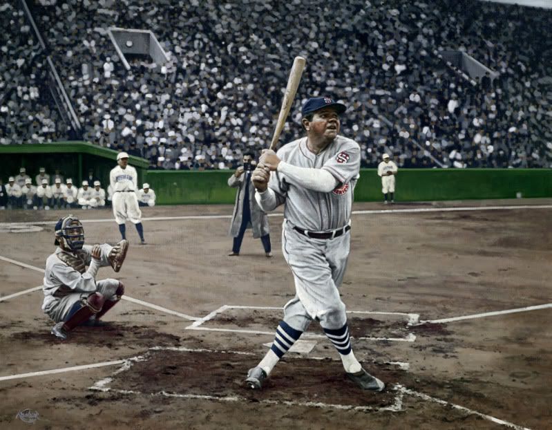 Man, I'm happy that it's gone. I can't even articulate how large this damn thing was. At 50" x 64", it's the largest canvas I've ever worked on, and in my small little studio, it only seemed that much larger. Anywho, depicted is Babe Ruth during a home run derby of sorts, at Meiji Jingu Stadium in Tokyo, November 4, 1934. That Sunday marked the first game the team of American All-Stars played during their tour of Japan, the one that was credited for really getting the Japanese excited about baseball. Being able to see stars like Ruth, Lou Gehrig, and Jimmie Foxx will do that to ya, I guess. By the way, have any of you guys seen the new auction at Heritage? I was browsing through the other night and found this AMAZING shot of Gehrig:  Anyone know anything about it? It looks like an early one, maybe even pre-27. Either way, it's part of a REALLY nice lot with some other shots of the great man. Actually, they're a bunch of REALLY nice photography lots in there, especially all of those cool panoramics. Heritage continues to amaze me with the quality of their wares! Now, if I could only afford it all! Graig
__________________
Check out my baseball artwork: www.graigkreindler.com www.twitter.com/graigkreindler www.facebook.com/graigkreindler
|
|
#373
10-26-2011, 06:25 AM
|
||||
|
||||
|
Hey all,
Speaking of Lou Gehrig, here's one that I'm working on now: 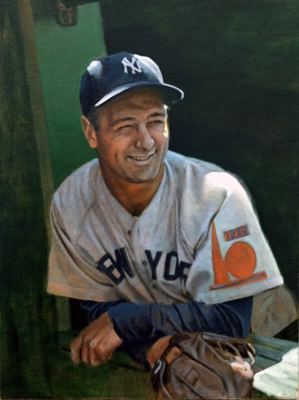 I've always loved this image, despite the fact that I normally don't love working from photos that were taken with flash. Though, I think the light from the illuminated clay next to the dugout reflects back into his uniform and face nicely. Or at least, it's my hope that it does. Anywho, thought I'd share! Graig
__________________
Check out my baseball artwork: www.graigkreindler.com www.twitter.com/graigkreindler www.facebook.com/graigkreindler
|
|
#374
11-22-2011, 02:07 PM
|
||||
|
||||
|
Hey all,
I don't know if I posted this one before, but it's almost done with: 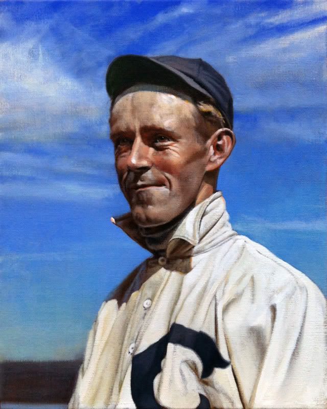 Evers had one hell of a cool face to paint, especially with those eyes and that forehead and jaw. Also, those '07 Cubs jerseys were beyond bad @$$ - and I can say that with confidence after seeing the new Marlins unis. Obviously it would be less comfortable and all, but man, I wish baseball jerseys looked like this. Anywho, I hope ya dig it! Graig
__________________
Check out my baseball artwork: www.graigkreindler.com www.twitter.com/graigkreindler www.facebook.com/graigkreindler
|
|
#376
11-23-2011, 09:25 AM
|
||||
|
||||
|
Thanks, Sean!!
I haven't really considered doing any of these in black & white, as I just don't think it would interest me as much. I guess the sentiment is, if I'm just recreating a black & white photo in black & white, then it seems kind of redundant to me. Then again, me doing what I do know might seem redundant to a lot of people, too. But, you can be sure there'll be more portraits from the '07 team - I already started one for Three Finger Brown!! G
__________________
Check out my baseball artwork: www.graigkreindler.com www.twitter.com/graigkreindler www.facebook.com/graigkreindler
|
|
#377
11-23-2011, 09:33 AM
|
||||
|
||||
|
stunning
|
|
#378
11-23-2011, 11:01 AM
|
||||
|
||||
|
sweet! Id just love to see what you could do with black and white regarding shadows and what not. On the other hand part of what makes your paintings so stunning is seeing these strictly black and white players in color
Speaking of which, whatever happened to this photo: Cubs1908.jpg
|
|
#379
11-24-2011, 10:25 AM
|
||||
|
||||
|
Graig,
This is truly some fascinating, incredible stuff. It blows my mind how true to life you make each of the elements, with my favorites being the old jerseys and the gritty dirt. Your attention to detail is unsurpassed. Now, the 2 big questions. I didn't see anywhere on your site where you can purchase prints of these pieces. Did I miss it, or are these works only available as paintings? If so, start selling prints to us poor folk!!!!!!! And, as a fellow New Yorker, any chance of recreating Willie Mays' time with the New York Mets? God, I would love to see your take on that. --elm
|
|
#380
11-25-2011, 09:13 AM
|
||||
|
||||
|
Sean, that's a good question. It's still on my 'to do' list. The problem is, that list is growing faster than I can paint. Originally, I wanted to have the thing done to display at our booth at this year's National in Chicago. But, we didn't end up getting one, since I didn't have much to show, so I guess the idea went to the back-burner. I REALLY hope I can to it soon, though. These deadball era images are just beyond inspiring.
Elm, thank you so much for the kind words - you make me blush!! As of now, there aren't any solid plans to do prints, though it's still something that my agent and I are looking into further. I think we're still just looking for the right opportunity - if there is one. But, if you'd like, you can keep an eye on my Facebook fanpage, as I'm hoping to run a contest soon to win a free painting (or maybe even two). Regarding Mays, well to be honest, I had not thought of painting him as a Met. But I must say, now I'm a bit intrigued. The idea of him coming back to NY in the twilight of his career, and only a shadow of his former self, it could make for a great narrative. Do you have any specific moments or photos in mind? Graig
__________________
Check out my baseball artwork: www.graigkreindler.com www.twitter.com/graigkreindler www.facebook.com/graigkreindler
|
|
#381
11-25-2011, 12:01 PM
|
||||
|
||||
|
Graig,
As usual the Evers painting is stellar. As you can imagine, I am still biased towards the Lou in the post above it. BTW, I'm going to try to get to the National in Balt this time. I really hope you set up so I can see some of those big one in person. The 16x20 I have is fantastic, I can only imagine how grand they look in the bigger sizes. Keep on painting! Mark
__________________
My signed 1934 Goudey set(in progress). https://flic.kr/s/aHsjFuyogy Other interests/sets/collectibles. https://www.flickr.com/photos/96571220@N08/albums My for sale or trade photobucket album https://flic.kr/s/aHsk7c1SRL
|
|
#382
11-25-2011, 06:54 PM
|
||||
|
||||
|
Quote:
--elm
|
|
#383
11-26-2011, 12:37 PM
|
||||
|
||||
|
Mark, you like Gehrig?
 I don't know if we'll be exhibiting in Baltimore, but as per usual, I'm very much hoping for it. I would imagine that I'll be down there either way (or at least, that's my hope). I guess it just all comes down to how much inventory stuff I can get finished in addition to the commissions. And of course, how much Dean cracks that whip (though I doubt he could do it anymore than he already does). Elm, that shot of him pleading is pretty iconic. I've seen it from plenty different angles as well. I guess that in a way, that shot of him symbolizes the whole plight of the Metropolitans (and certainly some of their fans). There's just always the sense of almost getting there... Which reminds me, I don't know if I ever posted this, but I did a small portrait of Mr. Kranepool for a client a while back - thought you might dig it! 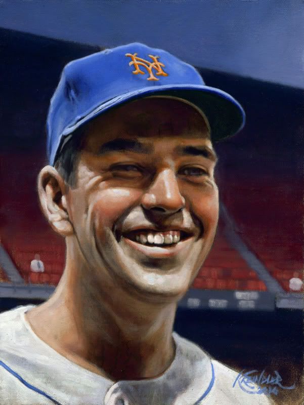 Graig
__________________
Check out my baseball artwork: www.graigkreindler.com www.twitter.com/graigkreindler www.facebook.com/graigkreindler
|
|
#384
11-26-2011, 02:46 PM
|
||||
|
||||
|
Graig,
When I typically view a painting of a sports figure there's always something that seems a bit off (Rockwell excluded). As I viewed your paintings almost all seem to jump out out at you and grab your attention. I'd love to see a Brooks Robinson painting that did that; I haven't seen one since "Thanks Brooks" was painted. Also, I haven't seen an early career Brooksie painting as well. All seem to revolve around the '70 season, for some reason  Love your work! Regards, Mark
|
|
#385
11-26-2011, 04:33 PM
|
||||
|
||||
|
Thanks for the very kind words, Mark!
Rockwell was pretty much second-to-none when it came to this kind of stuff. Actually, I would say that applied to most of his art - the man was one of the greatest visual storytellers of all-time. Whether one thinks his work is sappy or trite, they can't deny the fact that it at least evokes some sort of sentiment - something that I don't think many people can do with their work. I've done one Brooks painting, actually. It's from almost five years ago, so I don't know if I had ever posted it on here or not. 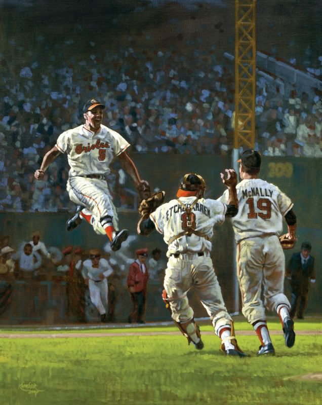 The photo might be a little washed out, so I apologize for that. The client I did it for seemed to be very much into Baltimore teams, as I also did one of Alan Ameche's drive in the '58 Championship Game at Yankee Stadium (one of my father's least favorite moments of all-time) for him. He even said he wanted me to do one of the Bullets as well, but he never followed through with the plan. Anywho, he seemed really happy with this one when I dropped it off, so I hope he still is. And worry not, they're definitely more Brooks paintings on the way. I just hope they're sooner than later. I would also kill to do a Frank Robinson or Jim Palmer. Ohh, and definitely Mike Cuellar. I guess the list goes ever onwards. Graig
__________________
Check out my baseball artwork: www.graigkreindler.com www.twitter.com/graigkreindler www.facebook.com/graigkreindler
|
|
#387
11-26-2011, 05:22 PM
|
||||
|
||||
|
Thanks a lot, Jay!! I'm glad you're diggin' it.
__________________
Check out my baseball artwork: www.graigkreindler.com www.twitter.com/graigkreindler www.facebook.com/graigkreindler
|
|
#388
11-26-2011, 10:05 PM
|
||||
|
||||
|
Graig,
All I can say is WOW!! That has to be one of my favorite paintings; gotta love Brooks, Andy and Dave in the '66 WS. I really love the way you did this painting. This one also jumps out at you and brings me back to that day in history; LOVE IT! I have this particular picture and the detail in your painting is better than the original photo. Thanks so much for posting the pic. I definitely dig it. Oh, our family were BIG Colts fans (Baltimore that is...) so the Alan Ameche's TD's was one of my fathers favorite moments of all time; I wasn't quite around then, but he talked about it as a very exciting game from the past. Just a little side note we moved from MD to NJ when I was younger and the company my father worked for had box seats on the 3rd base side in Yankee stadium so when the O's were in town he'd get the tickets. Loved watching your name sake growing up (even though Brooks was my hero!); he was a great third sacker.
|
|
#389
11-27-2011, 01:37 PM
|
||||
|
||||
|
Quote:
I have been beating the drum for two years now to be able to buy prints of your work. I am not the only one who feels this was as noted by a number of people in this thread alone. I know I will probably never be able to purchase an original work of yours but I would love the chance to be able to be able to add a print of your work to my collection. Your work would look great framed and matted hanging on my sports room wall. I know there are start up costs that go along with making prints of your work but I am sure you could make your money back and turn a profit by selling these prints of your work. You would sell a ton at the National alone!! Get your agent working on this project!! LOL I just want the chance to get litho number 1 that is hand signed by you of the Matty!! Keep up the usual great work. You are a true artist!! Andrew
|
|
#390
11-29-2011, 01:01 PM
|
||||
|
||||
|
Quote:
Separated at birth? 
__________________
$co++ Forre$+
|
|
#392
12-07-2011, 09:15 AM
|
||||
|
||||
|
Hey guys,
Here are two more I just got back from the photographers: 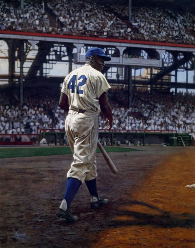 Jackie Robinson, August 28, 1949, 46" x 56" 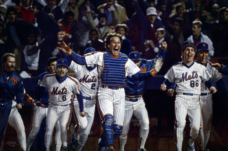 Gary Carter and his boys, October 25, 1986, 30" x 45" I gotta admit, I'm really scared even sharing these, as they're both pretty important paintings for me professionally. The Jackie canvas is going to a pretty high-profile client, and if it's loved, can open some serious doors. Also, it's going to be hung somewhere with a lot of visibility. The Mets one is kinda in the same situation - it will be auctioned off at the B.A.T. dinner in January, which will be attended by tons of former and current players, many Hall of Famers, media and probably other people I don't even think I want to know about. So, yeah, I just really hope that they're both loved not only by the clients, but by everybody. I just feel like there's gonna more scrutiny over these than some of the other stuff I've done. And believe me, I'm extremely grateful to even have people looking at this stuff, but I'm still shaking in my boots. Gaaahh!! Graig
__________________
Check out my baseball artwork: www.graigkreindler.com www.twitter.com/graigkreindler www.facebook.com/graigkreindler
|
|
#393
12-07-2011, 09:45 AM
|
||||
|
||||
|
Quote:
congrats! high profile client eh? can we get a low profile hint good luck on the auction. I hope bill buckner wins it
|
|
#394
12-07-2011, 11:30 AM
|
||||
|
||||
|
I dont think you have anything to worry about as those two paintings are among your best work......although I hate the Mets!! LOL.
Seriously....you have NOTHING to worry about!!
|
|
#395
12-07-2011, 12:03 PM
|
||||
|
||||
|
Graig,
Both of these paintings just blew me away! They just pop and jump off the canvas. Their new owners are going to love them!
Last edited by Scott Garner; 04-11-2012 at 04:41 AM.
|
|
#397
12-07-2011, 02:57 PM
|
||||
|
||||
|
That Jackie Robinson is one of your 2 best paintings, Graig. Really impressive work - love it. You have nothing to worry about.
And I suspect there'll be quite a crowd around that Mets painting at the BAT dinner, as your paintings created last year. Great work buddy!
|
|
#398
12-07-2011, 05:41 PM
|
||||
|
||||
|
That Jackie painting might be my favorite of them all. Your treatment of the lighting is extraordinary, and the way he emerges from the shadowed area is nothing short of epic. It feels almost symbolic in nature, as if Jackie is representative of Baseball's "coming into the light" in the dawning of a new era.
I've never seen this pose before, and it's about as nice as any Jackie image I can imagine. Even the background setting is among the most interesting I can recall. Beautiful colors and vibrant use of light... One of your most dramatic, and best-ever, Graig! Last edited by perezfan; 12-07-2011 at 05:49 PM.
|
|
#399
12-07-2011, 05:50 PM
|
||||
|
||||
|
Quote:
|
|
#400
12-07-2011, 06:19 PM
|
|||
|
|||
|
Quote:
You should be a writed. Your descriptive nature is unbelievable....................... In fact - Graig should hire you to write the copy for his paintings. Jerry
|
 |
|
|
 Similar Threads
|
||||
| Thread | Thread Starter | Forum | Replies | Last Post |
| 68 Topps 3D Easel | Archive | Postwar Baseball Cards Forum (Pre-1980) | 1 | 04-22-2008 02:17 PM |


 Linear Mode

