|
||||||
 |
|
|||||
|
||||||
|
|
|||||
|
|||||||
| View Poll Results: Was this image used as a reference for the #61 1934 Goudey card by the artist. | |||
| YES |
|
27 | 67.50% |
| NO |
|
13 | 32.50% |
| Voters: 40. You may not vote on this poll | |||
 |
|
|
Thread Tools | Display Modes |
|
|
|
#1
 12-15-2012, 11:15 AM
|
||||
|
||||
|
Good afternoon Gents,
I picked up this fantastic Gehrig photo this month. Do you think it was used as the reference for a 1934 Goudey card by the artist? Why or why not? Ben
__________________
[I]"When you photograph people in colour you photograph their clothes. But when you photograph people in B&W, you photograph their souls." ~Ted Grant Www.weingartensvintage.com https://www.facebook.com/WeingartensVintage http://www.psacard.com/Articles/Arti...ben-weingarten ALWAYS BUYING BABE RUTH RED SOX TYPE 1 PHOTOGRAPHS--->To add to my collection Last edited by Forever Young; 12-15-2012 at 11:22 AM. 
|
|
#3
12-15-2012, 11:37 AM
|
||||
|
||||
|
I am Not a photo guy but collected some photos with regard to them being made into cards. As I did it, and as is with this photo, I would want more of an exact match to say this is definitely the right photo for the card. However, I am not 100%, it's just a guess. Travis could be right....
__________________
Leon Luckey
|
|
#5
12-15-2012, 12:29 PM
|
||||
|
||||
|
I'd say you've got a match, Ben.
Sometimes, I know it can be hard to tell what's what when it comes to cards that have been illustrated. That's usually so because when these artists were hired (whether freelance or out of source), the art directors (or whomever was the acting art director) would most likely provide each artist with the photos they'd be using for reference, or access to someone who had them. And most certainly, they were also given certain parameters to follow in terms of size and dimension. Because of that, certain changes were made to these illustrations. The best example I can think of off the top of my head is the '51 Bowman Mantle rookie card, as well as the photograph that was used to make it: 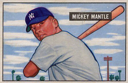 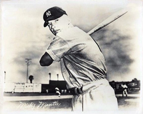 I think it's fair to say that the card was illustrated with the photo as reference. They do look very similar: the pose, the likeness, the uniform folds, positioning of the bat, etc. However they ARE some subtle differences that were made by the illustrator with the final product in mind - the final product being a baseball card that is only a fraction of the size of the photo, as well as the original painting. If we look at the bat in both images, you'll see that the photo has the branding on it, and on the card, it's gone. There's no doubt in my mind that that was done either because the artist knew that having even an indication of the branding might compete with the nameplate on the card, but most likely, he/she knew that the image was going to be shrunk down so much, so that fine detail would end up being lost. And then there's the issue with the palm trees and the telephone pole. In the card, they're placed in spots that are different from the photo. In this case, the artist probably just wanted to take some of those background elements and pop them into that small rectangle, mainly to give a sense of space with the whole thing. You'll notice that if the photo was cropped just like the card, all of that stuff is either not visible or in a different place: 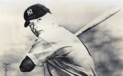 So, with that in mind, I think you can take a lot of that same thinking and add it to the Gehrig photo and card. You have the jersey folds being incredibly similar, and even the way the pinstripes fall on them. The hands are the same, as is the positioning of the bat. And, the lighting on the jersey is also very similar in both the photo and card. The face, although lit differently than the photo, is angled the same and though stylized, still exhibits the same characteristics of the real portrait. The hat that Gehrig wears on the card is a bit different than what he has on the photo, but I think that just goes back to the particular dimensions that the artist had to work with. If the hat was depicted as it was in the photo, it would be cropped across the logo, something that I'm sure wouldn't have made the Goudey people happy. The artist most likely made the adjustment and lowered the thing to fit into the whole frame - a bit of license had to be taken with the look of it. Long story short, since an illustration is going to differ a little bit from the source, you can't say with 100% assurance that it's. But, if we all agree (not just from what we see on the boards, but even in the books that we've read - Yee's book comes to mind) that that Mantle photo was used to make the Bowman card, then the same should be said for this Gehrig photo. From an artist's point of view, Ben's Gehrig photo HAS to be the one the illustrator had in hand while he/she was painting the original artwork used for that Goudey card. I'm not sayin'. I'm just sayin'. Graig
__________________
Check out my baseball artwork: www.graigkreindler.com www.twitter.com/graigkreindler www.facebook.com/graigkreindler
|
|
#6
12-15-2012, 12:41 PM
|
||||
|
||||
|
Quote:
I was hoping you would give your opinion on this one. Thank you for your point of view on this as an artist. Travis and steve.. I agree with you and purchased it because of this. Leon, I completely see what you are saying. I knew there would be some with your opinion. I created the poll to see the breakdown of both views.. Thanks! Ben
__________________
[I]"When you photograph people in colour you photograph their clothes. But when you photograph people in B&W, you photograph their souls." ~Ted Grant Www.weingartensvintage.com https://www.facebook.com/WeingartensVintage http://www.psacard.com/Articles/Arti...ben-weingarten ALWAYS BUYING BABE RUTH RED SOX TYPE 1 PHOTOGRAPHS--->To add to my collection Last edited by Forever Young; 12-15-2012 at 02:28 PM.
|
|
|
|
 Similar Threads
|
||||
| Thread | Thread Starter | Forum | Replies | Last Post |
| 1933 Goudey Baseball Cards: Ruth, Gehrig, Foxx, & Ott - Are these Legit or Fakes? | meatloaf | Net54baseball Vintage (WWII & Older) Baseball Cards & New Member Introductions | 12 | 12-29-2011 06:04 PM |
| 1934 Goudey Gehrig Raw Question???? | jg8422 | Net54baseball Vintage (WWII & Older) Baseball Cards & New Member Introductions | 8 | 07-20-2011 01:49 PM |
| WTB Gehrig -- 33 Goudey 5/6 | becollie | 1920 to 1949 Baseball cards- B/S/T | 0 | 06-28-2011 11:30 PM |
| Fake '33 Goudey Lou Gehrig card on eBay | iggyman | Net54baseball Vintage (WWII & Older) Baseball Cards & New Member Introductions | 26 | 04-19-2010 11:15 AM |
| Question about 1933 Goudey Lou Gehrig Cards | Archive | Net54baseball Vintage (WWII & Older) Baseball Cards & New Member Introductions | 3 | 12-01-2006 11:49 AM |


 Hybrid Mode
