|
|
#1251
|
|||
|
|||
|
Wonder if Ted Z would know or have sheet scan
|
|
#1252
|
|||
|
|||
|
There should be.
|
|
#1253
|
|||
|
|||
|
I will not be scanning all 36 pairs of cards in this set as the variation is the same on all 36 of the cards in series 6. These are the tow I have so far. Notice that the top version has the player name almost touching the position and team name and the logo is colliding with the word underneath it. On the bottom version, the name and logo are positioned properly so as to not collide and have a gap over the name and position.
|
|
#1254
|
|||
|
|||
|
Darn Thomas. I added the copyright and no copyright variants for my set but not this anomaly. On the other hand while I do almost any recurring variant for my Topps sets I have tried to stick to variants listed by SCD, Beckett and The Registry for my Bowman sets. You are messing that up.

|
|
#1255
|
|||
|
|||
|
It's hard to tell if that's a variation, or just bad registration.
Even for the era, that's pretty bad registration, especially for Bowman. Fixing registration is so easy I can't imagine they'd have just let it go as-is for any length of time. If it was Leaf that would be different. It's interesting that it's not just scattered cards, and in no other series too. Overall, It's consistent enough that I think it is a variation. |
|
#1256
|
|||
|
|||
|
Quote:
|
|
#1257
|
|||
|
|||
|
I might do better if I just saved money instead of buying cards
|
|
#1258
|
||||
|
||||
|
Searching the bay last night I realized my Luis Aloma was not a dirty/defective card but rather a normal one.
In the upper left border area, you can see a small part of the border missing as well as, what I thought, was something that got spilled on my card just going by the way the clouds/that area looks. Searching now, I see the majority/all of these cards have the same print defect. Mine has a small red print mark on the lower right corner which is also common but is not on all cards. Nothing earth shattering, obviously, just something that surprised me is all. 
__________________
52 Topps cards. https://www.flickr.com/photos/144160280@N05/ http://www.net54baseball.com/album.php?albumid=922 |
|
#1259
|
|||
|
|||
|
Dale-- irishhosta has been trying to sell that recurring print defect for $200 on eBay for some time. He usually has a lot of 52 variants listed for high prices, most of which can be found on eBay at regular prices if you look for them.
|
|
#1260
|
||||
|
||||
|
Quote:
I've seen some of Irish Hosta's cards and always wondered if he was related to Dean? 
__________________
52 Topps cards. https://www.flickr.com/photos/144160280@N05/ http://www.net54baseball.com/album.php?albumid=922 |
|
#1261
|
||||
|
||||
|
There is a recurring print flaw on the 1984 Topps Buddy Bell and Johnny Ray cards that are side by side on a 1984 Topps uncut sheet, I don't believe it reaches the Boggs but it may affect the Kittle. Something partially blocked the final black ink coat of the border lines in the printing process. I knew about the Bell for years but recently found out about the Ray.
|
|
#1262
|
|||
|
|||
|
Good ones Cliff. You are on a roll
|
|
#1263
|
||||
|
||||
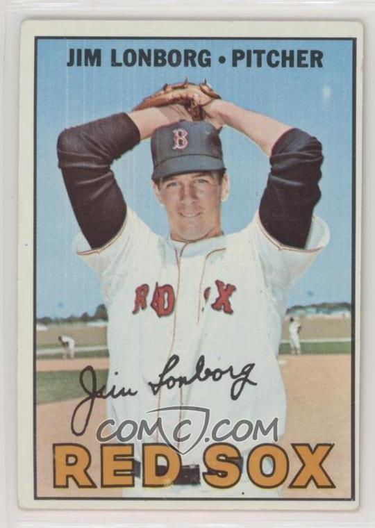
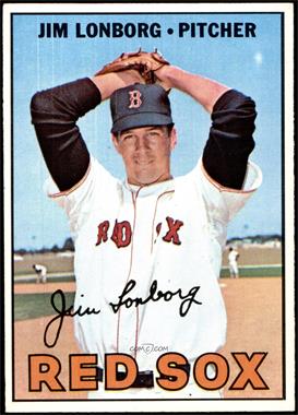
 1967 Topps #371 Jim Lonborg - recurring print defect of vertical lines in sky.  1967 Topps - [Base] #371 - Jim Lonborg [EX+] Courtesy of COMC.com Seems to be paired with the white splotch print defect over his left elbow.
__________________
-- PWCC: The Fish Stinks From the Head PSA: Regularly Get Cheated BGS: Can't detect trimming on modern SGC: Closed auto authentication business JSA: Approved same T206 Autos before SGC Oh, what a difference a year makes. |
|
#1264
|
|||
|
|||
|
Quote:
.. |
|
#1265
|
|||
|
|||
|
Had not seen that one John
|
|
#1266
|
||||
|
||||
|
You can call it the Marionette version, since it looks like he's hanging from strings. ;-)
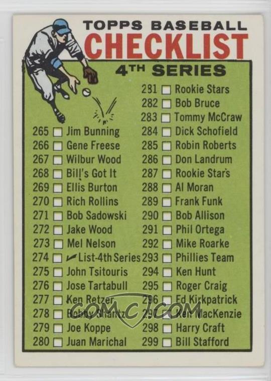
Here's another I spotted today. COMC makes it so easy by putting multiples of a card right next to each other: Recurring Print defect of a fake apostrophe on 1964 Topps #274 checklist. #287 looks to say "Rookie Star's" but it is a spot.  3 of the first 12 on COMC's raw page have the errant spot.
__________________
-- PWCC: The Fish Stinks From the Head PSA: Regularly Get Cheated BGS: Can't detect trimming on modern SGC: Closed auto authentication business JSA: Approved same T206 Autos before SGC Oh, what a difference a year makes. |
|
#1267
|
|||
|
|||
|
Hey John---it is my impression almost all of the 1960s and many 1970s Topps CLs are DPs and variances can be found in most of them, albeit sometimes pretty subtle cropping differences.
On this one, not only the errant dot but note the 281 number and the K in Ken on 277 have defects. On the other version they are ok, although the R in Rookies in 281 has a slight defect on that version. Plus there is a very slight green bleed into the boxes in the version you posted. They are clear on the other version. The dot version seems to appear only on the version you posted Last edited by ALR-bishop; 07-17-2019 at 10:02 AM. |
|
#1268
|
||||
|
||||
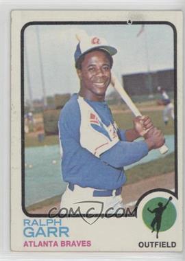
 1973 Topps - [Base] #15 - Ralph Garr [Good*to*VG‑EX] Courtesy of COMC.com Recurring black print defect in the top border. Most fisheyes in 1973 Topps on the borders are white. There are at least 4 of these on COMC.
__________________
-- PWCC: The Fish Stinks From the Head PSA: Regularly Get Cheated BGS: Can't detect trimming on modern SGC: Closed auto authentication business JSA: Approved same T206 Autos before SGC Oh, what a difference a year makes. |
|
#1269
|
|||
|
|||
|
Picked up a Gossage rookie for my set, and noticed it has quite prominent 'yellow bleed'. Haven't seen it mentioned before, but I only casually collect 1973's.
Note the yellow patch in the grass by his knee, the yellow on his pitching arm, a spot on his glove, and on his 'personal area': |
|
#1270
|
|||
|
|||
|
Good thing the yellow is not limited to the latter
|
|
#1271
|
||||
|
||||
 Sent from my iPhone using Tapatalk
__________________
I have counted the stitches on a baseball more than once.[/B] My PM box might be full. Email: jcfowler6@zoominternet.net Want list: Prewar Pirates items 1909 Pirates BF2 Wagner Cracker Jack Wagner and Clarke Love the hobby. |
|
#1272
|
||||
|
||||
|
That is awesome, print offsets are among my favorite cards.
|
|
#1273
|
||||
|
||||
|
PSA should have given that an OF qualifier. A straight EX 5 is a gift, IMO.
__________________
-- PWCC: The Fish Stinks From the Head PSA: Regularly Get Cheated BGS: Can't detect trimming on modern SGC: Closed auto authentication business JSA: Approved same T206 Autos before SGC Oh, what a difference a year makes. |
|
#1274
|
|||
|
|||
|
Maybe the grader thought Wagner actually looked like that.
|
|
#1275
|
||||
|
||||
|
Quote:

|
|
#1276
|
|||
|
|||
|
1970 Topps Stan Bahnsen (#568) - sheet markings on the left, a bit more than the Slit markings you usually see on these sheet edge cards
|
|
#1277
|
|||
|
|||
|
1962 Mack Jones #186 - can be found with or without a small line at the bottom of the stat box that is not filled in with brown. This version is tougher, but both are on comc. The version shown here with the line, also has a similar line on bottom of the cartoon.
Last edited by G1911; 08-08-2019 at 11:06 PM. |
|
#1278
|
|||
|
|||
|
Is the front of the card a green tint ?
|
|
#1279
|
|||
|
|||
|
Is this the greenie or regular version? Thanks.
|
|
#1280
|
|||
|
|||
|
This is the regular card - I have never seen a green tint with this misalignment, but Ive only casually looked for a couple years.
|
|
#1281
|
|||
|
|||
|
In checking my set I have the green version and the version you posted above. I guess that means I now have to go out an get a "normal" version

|
|
#1282
|
|||
|
|||
|
Quote:
1966 Topps #150 Rocky Colavito - recurring green dot on arm (circled in blue, the blue circle is to highlight, not on the card!) |
|
#1283
|
|||
|
|||
|
1966 Topps #260 Bob Shaw - recurring white mark below team name. Mark is on maybe 10-15% of the cards.
|
|
#1284
|
|||
|
|||
|
1966 Topps #113 Hank Aguirre. There's a lot of them here, I don't think what I have at present is comprehensive of this card. I circled the key points to highlight them
Top left - No recurring green dot in banner, series of white speckles to left, and a couple to right, of face. Top right - single white speckle to left of mouth, single white speckle above object in bottom right Bottom Left - Recurring green dot in Tigers banner, Oddly color-distorted spot on neck (this neck splotch IS recurring but is extremely difficult to find), single white Spoeckle to left of face, single white speckle above object in bottom right Bottom Right - Green dot in banner, standard two speckles, the one to the right above object at bottom, and to the left of his mouth. ALL cards seem to have 1 white pixel to left of mouth, and at right above whatever the object in the bottom right corner is. Some have a wider speckle pattern, which is not too hard. The green mark in the team banner I would say is between 5-10% of cards. The oddly bright-colored neck patch is very, very tough to find. |
|
#1285
|
|||
|
|||
|
This series of white speckles is not very tough on Aguirre; it is also present on card 161 of Jerry Lumpe, where it is not so common.
My copy of the speckles happens to also be the well-known print error with the missing wedge from the name banner by "2nd Base". I haven't seen this version on the normal card yet, but have not looked too closely for a copy. |
|
#1286
|
|||
|
|||
|
Most 66 Topps cards have the team banner ending at the top before it reaches the black line, though there is a blank spot in the borders black line where the banner is. #173 Al Spangler has a variation or recurring defect here, where the banner extends into the top border, past the black frame of the card top.
There is also a version where the banner is about exactly equal with the black frame line (second picture). The card where the purple team banner notably exceeds beyond the black frame line has a variation, where there is or is not a red dot in the banner. The version without the dot can also exceed the frame on the left side. Easiest is the normal card, with banner below frame. Card with banner about equal to frame is tougher but not very hard. Card that notably exceeds the black frame (easier to see in person), is tougher. Seems about 50/50 on if this card will have the red dot. There are at least 5 different versions here, possibly more combinations. This frame defect does not seem to regularly affect other cards. |
|
#1287
|
|||
|
|||
|
#112 Manny Mota - with red spot on cap. This is recurring, but it is very, very tough from what I can tell. Looks like 1% or so maybe
|
|
#1288
|
|||
|
|||
|
#41 Don Le John has several versions
A) No yellow mark in Dodgers Banner B), small dot shape yellow mark to right of "S" C) small dot shape yellow mark above "S" D) Thin yellow line above "S". Regular is most common. The thin line is a tough one, and the dots you can find pretty easily on comc - Maybe 15% again. The tougher Line is pictured here as my others are in a different box that I can't remember where I put lol Last edited by G1911; 08-09-2019 at 04:42 PM. |
|
#1289
|
|||
|
|||
|
#25 Pete Ward - with or without a red dot above his cap, near the end of his bat.
Both versions are very, very easy. Maybe 35% have the red dot |
|
#1290
|
|||
|
|||
|
#58 Dave Wickersham
A) no green on arms B) bright green spot on glove arm C) lighter green spot on pitching arm Last card is not really a defect, just an example of how vastly the images change through a printing run, with none of the blue tint to the sky, his uniform, or the grandstands I have not seen a card with the green areas on both of his arms |
|
#1291
|
|||
|
|||
|
y'all able to tell 1966 is my favorite Topps set? Here's a 1961, #6 Ed Roebuck. Red printing splotch above the "k" in Roebuck, on his jersey. Only seen one other like this, though I haven't scoured that closely as I already have a copy. Certainly an uncommon one.
|
|
#1292
|
|||
|
|||
|
Here's an easier '61. Alex Grammas, card 64, with or without a black dot on back of his neck. The black dot is tougher than the regular card but this is an easy one, maybe 25% or so have it. Easily bought cheap on comc.
|
|
#1293
|
|||
|
|||
|
And another really easy 1961 Topps. Bill Henry #66 is found with or without a red pixel in the grass, in the bottom right by his pant leg.
The red dot variation is on maybe 35% of cards. |
|
#1294
|
|||
|
|||
|
And this one is even easier! Joe Pignatano, #74. Note the 'crack' line running from the right hand border across the card to his elbow.
I think this card is found with this 'crack' in it about 50% of the time. Tons of them to choose from. |
|
#1295
|
|||
|
|||
|
#75 Lindy Shows Larry. Finding pigmentation differences in common on every vintage Topps card, but this one seems to really exceed what is normal. The card can be found with both mens' pants white and light faces, or glowing red faces red pants, and red grass. Looking at my copies, I think this is more than the result of cards coming out bright or light depending on the ink levels used when the sheet was printed. Some of the red spots really shouldn't have red there in any amount, and don't on the 'correct' copies of the card. This is not a rare one to find at all, pretty easy recurring defect if this meets ones definition.
EDIT - my iPhone has a hard time picking this up, you can see it in the photo but it is truly blindingly obvious if you have both cards in person Last edited by G1911; 08-09-2019 at 05:43 PM. |
|
#1296
|
|||
|
|||
|
1961 Topps series 1 again. 83 Bob Bruce has a red spot on jersey near his neck. Maybe 10% of the cards have it? Not too tough
|
|
#1297
|
|||
|
|||
|
Possible variants, I have not encountered a corrected copy of these defects, but thought I should note them as there may well be variants here in your guys collections:
1961 Topps #115 Johnny Antonelli - red dot by ear, right side. 1965 Topps Manny Mota - white splotch interrupting part of ".259" in lifetime batting average. 1966 Topps #120 Harmon Killebrew - stray blue line by ear |
|
#1298
|
|||
|
|||
|
1961 Topps 137 Chuck Dressen - big yellow splotch in red banner. Topps sure seemed to struggle with random yellow ink getting into places it shouldn't for a good 30 years or so. This one is very, very tough to find.
The lines through his face from the frame are pencil marks, not part of the printing |
|
#1299
|
|||
|
|||
|
And speaking of 1961 Topps and yellow problems, here's another toughie. 159 Orioles Team card, with yellow streak in name box
The other arrow is pointing to a white splotch above one of the players heads. It is difficult to see, even in person, and its hard for me to tell how recurring or rare this is as my eyes have a tough time here on scans. |
|
#1300
|
|||
|
|||
|
1961 Topps card 178, Bob Nieman. With or without a blue splotch in the sky next to his ear. This version with the blue splotch is less common, I think maybe 5% or so.
|
 |
|
|
 Similar Threads
|
||||
| Thread | Thread Starter | Forum | Replies | Last Post |
| 1966 Topps High # Print Variations | 4reals | Postwar Baseball Cards Forum (Pre-1980) | 9 | 04-27-2014 06:05 PM |
| Are these variations or print defects? | savedfrommyspokes | Postwar Baseball Cards Forum (Pre-1980) | 16 | 02-09-2013 11:52 AM |
| Well known print defects. Do variations exist without? | novakjr | Postwar Baseball Cards Forum (Pre-1980) | 9 | 01-28-2011 04:32 PM |
| Finally confirmed - d311 print variations exist! ("bluegrass" variations) | shammus | Net54baseball Vintage (WWII & Older) Baseball Cards & New Member Introductions | 8 | 09-03-2010 07:58 PM |
| Wanted: T206 Print Variations and Errors | Archive | Tobacco (T) cards, except T206 B/S/T | 1 | 01-04-2007 07:23 PM |