|
|
#1151
|
||||
|
||||
|
It may have been posted somewhere else, but I do not recall seeing this variation before in this thread.....Richard's list, which contains most all of the variations from this thread, shows a variation for this card, but it is a variation involving Lyle's eye direction. Could that be the variation for this card that you have and one copy coincidently had the white slash?
|
|
#1152
|
|||
|
|||
|
You mean I have to go back and check the eyes now ?
I have to put little labels on my variants noting the difference, because often I can’t remember or see it. On this one I had noted the slash Last edited by ALR-bishop; 10-08-2018 at 03:08 PM. |
|
#1153
|
||||
|
||||
|
I'm sure this one has been discovered YEARS AGO, but just in case. 1966 Topps #582 with blue circle in the sky. The "variation" seems like it's on roughly 1/3 of the cards (SWAG).

|
|
#1154
|
|||
|
|||
|
How does a card with a worm hole on it get a 9 ?
|
|
#1155
|
||||
|
||||
|
Worm holes are awesome.

|
|
#1156
|
||||
|
||||
|
Not sure if this series of variations qualify as a "progressive" variation or not?? The first card shows a single white streak in the sky above the right shoulder. Richard's list mentions this variation. There is a second variation I noticed has a second white streak below the first streak...the first streak is more to the right though. Finally, the third card shows nearly this entire area white. The amount of white appear to grow with each card in this progression.
|
|
#1157
|
|||
|
|||
|
I have one like the one on the left in your post, but not like the two to the right. This other one I have looks a little different too
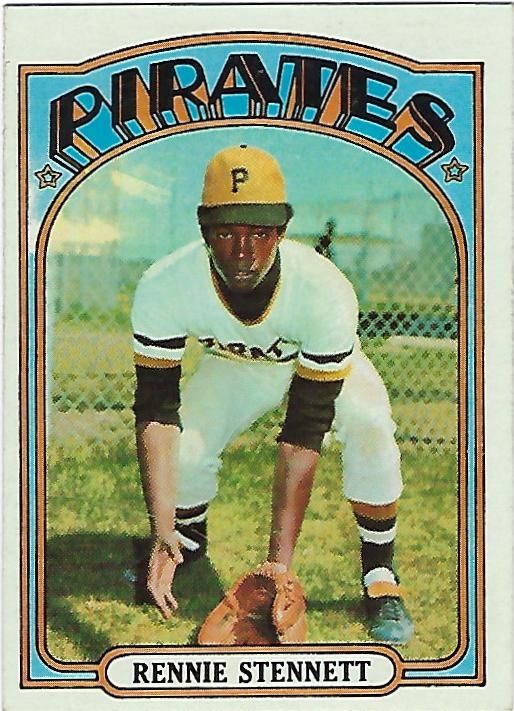
|
|
#1158
|
||||
|
||||
|
Very nice Al, a 4th variation....looks like this card's variation is a progressive variation. Appears that your variation would fit well as the third of four in the progression of least white to the most white. I wonder if there could be a fifth and where it might fit in?
|
|
#1159
|
||||
|
||||
|
Quote:

__________________
All the cool kids love my YouTube Channel:
Elm's Adventures in Cardboard Land  https://www.youtube.com/@TheJollyElm Looking to trade? Here's my bucket: https://www.flickr.com/photos/152396...57685904801706 I was such a dangerous hitter I even got intentional walks during batting practice. Casey Stengel Spelling "Yastrzemski" correctly without needing to look it up since the 1980s. Overpaying yesterday is simply underpaying tomorrow.  |
|
#1160
|
||||
|
||||
|
No doubt....maybe we should have finished the index for this thread

|
|
#1161
|
||||
|
||||
|
Ha ha! My thoughts exactly!!!!!!
__________________
All the cool kids love my YouTube Channel:
Elm's Adventures in Cardboard Land  https://www.youtube.com/@TheJollyElm Looking to trade? Here's my bucket: https://www.flickr.com/photos/152396...57685904801706 I was such a dangerous hitter I even got intentional walks during batting practice. Casey Stengel Spelling "Yastrzemski" correctly without needing to look it up since the 1980s. Overpaying yesterday is simply underpaying tomorrow.  |
|
#1162
|
|||
|
|||
|
I guess that earlier post by Darren is why I had mind
Last edited by ALR-bishop; 11-24-2018 at 10:32 AM. |
|
#1163
|
|||
|
|||
|
This has probably been noticed before by others, but I found it and have it here. The blue line recurs a LOT as about half of these cards have it.
|
|
#1164
|
||||
|
||||
|
Quote:
Johnson (Hands at Chest) PD350.jpg |
|
#1165
|
||||
|
||||
|
Post 692 in this thread shows a few additional progressions to the blue line seen on this card.
|
|
#1166
|
|||
|
|||
|
Here's a strange Joe Page 1950 black reverse overprint I found, the subject of another thread.
|
|
#1167
|
|||
|
|||
|
Quote:
|
|
#1168
|
||||
|
||||
|
As an example, here is a link to 692
http://net54baseball.com/showpost.ph...&postcount=692 Otherwise using the manual process of scrolling through the thread looking for it...... |
|
#1169
|
|||
|
|||
|
....or describe what you are looking for in a new post and hope someone here goes and finds it for you

|
|
#1170
|
||||
|
||||
|
Actually, the post can be found by going to the top right corner of the thread and click the down arrow next to the page numbers. Then divide the post by 10, and go to that page (or the one next to it). Presuming you have the standard 10 posts per page. If you've changed your preferences to change the number of posts per page, divide that number.
And since I'm here: 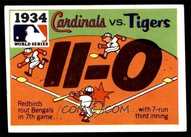 Looks like a bunch of Laughlin #32 were printed without the black ink pass, so that the 11-0 is transparent. Not sure if these cards were printed as one card per sheet, or if this would be widespread across the rest of the series.
__________________
-- PWCC: The Fish Stinks From the Head PSA: Regularly Get Cheated BGS: Can't detect trimming on modern SGC: Closed auto authentication business JSA: Approved same T206 Autos before SGC Oh, what a difference a year makes. |
|
#1171
|
||||
|
||||
|
Here is another variation within a variation. The obvious/known variation is that the word "Outfield" is on the card. In flipping few a few of the OF copies, there is, along the lower left area of the image, what appears to be a hand/finger print smudge of sorts. This smudge is more obvious in hand.
I did not see any of the copies w/o "Outfield" that have this smudge. Possibly someone caused this smudge while reviewing the correction? |
|
#1172
|
||||
|
||||
|
While it is well known about the cropping variations with the 63 Topps mid series cards, I noticed something new (at least to me) on the back of one of the cropping variations. On the back of the 387 McBean card, the text below the animation box starts with "Al". Corresponding to the front cropping variations, half of the cards have a yellow "A" and the other half have a white "A" in "Al". Also, on the yellow "A" card, the white box that the card number is printed in is smaller than the white card number box on the white "A" card.
|
|
#1173
|
|||
|
|||
|
If I recall in his SCD article on the 63 cropping differences George Vrechek did note the difference on the back of the McBean card. I think the article had comparison scans of the differences in all the cards involved ( 11 ? ), which was very helpful in tracking them down.
Not sure if it showed up earlier in this thread edit---here is SCD article http://r.search.yahoo.com/_ylt=A0geJ...zWC9manHnPNYw- Last edited by ALR-bishop; 12-17-2018 at 12:10 PM. |
|
#1174
|
||||
|
||||
|
There are also differences on the backs of the 1963 Topps double prints Norm Cash and Johnnie Wyatt, although they are more subtle. In the stat box on half of the Cash cards the line can be continuous all the way through between 3B and HR nearly touching the career HR 102 or it can be found with a shorter line on the other half of the Cash cards so that the line is not touching the number of 102 career HR’s, and on half of the Wyatt cards the line between Year and Team is continuous and nearly touches the 1957-58 stat, on the other half of Wyatt cards the line is purposely broken so that it doesn’t touch 1957-58.
Last edited by Cliff Bowman; 12-17-2018 at 10:27 PM. Reason: Added scans |
|
#1175
|
||||
|
||||
|
Al, that was a good article. It has been a few years since I last read it, so I didn't remember the parts about the differences on these card backs. Like Cliff mentions, there are differences on many of the backs of these 11 cards. For example, on the Davenport card back, the white card number box is bigger on one version than the other.
|
|
#1176
|
|||
|
|||
|
Notice in the left version that the ball in the inset is touching the inset margin, while in the right version it is not touching. His body in the inset is more present in the left version as well. In the main photo, the left version has the know of theta into the left margin, while the right version has the knob almost entirely IN the picture. The right version has his sweatshirt almost touching the right margin while the left one has it more into the photo. Also on the left version, a small part of his uniform is visible right above the red border and left of the inset circle as a result of this shift. The version with the shift to the right is on the front of the version that has the 3B/HR line on the back going past the number 102 to the bottom.
Last edited by Sliphorn; 12-18-2018 at 12:01 PM. |
|
#1177
|
||||
|
||||
|
Here's a 1968 Rich Reese "Head in the Clouds" variation.

__________________
Hypocrisy is a tribute vice pays to virtue - Francois de La Rochefoucauld. If we are to have another contest in the near future of our national existence, I predict that the dividing line will not be Mason and Dixon's but between patriotism and intelligence on the one side, and superstition, ambition and ignorance on the other. - Ulysses S. Grant, military commander, 18th US President. |
|
#1178
|
|||
|
|||
|
To me these seem just as significant as the Red Cap Peterson and the mis-spelled Hermanski.
|
|
#1179
|
|||
|
|||
|
OUCH! These are both SP's an cost me a fortune to get the two I have. Now I'll be looking for the other version. Thanks for posting.
|
|
#1180
|
||||
|
||||
|
I just noticed the name stripe on the 1987 Donruss Kevin Brown:
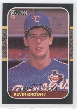 1987 Donruss - [Base] #627 - Kevin Brown Courtesy of COMC.com 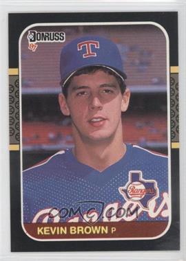 1987 Donruss - [Base] #627 - Kevin Brown Courtesy of COMC.com
__________________
-- PWCC: The Fish Stinks From the Head PSA: Regularly Get Cheated BGS: Can't detect trimming on modern SGC: Closed auto authentication business JSA: Approved same T206 Autos before SGC Oh, what a difference a year makes. |
|
#1181
|
||||
|
||||
|
Quote:
.jpg?id=b5f01e52-b1a0-44cb-aa58-98eafa64576f&size=original&side=back) 1960 Topps - [Base] #7 - Master & Mentor (Willie Mays, Bill Rigney) [VG*EX] Courtesy of COMC.com Maybe now that I can prove it's recurring, I can get it checklisted in Beckett.
__________________
-- PWCC: The Fish Stinks From the Head PSA: Regularly Get Cheated BGS: Can't detect trimming on modern SGC: Closed auto authentication business JSA: Approved same T206 Autos before SGC Oh, what a difference a year makes. |
|
#1182
|
||||
|
||||
|
*Double post*
__________________
-- PWCC: The Fish Stinks From the Head PSA: Regularly Get Cheated BGS: Can't detect trimming on modern SGC: Closed auto authentication business JSA: Approved same T206 Autos before SGC Oh, what a difference a year makes. Last edited by swarmee; 01-02-2019 at 06:34 PM. |
|
#1183
|
||||
|
||||
|
Quote:
http://net54baseball.com/showpost.ph...&postcount=867 |
|
#1184
|
|||
|
|||
|
Scarce but recurring. Good to know John.
|
|
#1185
|
|||
|
|||
|
Quote:
|
|
#1186
|
||||
|
||||
|
For those that don't know, I am a Cardinals team set collector. I recently started searching for reoccurring vintage Topps variations, after a few years of collecting modern Topps variations. When I discovered this thread I went through all 119 pages looking for Cardinals. I also went through Richard Dingman's variation site and listed all of the variations on my spreadsheet that I didn't have. I was able to find most.
Along the way, I happen to have discovered a few variations on my own that were not listed anywhere that I have seen. My rule for myself is that it has to be reoccurring. Some of the variations that I have found are variations within variations. For example, the 1960 Topps Lindy McDaniel (yellow blob in the orange area on the left) has different reoccurring shapes. This card also has a thin donut and a thick donut that are both reoccurring. Also, it has a white donut on his arm that is reoccurring. I don't have those scanned. Maybe I will later this week. Another variation that I found that I have not seen mentioned anywhere else is a 1969 Topps Mike Shannon with a long black line down the left border similar to the Adlesh on the top border that was previously discussed (I think, from memory). Here is one that I have found going through my duplicates - a 1972 Topps Don Shaw. I found these as reoccurring on COMC. These are the ones I found in my duplicates. The one on the left is a normal card. The one in the middle has an outline around his hat. The one on the right has an outline around his hat, but the entire picture has a brownish tint to it. It is hard to see on my scan, but it is very visible in person and also very visible on COMC's scans. 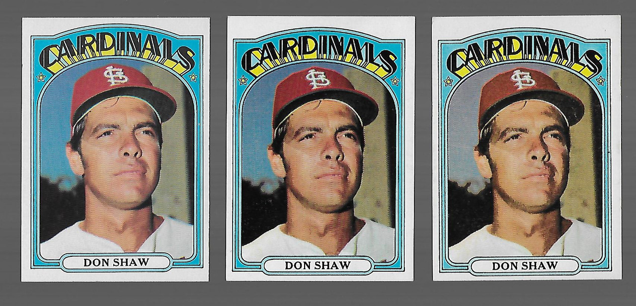
|
|
#1187
|
||||
|
||||
|
Does anyone know if there is a red/pink tint variation with '68 BB? Ran across a couple cards with a weird color variation.....Thoughts? Common?
Not sure this scan does justice but the cards def. have a red "hue" to them... |
|
#1188
|
|||
|
|||
|
Patrick---I think that defect is fairly common in the 68s. Ben would note that some sellers offer them as rare variations at high prices, but not always
 And here is another Hiller oddity that also has related defects in the set And here is another Hiller oddity that also has related defects in the seto 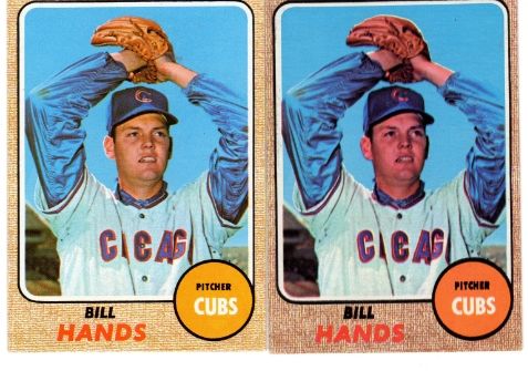 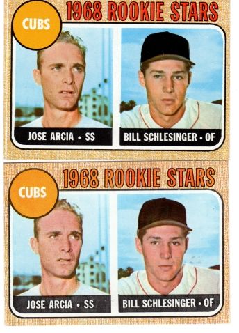 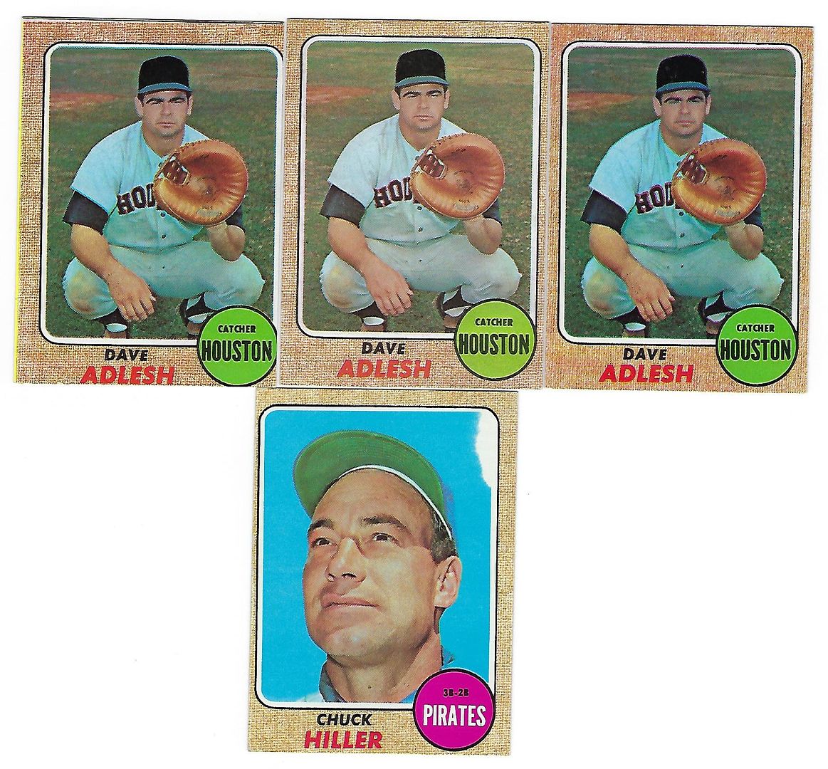
Last edited by ALR-bishop; 02-11-2019 at 09:32 AM. |
|
#1189
|
||||
|
||||
|
Al, are there other cards, in addition to the Torborg, that have a print defect directly related to the Hiller oddity?
|
|
#1190
|
||||
|
||||
|
I cant find it now but there used to be a page on Google of a auction house with a scan of a complete uncut sheet of the series with the 1968 Topps Chuck Hiller and Jeff Torborg, they were side by side in the middle of the sheet with Hiller on the left and Torborg on the right. I forget who was above them, but if either of them were affected with the same flaw I think examples would have shown up by now.
|
|
#1191
|
||||
|
||||
|
Quote:
|
|
#1192
|
||||
|
||||
|
Ever since I found a 1974 Topps Sandy Alomar printing flaw card missing much of the right border three years ago I have been looking for a 1974 Topps Dusty Baker that would line up with it. I found one recently that I got from D***'* ****S for less than a dollar. Interestingly, the gray border on the Alomar was applied on the final ink coat and is missing, but the light blue border on the Baker was not part of the final ink coat run and is complete other than the missing black lines. Now I have to find a 1974 Topps Cookie Rojas missing border to complete the puzzle.
Last edited by Cliff Bowman; 02-12-2019 at 07:03 PM. Reason: Enlarged photo |
|
#1193
|
||||
|
||||
|
Nice find on those 74s Cliff, something else to keep an eye out for.
|
|
#1194
|
|||
|
|||
|
Another ridiculously priced museum piece card from that DC guy

|
|
#1195
|
|||
|
|||
|
What fun! I've had the Alomar for years, and have it filed as a one time only thing.
Nice to find out it's not. |
|
#1196
|
||||
|
||||
|
I had not noticed this recurring print issue on the 62 268 McBride card until today. The white spot in the upper right corner almost seems to match up with the previously mentioned 62 Pizarro's white spot in the upper left corner . I could not find an uncut sheet for this series of 62s, but I wonder if these two cards were side by side based on the locations of their white spots.
|
|
#1197
|
||||
|
||||
|
I stumbled across this pretty cool color print flaw card on eBay at a very reasonable price (KitYoung of all people), I put a normal one next to it for contrast. P.S. eBay saw an uptick on sales of 1962 Topps Pizarro and McBride cards this morning due to the previous post
 . .
|
|
#1198
|
||||
|
||||
|
Quote:
FWIW, I contributed to the spike as I grabbed one of the McBride cards so I had a second copy to put next to my Pizzaro copies. |
|
#1199
|
||||
|
||||
|
Its the only one I have ever seen, I stumbled across it a few weeks when I punched in topps defect on eBay and it popped up. I found a partial 1958 Topps sheet with the Aaron All Star on it, it has the immortal Ray Monzant to the right of it and then three consecutive Stan Musial All Star cards in a row. I looked at all of the 58 Monzant cards on eBay, COMC, and DC but didnt see any with a corresponding ink flaw.
Last edited by Cliff Bowman; 03-08-2019 at 08:31 AM. Reason: Added scan |
|
#1200
|
||||
|
||||
|
Cliff, you are the man! I don't chime in much anymore due to time and three boys in 4-6th grade but I love browsing this thread and seeing these finds you and the others come up with. Keep em coming!
__________________
COLLECTING BROOKLYN DODGERS & SUPERBAS |
 |
|
|
 Similar Threads
|
||||
| Thread | Thread Starter | Forum | Replies | Last Post |
| 1966 Topps High # Print Variations | 4reals | Postwar Baseball Cards Forum (Pre-1980) | 9 | 04-27-2014 06:05 PM |
| Are these variations or print defects? | savedfrommyspokes | Postwar Baseball Cards Forum (Pre-1980) | 16 | 02-09-2013 11:52 AM |
| Well known print defects. Do variations exist without? | novakjr | Postwar Baseball Cards Forum (Pre-1980) | 9 | 01-28-2011 04:32 PM |
| Finally confirmed - d311 print variations exist! ("bluegrass" variations) | shammus | Net54baseball Vintage (WWII & Older) Baseball Cards & New Member Introductions | 8 | 09-03-2010 07:58 PM |
| Wanted: T206 Print Variations and Errors | Archive | Tobacco (T) cards, except T206 B/S/T | 1 | 01-04-2007 07:23 PM |