Quote:
Originally Posted by tedzan

Hi Corey....it's been quite a while since we have last spoken....great hearing from you.
My experience looking over 1000's of T206's these past 40 years is that PIEDMONT 150, SOVEREIGN 150 and SWEET CAPORAL 150 T206's are generally richer in color (especially blue)
than their T206 counterparts with SWEET CAPORAL 350 (Factory #30) backs
For example......
 . 
 . 
Regarding ink colors, what has mystified me more so is why the 150 Series ** cards are lacking the rich dark BLUE color seen on numerous subjects in the 350 Series
and 460 Series subjects....such as:
150 Series................................... 350 Series.................................. 460 Series
 .  **....Note
 Waddell (portrait) is the only 150 Series subject printed with dark blue ink.
TED Z
T206 Reference
. |
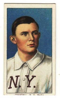
Ted I don't know if some of it has to do with your scanner but the Crandall
Piedmont 150 you posted is an unusually darker blue.
Not to long ago I had 15 Crandall no caps including two with the same
exact plate scratch as yours (the one I have left is the last one one the right)
the blue does vary even in the same backs but yours is the darkest blue I've
seen.
Here are the eight I still have seven are piedmont 150's. Luke has a good description of the difference between some
of the 150 and 350 series when he describes the 350's as having a washed out look compared to the 150's.
img027.jpg
same plate scratch as yours
img027 - Copy.jpg