I don't wanna create any waves or anything, but I just thought I'd put this out there as some food for thought. And in no way is this meant to attack anyone.
In that '33 Goudey set (as well many other period illustrated ones), you have a lot of examples of familiar photos being used for reference in the illustrations.
Check out these Ruth cards and photo:
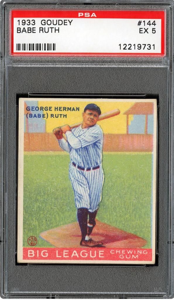
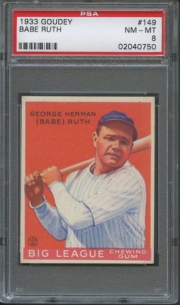
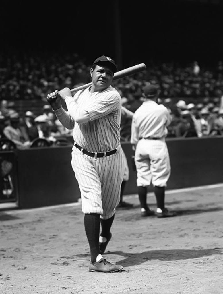
I think it's fair to say that they're the same image. But they're still some minor differences here and there.
And on the other side of the spectrum are the illustrations that very much resemble certain photos, but have larger differences. The one that immediately comes to mind for me is the Hubbell from the same set (or even the one from the '34 issue):
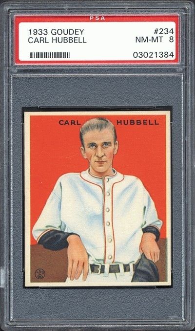
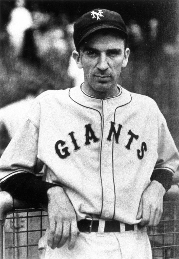
I don't think the comparison is as obvious between the two, but I believe that the illustration was done from this photo. Obviously, the jersey's different and he's not wearing but holding his hat in the card, but still, they're too many things that make me think that it was just a liberty taken by the artist.
The gestures are pretty identical, especially in regard to his lean against the fence. Also, his right hand falls the same way in both images. His left hand, though hold the hat, still very much mimics the grip in the photo. The jersey, though without any lettering, has man of the same folds that are in the photo, and the collar/neck hole shape is exactly the same. The positioning of the belt buckle is the same. The faces (minus the hat) are incredibly similar.
So, I can look at that photo and say that in my own opinion, it was used to make the Goudey card. But of course, I could be wrong, and it's possible that another photo could surface that looks more like the image on the card. But unless one is found, then I wouldn't think otherwise.
The Elberfeld example that Runscott provided is an interesting one. In the one with Detroit jersey, they're a lot of similarities. But after seeing the shot of him with NY, I would definitely say that that one was what the artist had in hand. But what's to be said about the differences between his NY jersey in the studio photo and the one on the card? Obviously, a lot of t-206 artists took liberties in those jerseys, whether it came to collar folds or whatever was written across their chests. That was mostly done in order to be current with the correct teams the players were on, or just to make it obvious to the viewer who was on what team.
There's going to be some liberties taken in all of these illustrated cards, and I guess the more obvious the liberty, the more distant said illustration gets from said card muddies. In my eyes, that Gehrig card is an example of that. I think the biggest liberty was taken in his face. The lighting that's in that face has gotta be made up, as there was no way that the brim of that hat he's wearing in the card would cover that entire face in shadow, and then produce that depicted light pattern in his jersey. With that in mind, I'm pretty darn sure that a photo depicting that exact lighting condition doesn't exist. And of course, I could be wrong, too!
I guess what I'm trying to say is that we can't be 100% that any of these are from those exact photos. All we can do is use our eyes and make the most educated guess possible. Kinda like the autograph game. I guess to know for sure, we would have had to have seen the artist in the process of creating the illustration.
And now please excuse me while my head explodes.
Graig