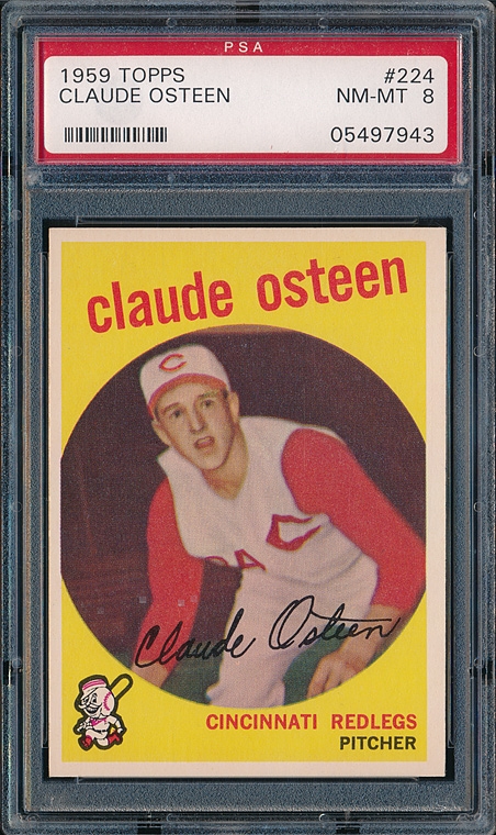
Overrated: 1959 Topps (Sorry, Don). The player image is consigned to a small bullseye-type circle ("There he is! In that small circle! Yeah, right there!!") I also don't care for the e.e. cummings type lower-case lettering for the player's name. Names have capital letters! Deal with it!

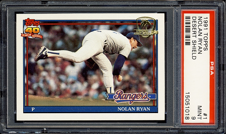
Underrated: 1991 Topps (Sorry, everybody else). I only have the Desert Shield set, but if I squint real hard and try and pretend that there isn't a picture of a palm tree on the front of my card, I can sort of intuit what the regular issue set might look like. Gorgeous! There's a nice mix of action photos and non-action photos (can't think of a name for those).

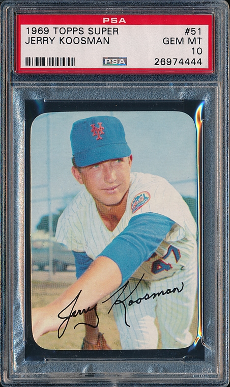
Favorite: 1969 Topps Supers. Nuff said.

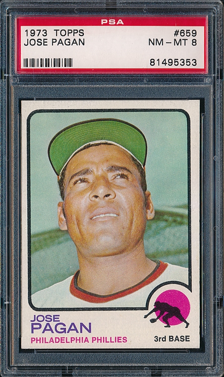
Least Favorite: 1958 Topps and 1973 Topps (it's a tie). Ick.

